
Kendo UI for Vue
Vue DateTimePicker
- Combines Vue DateInput, Calendar, and TimePicker component features, and enables the user to enter or pick a date and time values.
- Part of the Kendo UI for Vue library along with 110+ professionally-designed components.
- Includes support, documentation, demos, virtual classrooms, learning resources and more!
-
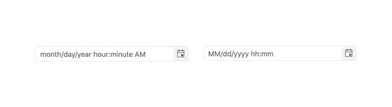
Placeholders
The placeholder functionality is essential when you work with a date and time in a single component. The DateTimePicker allows the developer to use any valid format string to define how the date and time values will be displayed.
-
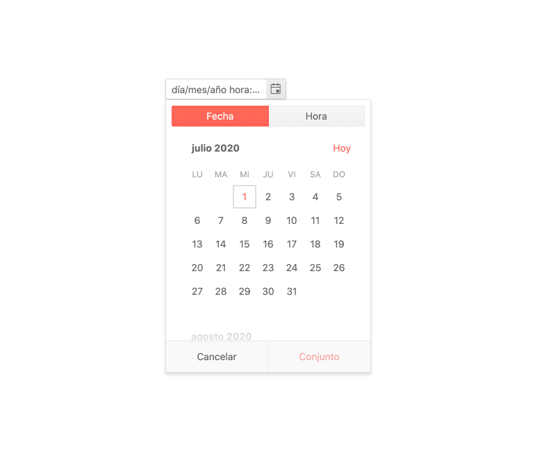
Globalization
The Kendo UI for Vue DateTimePicker has built-in globalization support. With this functionality, the data and text displayed in the component are localized based on the end users’ preferences.
-
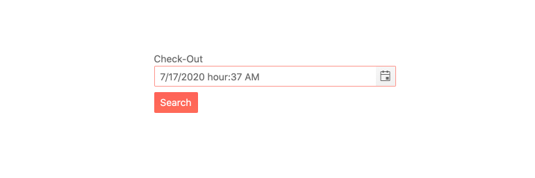
Forms Support
When your scenario requires the submission of a form that contains date and time values, the Kendo UI for Vue DateTimePicker is the component you can rely on because:
- It provides a user-friendly interface for the selection of the date and time
- It simplifies the form by combining two components in one
- It is shipped with built-in validation functionality and error messages customization
-
Controlled and Uncontrolled Modes
The DateTimePicker works in both controlled and uncontrolled modes. When the component is in uncontrolled mode, its form data is handled by the DOM. When working in a controlled mode, DateTimePicker’s form data is handled by the Vue component. By default, the component works in uncontrolled mode. The switch to controlled mode can be done by a single configuration option.
Kendo UI for Vue DateTimePicker Controlled Mode example -
Keyboard Navigation & Accessibility
The implementation of the DateTimePicker component follows the WAI-ARIA and Section 508 standards. It is accessible by screen readers and other assistive technologies. The component also has an integrated Keyboard Navigation. This navigation enables the opening of its popup, the selection of date and time, and the updating of its value using just the keyboard.
Kendo UI for Vue DateTimePicker Keyboard Navigation example
-
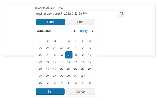
Overview
The Kendo UI for Vue DateTimePicker is a component that provides an intuitive and user-friendly interface for selecting a specific day and time of the day. The users can choose day and time from a popup list that appears under the component or manually insert values in its input. With its various customization options, the DateTimePicker allows the developers to implement the date/time selection scenario they need.
See Kendo UI for Vue DateTimePicker Overview example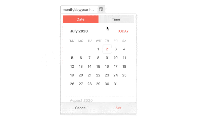
-
Disabled DateTimePicker
Sometimes the interaction with the DateTimePicker should be disabled for the users. For these scenarios, the component provides a visible indication of its disabled state. By controlling the value of a single property, we can enable or disabled the DateTimePicker on the fly.
Kendo UI for Vue DateTimePicker Disabled state demo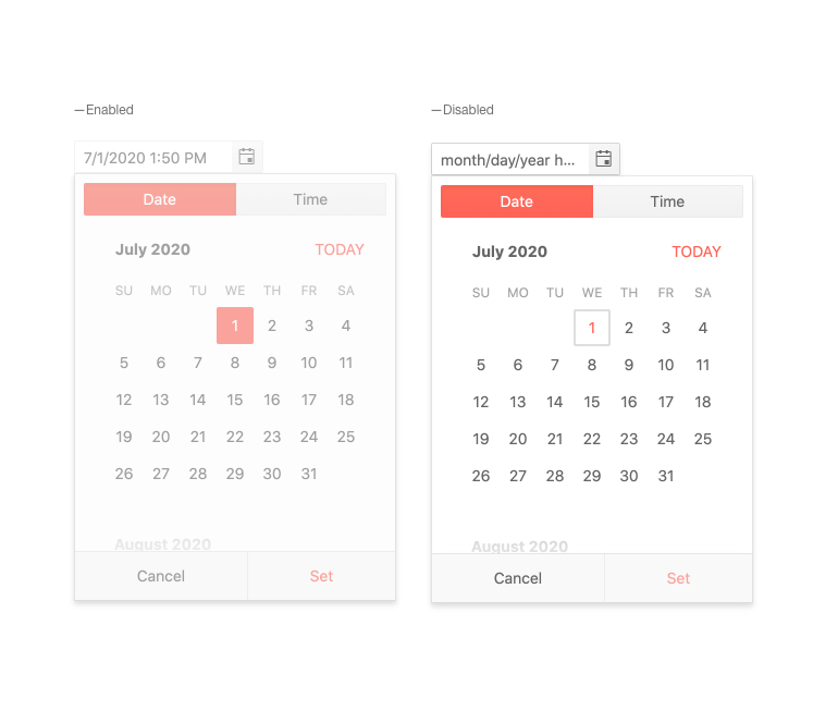
-
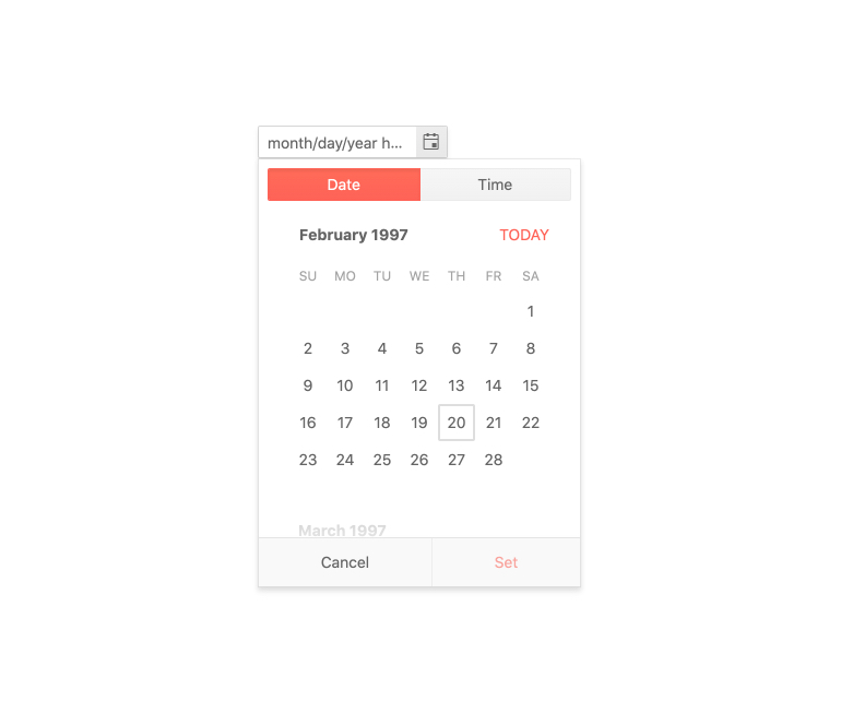
Focused Date
The DateTimePicker always has a date in its popup calendar that is displayed differently. This date is called a “focused date”. By default, the focused date is today’s date but the focus can be set to any other date using a single configuration property.
-
Date and Time Limits
The Kendo UI for Vue DateTimePicker works with all available hours(24-hour clock) and all past or future dates. When you don’t need a wide date and/or time range, the component’s limiting functionality can set the date and time slots that the users can select or enter. With this range limitation, the users can’t select or enter values that are beyond the defined boundaries.
Kendo UI for Vue DateTimePicker Date and Time Limits example
-
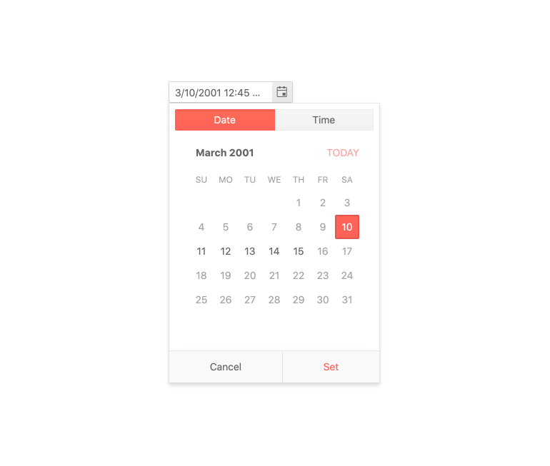
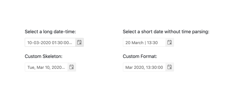
Formats
The DateTimePicker supports all standard date and time strings and can display them in various formats configured by the developer.

Get Started with Kendo UI for Vue
