Kendo UI for Vue
Vue Heatmap
- Visualize complex data patterns at a glance with Kendo UI for Vue Heatmap chart.
- Part of the Kendo UI for Vue library along with 110+ professionally-designed components.
- Includes support, documentation, demos, virtual classrooms, learning resources and more!
-
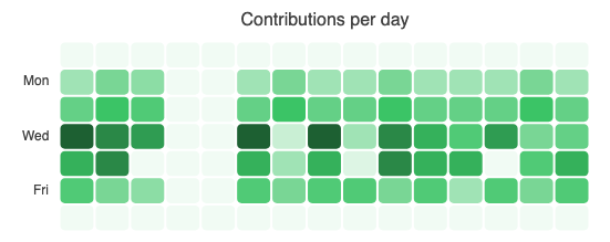
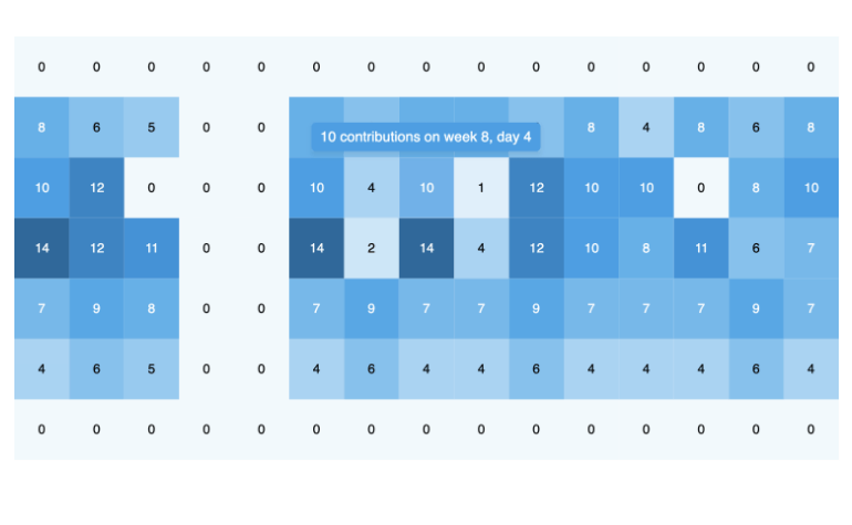
Visualize Data Density with the Heatmap Chart
The Kendo UI for Vue Heatmap Chart offers a powerful way to visualize data intensity across two categories using color gradients. Whether you're tracking traffic patterns, server loads, or performance across teams, the Vue Heatmap makes it easy to spot trends, discrepancies and insights at a glance.
.png?sfvrsn=915f9969_2)
-
Data Binding
Effortlessly bind your Heatmap to local arrays or live data sources with full support for reactive updates. As your data changes, the chart updates automatically, making it perfect for real-time dashboards and analytics views.

-
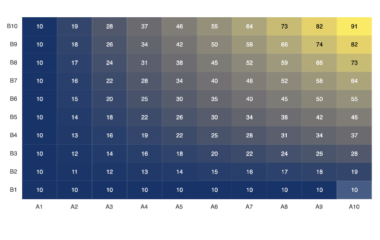
Color Scales
The Kendo UI for Vue Heatmap features a built-in color scale that automatically adjusts the intensity of each data point based on its value. Higher values appear in the boldest shades of your chosen color, while lower values are rendered in progressively lighter tones, making trends and outliers instantly visible. To define a custom color scheme, pass a callback function as the series color.
-
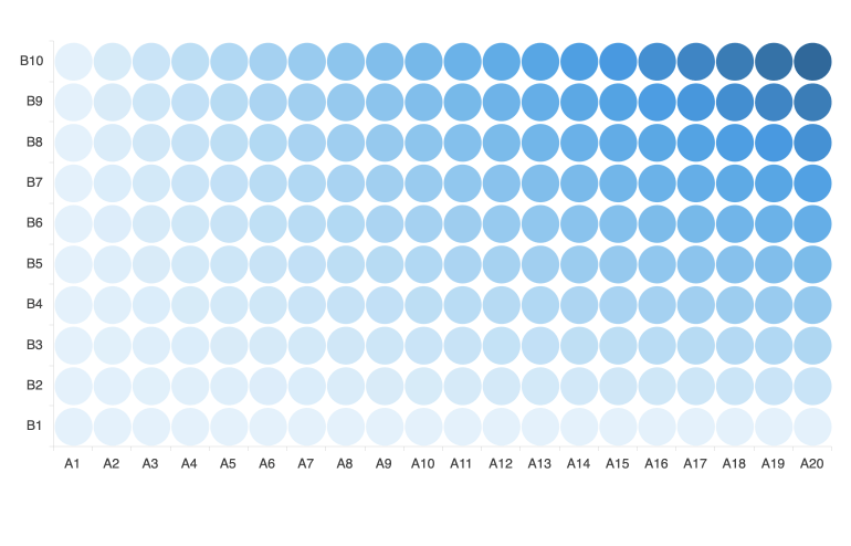
Marker Shapes
Customize the look of your Heatmap with flexible marker shapes that fit your data and design. Choose from rectangles, rounded rectangles, circles, or triangles to visually differentiate datasets or match your application needs. By default, markers automatically scale to fill the available space with consistent spacing. You can easily define exact pixel values for marker size, giving you full control over spacing, density, and layout precision.
-
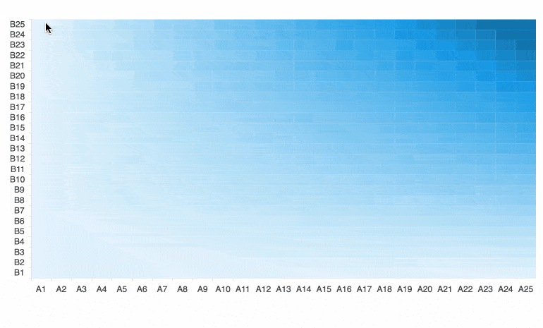
Panning and Zooming
Give users complete control over their data exploration with built-in panning and zooming capabilities. Panning is as simple as clicking and dragging across the chart, while zooming can be done with a mouse wheel, touch pinch gestures, or by holding Shift and selecting a specific area to zoom in.
-
Tooltips
Tooltips in the Kendo UI for Vue Heatmap are fully customizable, giving you the flexibility to display the information your users need. The tooltip template gives access to rich data context, including the value coordinates, the original data item, and the full series configuration.
-
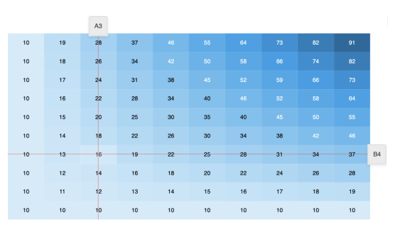
Crosshairs
Enhance data precision with interactive crosshairs that follow the user's cursor and display exact values along the chart axes. As users move across the Heatmap, vertical and horizontal guide lines help them pinpoint specific data points.

Get Started with Kendo UI for Vue