
Kendo UI for Vue
Vue Splitter
- Arrange your content in resizable, scrollable, collapsible panes.
- Part of the Kendo UI for Vue library along with 110+ professionally-designed components.
- Includes support, documentation, demos, virtual classrooms, learning resources and more!
-
Overview
The Vue Splitter allows you to divide a page into two or more panes in a row and/or column structure. Each pane can be resized with by dragging a handle up and down or side to side.
.jpg?sfvrsn=a6c3d479_2)
-
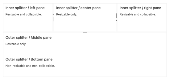
Panes
The panes are the Splitter’s content area, and the component provides the following configuration options to set them up the way you need.
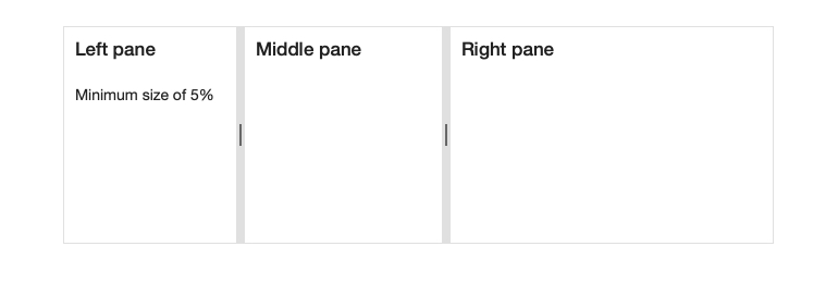
- Dimensions: Sets the initial dimensions of a pane.
- Resizing: Either allow or restrict end-user resizing.
- Collapsing: Allow users to completely collapse panes.
- Scrolling: Provide users with a scrollbar when content won’t fit inside a pane.
-
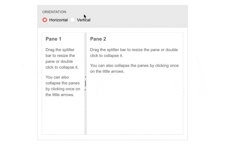
Orientation
The Vue Splitter will automatically layout your panes vertically or horizontally depending on what you choose.
-
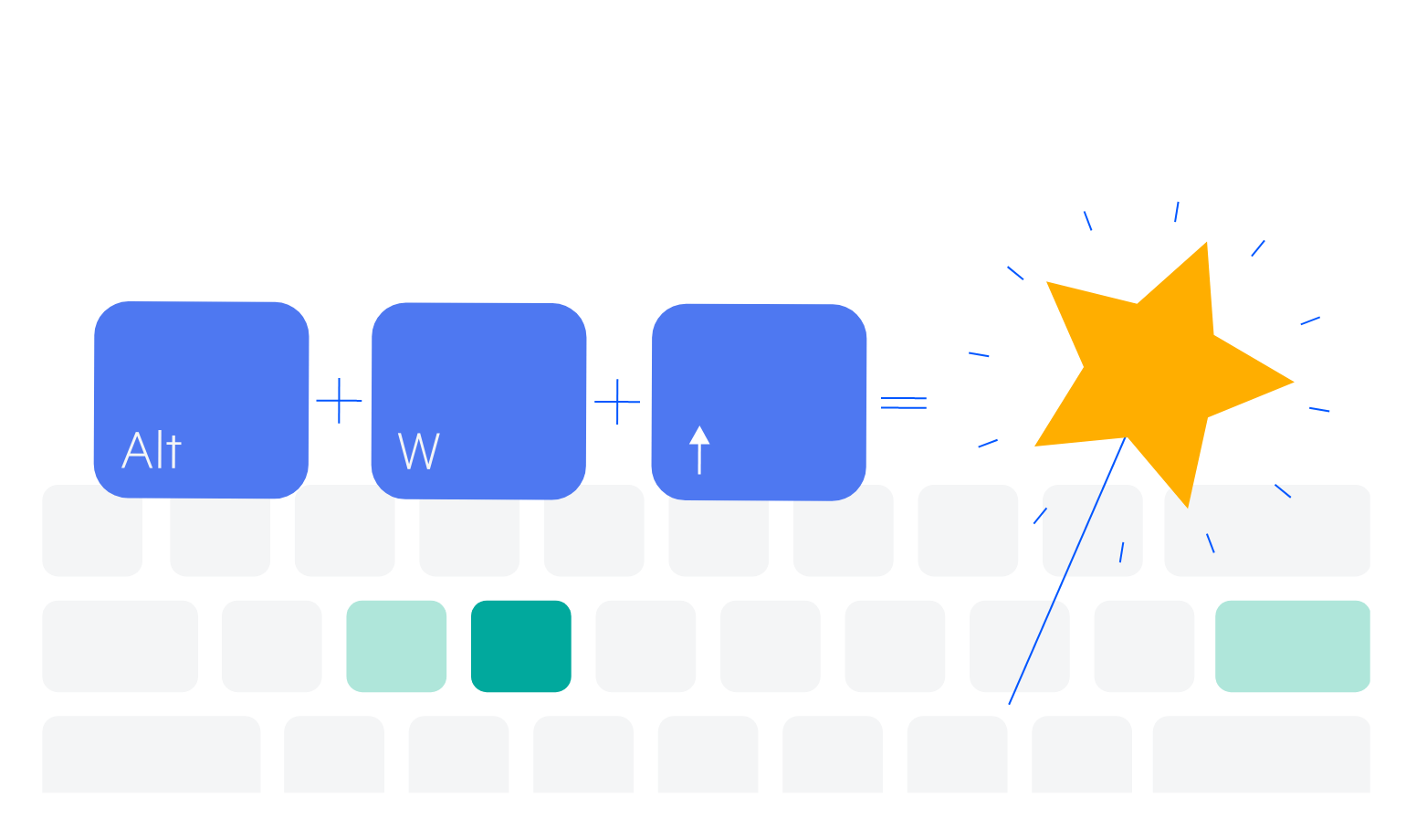
Keyboard Navigation
The Vue Splitter supports navigation and interaction of the component using the keyboard. This is part of our ongoing commitment to UX and accessibility.
-
Accessibility
All components included in Kendo UI for Vue provide full WAI-ARIA support, compliance with Section 508 requirements, and is AAA rated with WCAG 2.0.


Get Started with Kendo UI for Vue
