
Kendo UI for Vue
Vue DropDownTree
- Display hierarchical data in a tree-like structure with the Vue DropDownTree.
- Part of the Kendo UI for Vue library along with 110+ professionally-designed components.
- Includes support, documentation, demos, virtual classrooms, learning resources and more!
-
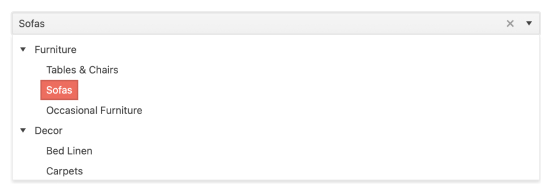
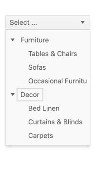
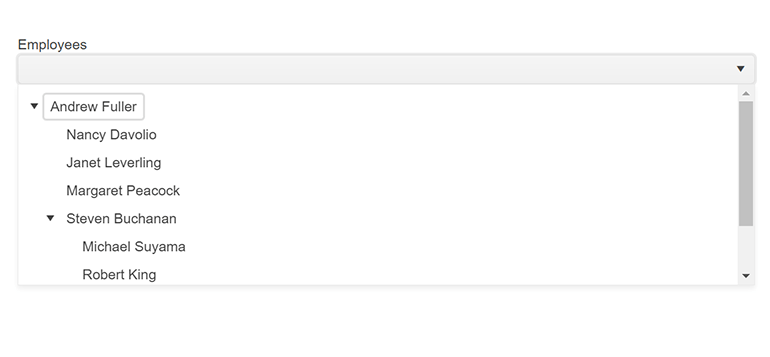
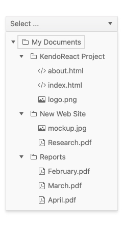
Easily Visualize Hierarchical Data in a Tree-Like Structure
A combination of the TreeView and DropDown components, the Vue DropDownTree is ideal for scenarios when you need to concisely display complex data. When users interact with this intuitive input element, the dropdown opens to reveal a built-in TreeView with a hierarchical structure. By selecting a node, the corresponding value will appear in the input of the component.
-
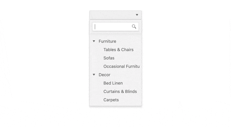
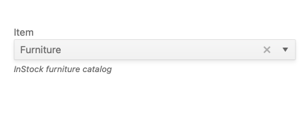
Filtering
When filtering is enabled, the Vue DropDownTree component displays an additional search box positioned above the item collection. The filtering mechanism enables end-users to minimize the displayed information within the component and facilitates them to find the specific items they're searching for.
See the Vue DropDownTree Filtering demo
-
Adaptive Rendering
The Vue DropDownTree supports an adaptive mode which provides a mobile-friendly rendering of its popup. When enabled, the component will automatically adapt to the current screen size and will change its rendering accordingly.
-
Custom Rendering
The Vue DropDownTree enables you to easily customize the look-and-feel of the component. You can modify the content of each list item, as well as the element content that holds the selected text. The component also enables you to customize the header and footer content, as well as the content of the option list when no data is available.
See the Vue DropDownTree Custom Rendering demo
-
Forms Support
The Vue DropDownTree component provides a native Vue implementation of HTML5 form validation, enabling you to validate the input values and prevent the submission of forms that are considered invalid.
See the Vue DropDownTree Forms Support demo
-
Keyboard Navigation
The DropDownTree incorporates built-in keyboard functionality, allowing users to interact with the Vue component solely using a keyboard. This enables users to effortlessly open and close the dropdown, navigate between items, select items and perform various other actions, all through convenient keyboard interactions.
-
Appearance
The Vue DropDownTree component provides a predefined set of appearance options. Apart from the default look of the DropDownTree, additional styling options allow you to customize individual aspects of the DropDownTree appearance, such as size, border radius and fill mode.
-
Accessibility
The Vue DropDownTree comes with comprehensive accessibility support, ensuring that the component is accessible to all users. The DropDownTree adheres to the Web Content Accessibility Guidelines (WCAG) 2.2 AA standards](https://www.w3.org/TR/WCAG21/) and Section 508 requirements. It also follows the Web Accessibility Initiative - Accessible Rich Internet Applications (WAI-ARIA) best practices for implementing keyboard navigation. The component offers various options for managing its focus and is tested against the most popular screen readers.


Get Started with Kendo UI for Vue
