
Kendo UI for Vue
Vue DateRangePicker
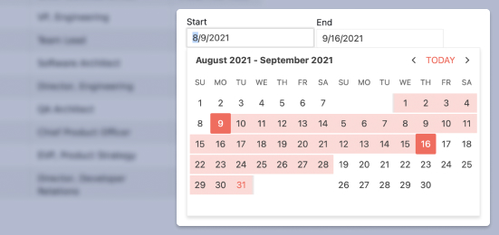
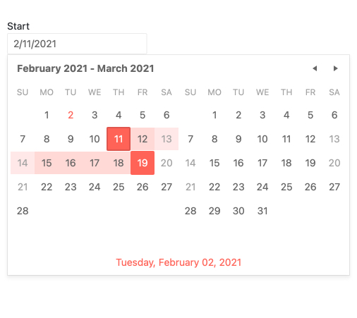
- Give your users a visual and interactive way to select date ranges by displaying side-by-side calendars.
- Part of the Kendo UI for Vue library along with 110+ professionally-designed components.
- Includes support, documentation, demos, virtual classrooms, learning resources and more!
-
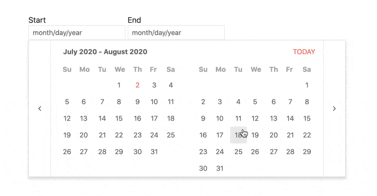
Focused Dates
The Vue DateRangePicker always shows a focused value when the calendar is displayed. The default is today, but you can assign whatever value you like.
-
Reverse Selection
By default, this Vue date picker component autocorrects scenarios in which end dates are selected before start dates. In other words, the first date selected is always the start date. You can change that behavior and allow the opposite so that the end date can be selected first.
-
Customization Options
The Vue DateRangePicker is very configurable with built-in properties, but you can also take it a step further by customizing the components used for these elements:
- Date Inputs
- Calendar
- Popup
-
Events
The Vue DateRangePicker component supports different events, enabling you to customize the component behavior based on your needs.
-
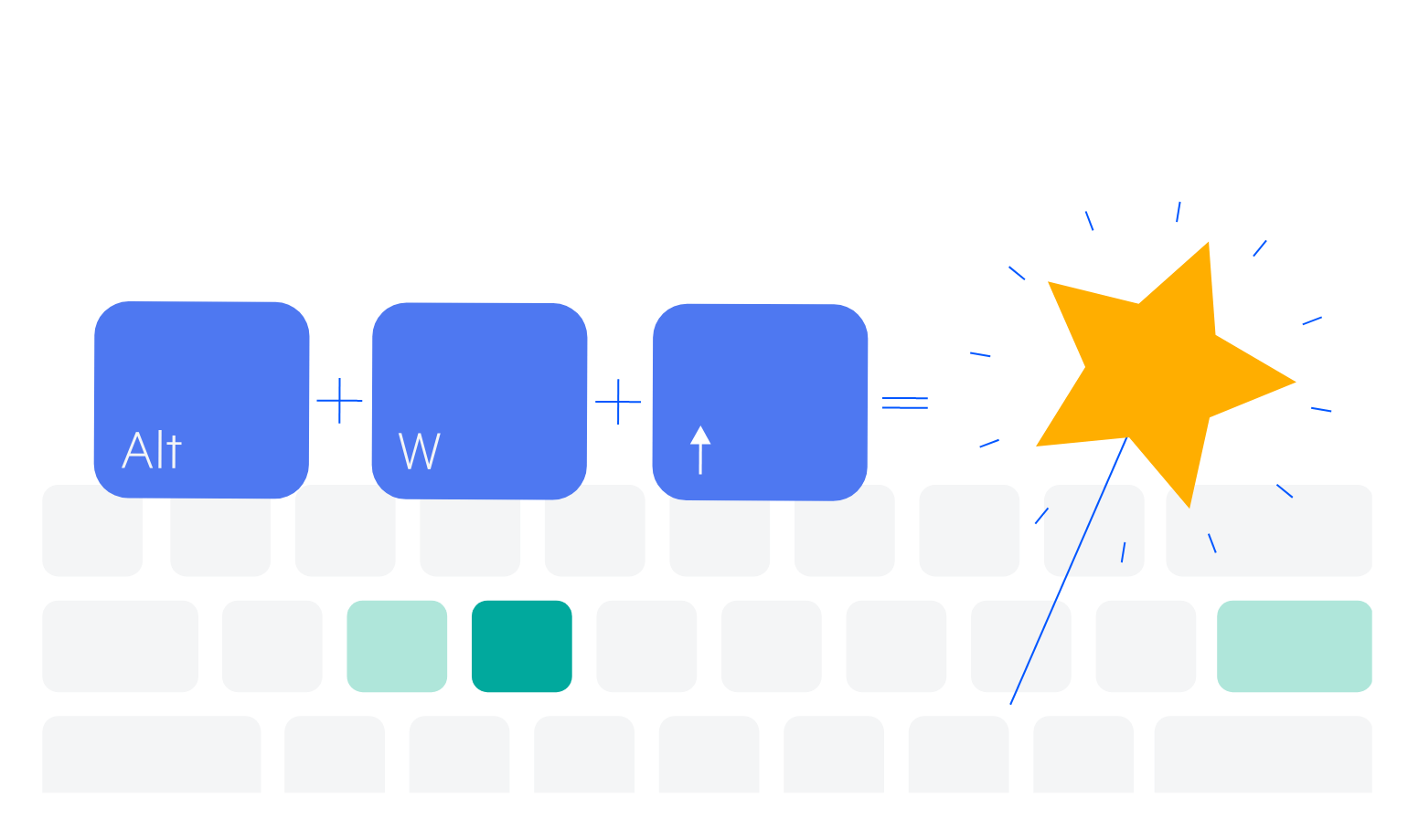
Keyboard Navigation
For users who prefer to use the keyboard or cannot use a mouse, this component fully supports keyboard interactions. See the demo for a complete list of supported shortcuts.
-
Overview
The Vue DateRangePicker component offers a highly customizable that help users select a range of dates using multiple calendars. The component by default has an end and a start date, and dates can be selected across any range and is supported by showcasing two calendars side-by-side.
-
Accessibility
Like the rest of Kendo UI, the Vue DateRangePicker is fully accessible to help you build software for everyone. It provides full WAI-ARIA support as well as Section 508 compliance.

-
Controlling States and Defaults
To give you full control, you can easily decide and configure the following:
- Controlled Mode: Specify behavior of the component when a date is selected and control when, and if, the calendar popup is displayed.
- Date Limits: Restrict the selection to upper and lower date ranges.
- Default Value and State: Set the initial selected range and calendar popup visibility.
- Disabled: Show the calendars, but in read-only mode.

Get Started with Kendo UI for Vue
