
Kendo UI for Vue
Vue GridLayout
- Easily organize the component contents in rows and columns in a grid structure with the Vue GridLayout component.
- Part of the Kendo UI for Vue library along with 110+ professionally-designed components.
- Includes support, documentation, demos, virtual classrooms, learning resources and more!
-
Overview
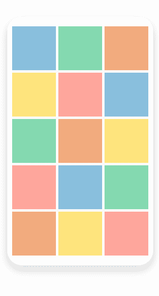
The Kendo UI for Vue GridLayout component enables you to easily arrange its contents into rows and columns in a grid structure. It offers a grid-like system for organizing the app content based on the CSS grid layout. You can configure items per row or column, as well as span content across them. The Vue GridLayout allows you to ensure UI consistency by applying the same basic rules (page structure) across multiple pages throughout your entire app.

-
Layout
With the Vue GridLayout, you get full control over the grid rows and columns, gaps and alignment. The rows and columns enable you to specify the number and size of each. Gaps, on the other hand, let you define the spacing between the items, while the alignment sets the position of the content within a cell.
-
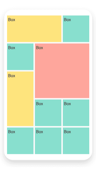
Items
The Vue GridLayout component enables you to easily play with the arrangement and dimensions of its items. By default, the size of each item is one row wide and one column high. Similar to other CSS grid systems, you can specify an exact item position or span items across rows and columns.

Get Started with Kendo UI for Vue
