Kendo UI for Vue
Vue Slider
- Enables the user to increase, decrease, and select predefined values by dragging its handle or by clicking the side arrow buttons.
- Part of the Kendo UI for Vue library along with 110+ professionally-designed components.
- Includes support, documentation, demos, virtual classrooms, learning resources and more!

-
Overview
With its intuitive interface, using the Kendo UI for Vue Slider you can select predefined values by dragging a handle along a track. The interface of the component also allows the users to increment or decrement a selected value by utilizing the provided side arrow buttons. Last but not least the Slider allows configuration of the step size and the min & max values available within the component.
See Kendo UI for Vue Slider Overview demo
-
Orientation
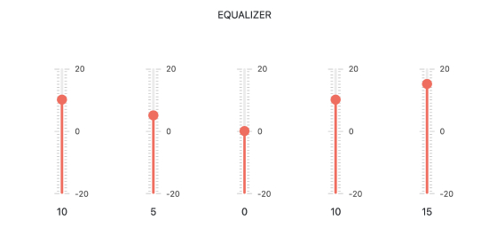
The Slider component can be rendered in both horizontal and vertical modes. The direction can be easily set by a single configuration option.
Kendo UI for Vue Slider Orientation demo
-
Labels
Each value that can be set in the component can have a label that hints to the users what a given tick presents. All labels in the component can be customized according to the business requirements of your application.

-
Controlled and Uncontrolled Modes
The Slider allows the developers to maintain its state based on implementation requirements. If there is no requirement for controlling the state of the component, the Slider functionality can be used in uncontrolled mode.
-
Keyboard Navigation & Accessibility
The implementation of the Slider component follows the WAI-ARIA and Section 508 standards. It is accessible by screen readers and other assistive technologies. The component also has an integrated Keyboard Navigation. This navigation enables the user to increase or decrease the value of the Slider using just the keyboard.

Native Vue Components
Common Features
Data Management
File Management
Labels
ScrollView
TreeView
Editor
Charts
- Area Chart
- Bar Chart
- Box Plot
- Bubble Chart
- Bullet Chart
- Charts
- Donut Chart
- Funnel Chart
- Heatmap
- Line Chart
- Pie Chart
- Polar Chart
- Pyramid Chart
- Radar Chart
- Range Area Chart
- Sankey Diagram
- Scatter Chart
- Sparkline
- Waterfall Chart
Indicators
Dropdowns
Inputs
Scheduling
Editors
Date Inputs
Dialogs
Progress Bars
Gauges

Get Started with Kendo UI for Vue
