
Kendo UI for Vue
Vue ChunkProgressBar
- Visualize a process with a predefined number of slices, or chunks, that make up the total.
- Part of the Kendo UI for Vue library along with 110+ professionally-designed components.
- Includes support, documentation, demos, virtual classrooms, learning resources and more!
-
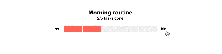
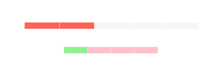
Visualize Any Process in Chunks on a Progress Bar
The Vue ChunkProgressBar displays and tracks the progress of a task or process in your application through a predefined number of chunks. The component supports both horizontal and vertical rendering modes and has styling options built in.
-
Values and Ranges
By default, the Vue ChunkProgressBar represents values from 0 to 100. For scenarios where this may not work, the min and max properties can be used to set a defined range of new values.

-
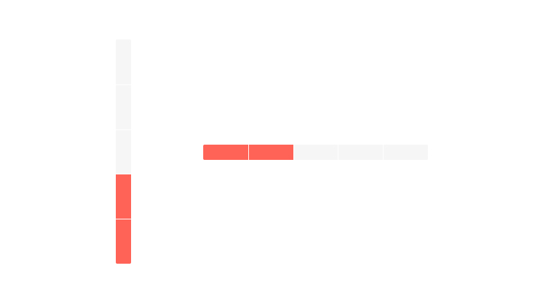
Orientation
Since most progress bard display horizontally, that is the default orientation for the Vue ChunkProgressBar component. You can choose to display it vertically and fill it from either top to bottom or bottom to top if you wish.
-
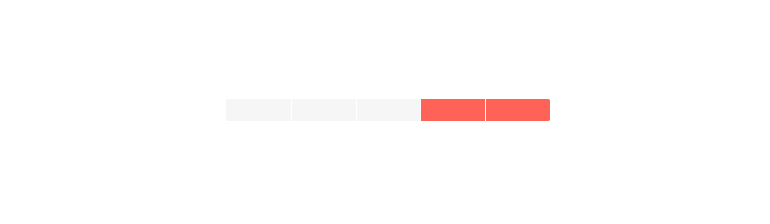
Direction
The Vue ChunkProgressBar fills itself from left to right by default but you can specify the reverse.
-
Appearance
The Vue ChunkProgressBar is styled by the applied theme by default but you can customize it. Options include dimensions and styling of empty and completed chunks.

Get Started with Kendo UI for Vue
