
Kendo UI for Vue
Vue TimePicker
- Represents a time-list where the user can enter or pick time values.
- Part of the Kendo UI for Vue library along with 110+ professionally-designed components.
- Includes support, documentation, demos, virtual classrooms, learning resources and more!
-
Overview
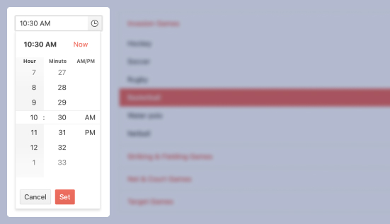
With the Kendo UI for Vue TimePicker, the user can select a valid time that fits the requirements of a specific format or culture. With its user-friendly popup interface, the users can easily select a time from a range that fits the requirements of your application.
-
Disabled TimePicker
There are scenarios in which the Kendo UI for Vue TimePicker needs to be disabled until a given user interaction or condition that should be met for its enablement. The enabled/disabled state of the component can be controlled with a single configuration property.
Kendo UI for Vue TimePicker Disabled state demo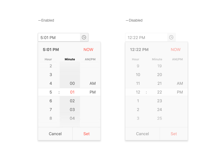
-
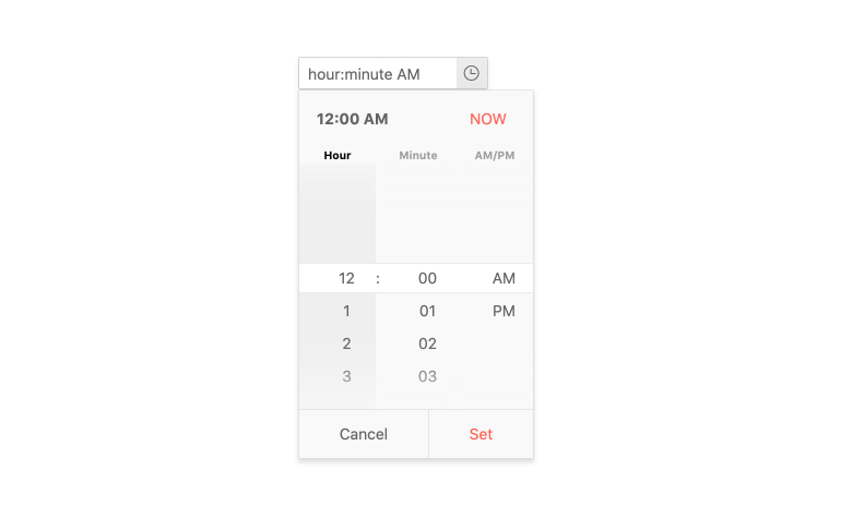
Default Value
By default, the Kendo UI for Vue TimePicker is initialized with an empty input. For the scenarios in which an initial time value is required, the component provides configuration property to achieve this functionality.
Kendo UI for Vue TimePicker Default Value example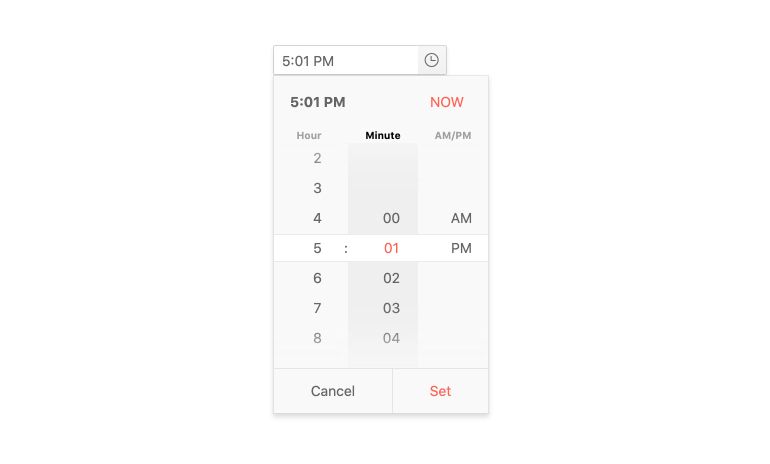
-
Keyboard Navigation & Accessibility
The implementation of the TimePicker component follows the WAI-ARIA and Section 508 standards. It is accessible by screen readers and other assistive technologies. The component also has an integrated Keyboard Navigation. This navigation enables the opening of its popup, the selection of a time, and the updating of its value using just the keyboard.

-
Time Limits
The available time slots in the Kendo UI for Vue TimePicker can be limited by the min and max configuration options of the component, letting you implement any custom time selection scenario.
Kendo UI for Vue TimePicker Time Limits example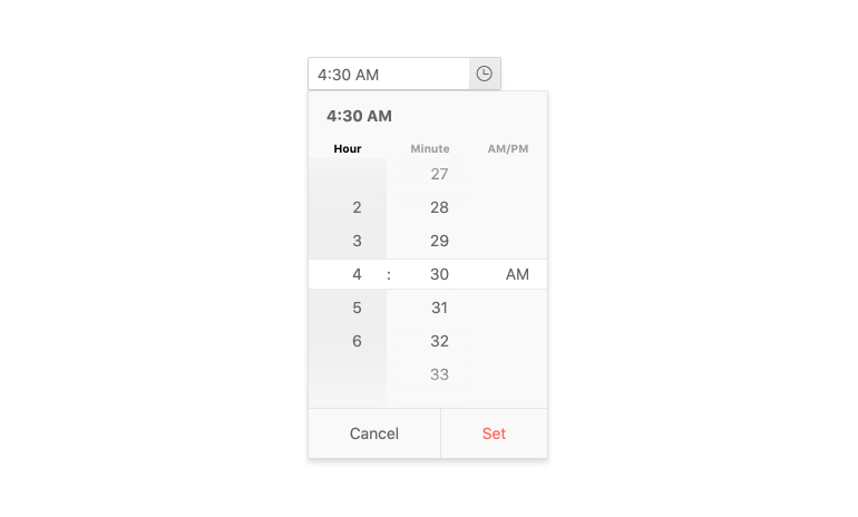
-
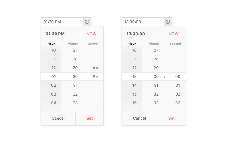
Formats
The time can be displayed in multiple formats – from the standard 12/24 clocks to formats that contain additional information like the day of the week or the seconds of the selected time. The TimePicker supports any string formats that define how the time value is displayed in the input of the component.
-
Placeholders
Displaying multiple input elements on a page can confuse the users. To prevent such confusion, the TimePicker provides a placeholder configuration. With it, the users can be guided to what is the type of the component and what input data it expects.
Kendo UI for Vue TimePicker Placeholders example
-
Forms Support
The Kendo UI for Vue TimePicker provides different options for validation of its input data. With the custom validation messages, minimum & maximum value, and required field configurations, we can integrate the component in any standard HTML form.
Kendo UI for Vue TimePicker Forms Support example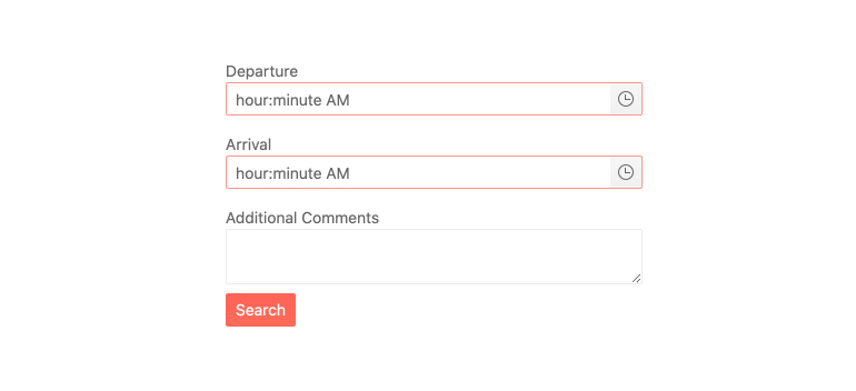
-
Globalization
The Kendo UI for Vue TimePicker automatically adapts its content to a selected locale, providing an intuitive experience to every user, no matter their location or language. The changes applied in the component include out-of-the-box time format changing(12 or 24 hours time format) and internal messages update based on users’ preferences.
Kendo UI for Vue TimePicker Globalization example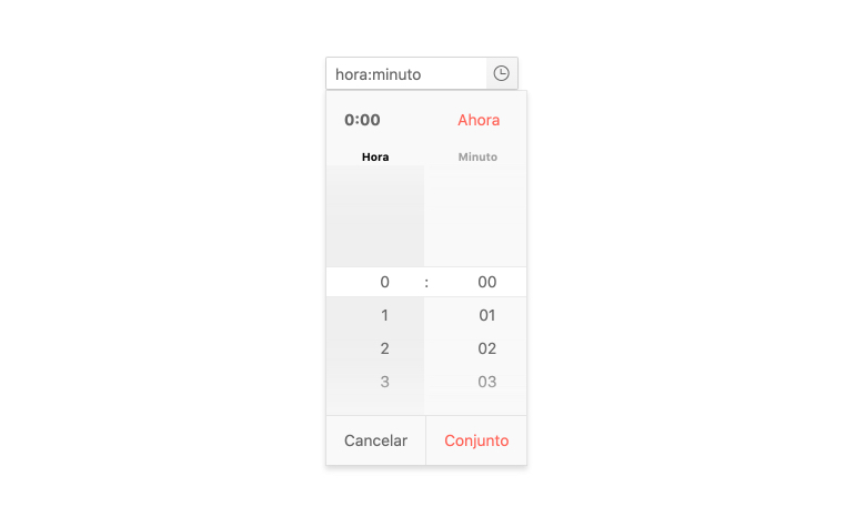
-
Controlled and Uncontrolled Modes
The default TimePicker state is in “uncontrolled mode”. This means that the form data tied to the component is handled by the DOM itself. If we set the state to “controlled mode”, the form data is handled by the Vue component.
Kendo UI for Vue TimePicker Controlled Mode example

Get Started with Kendo UI for Vue
