
Kendo UI for Vue
Vue ExpansionPanel
- Organize content on small screens in your Vue app in no time by adding an expandable and collapsible UI element with built-in animations.
- Part of the Kendo UI for Vue library along with 110+ professionally-designed components.
- Includes support, documentation, demos, virtual classrooms, learning resources and more!
-
A Fundamental Content Organizer
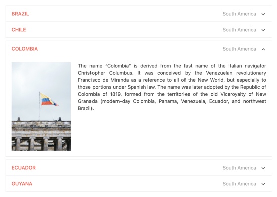
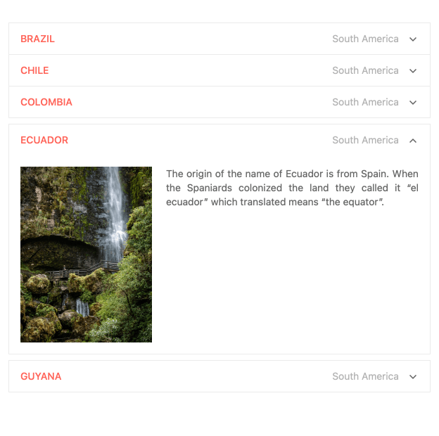
The Vue ExpansionPanel organizes any content into a UI element consisting of a title bar and expandable/collapsible content. The content can be as simple as text or as complex as another Vue component, such as the data grid. This fundamental UI layout tool supports complex content, animations, custom icons, and much more.
-
Animations
The Vue ExpansionPanel allows you to animate user interactions by adding expand and collapse animations. Developers have full control over this behavior, e.g., you can set the duration of the animation or disable it altogether.
-
Custom Icons
The Vue ExpansionPanel includes arrow ions to indicate expand and collapse actions, but you can replace them with icons of your choice. Use icons from the Kendo UI for Vue Icons collections, Font Awesome, or the library of your choice.
-
Accessibility
The Vue ExpansionPanel is accessible by screen readers. It is compliant with Section 508 and provides full WAI-ARIA support, following its accessibility best practices.
See the Vue ExpansionPanel Accessibility demo

-
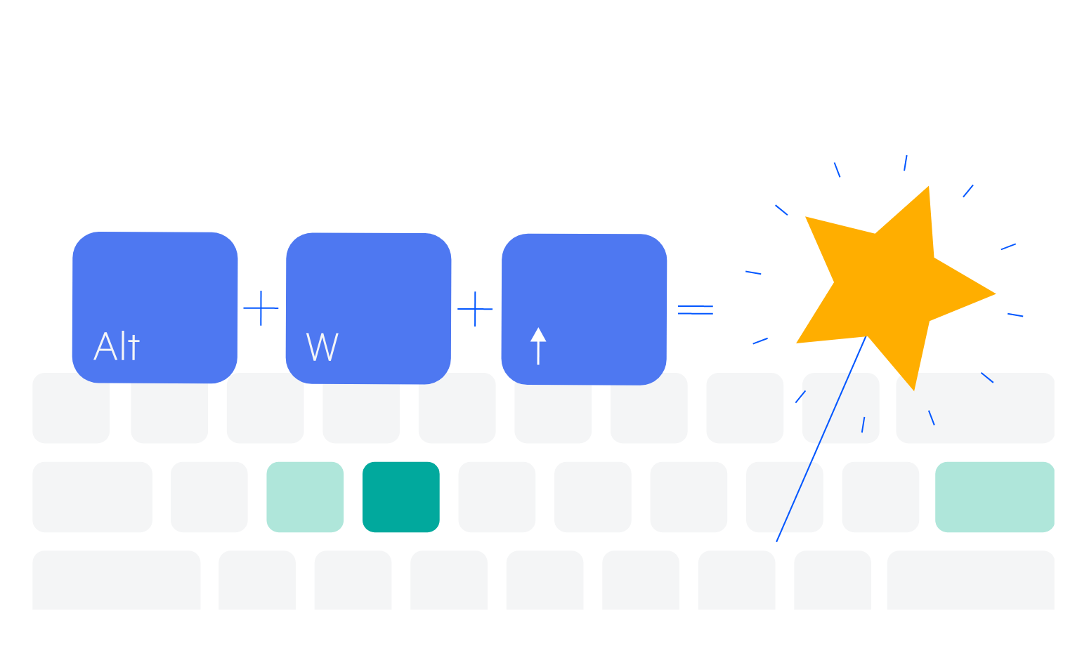
Keyboard Navigation
For optimal usability and accessibility, users can expand or collapse the Vue ExpansionPanel component using the mouse as well as keyboard shortcuts.
See the Vue ExpansionPanel Keyboard Navigation demo

Get Started with Kendo UI for Vue
