
Kendo UI for Vue
Vue Chip
- List items in containers, with text, images, and a delete icon. Common uses are selected tags or selected recipients.
- Part of the Kendo UI for Vue library along with 110+ professionally-designed components.
- Includes support, documentation, demos, virtual classrooms, learning resources and more!

-
Overview
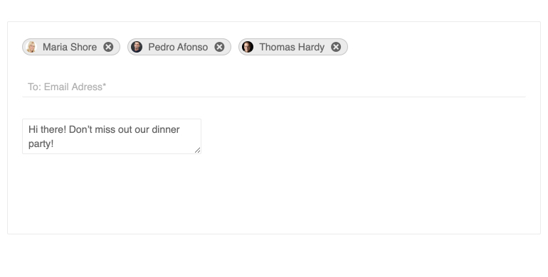
The Kendo UI for Vue Chip is a component that shows text, a close or delete icon, and images. Often used in social media platforms or email clients to indicate the different users in the recipient’s field of a message, the Vue Chip component is perfect for listing selected items.
-
Types
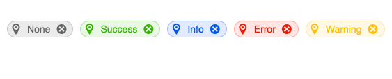
You can easily implement the Kendo UI for Vue Chip in different scenarios. The component provides several predefined types, including success, info, error and warning types, to better equip you for the manifold applications of the chip.
-
Customization
The Chip component has the ability to display avatars and can utilize custom select and custom remove icons.
-
Appearance
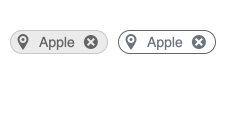
The Chip component includes two predefined appearance options: the Filled Chip, which sets a background color to its content, and the Outlined Chip, which sets a transparent background color and an outline.
-
Globalization
For globalization and internationalization scenarios, the Kendo UI for Vue Chip can be rendered in an RTL (right-to-left) mode.

Get Started with Kendo UI for Vue
