
Kendo UI for Vue
Vue AppBar
- The Kendo UI for Vue AppBar provides a collection of items on a toolbar that is contextual to the page element (a content block for example).
- Part of the Kendo UI for Vue library along with 110+ professionally-designed components.
- Includes support, documentation, demos, virtual classrooms, learning resources and more!
-
Add a Modern Layout and Navigation Element to Your Vue Apps
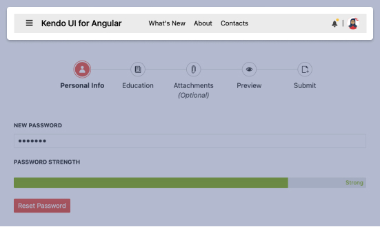
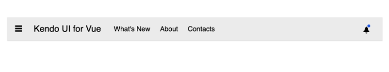
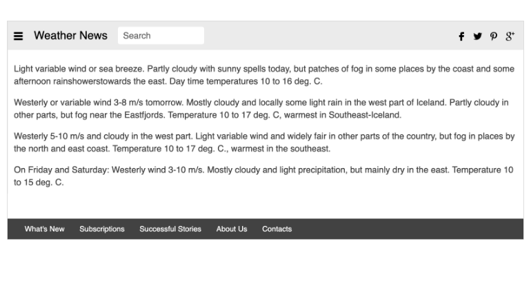
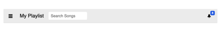
New Vue Component: AppBar
The Vue AppBar (sometimes known as a NavBar) component is a persisting contextual menu bar. It presents information and action related to a screen and is used as the main navigation element for an app or page. Convenient properties allow you to set content, position, spacing and theme. You can also decide whether you want it to be sticky or move out of view while the user scrolls.
-
Positioning
The Vue App bar gives you various options to determine where the component will appear and how it will behave. First, you can choose to place it at the top of the bottom of the associated content. The component will place a shadow at the bottom or top of the component depending on location. Second, you can choose fixed or sticky positions. With the former set, the component will scroll with the content. With the latter set, the component will remain pinned in its position so that it is always visible.
-
Content Arrangement
The Vue AppBar offers you full flexibility to define the items and the order in which they should appear in the menu. To assist with arranging the content, there are several layout components like the Section, Spacing, and Separator, which can be used to make the AppBar fit any design.
-
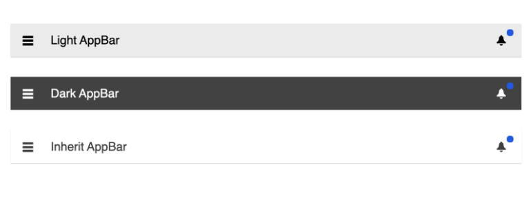
Appearance
In addition to the many styling options found in the themes and color swatches included with Kendo UI for Vue, the AppBar provides an easy way to change the look of the component. You just need to set the themeColor property to light, dark, or inherit.
-
Responsive Design
The Vue AppBar component can adhere to any responsive design rules you provide. This includes support for common responsive design tactics like using CSS media queries to customize what should be displayed and when as the Vue application and the AppBar component are being resized.

Get Started with Kendo UI for Vue
