Kendo UI for Vue
Vue MaskedTextBox
- Uses a mask to control the input of the user in terms of data type, data format, or text length.
- Part of the Kendo UI for Vue library along with 110+ professionally-designed components.
- Includes support, documentation, demos, virtual classrooms, learning resources and more!

-
Overview
The MaskedTextBox is a variation of the input element that controls the data entered by the user in terms of data type, data format, or text length. It is often used in scenarios where the user should enter data like zip codes, phone numbers, credit card numbers, etc. The Kendo UI for Vue MaskedTextBox provides both built-in masks and mask customization. Setting a mask for the component, it not only will indicate the user what kind of format is expected to enter but will also enforce this mask as the data is inserted in the input.
-
Masks
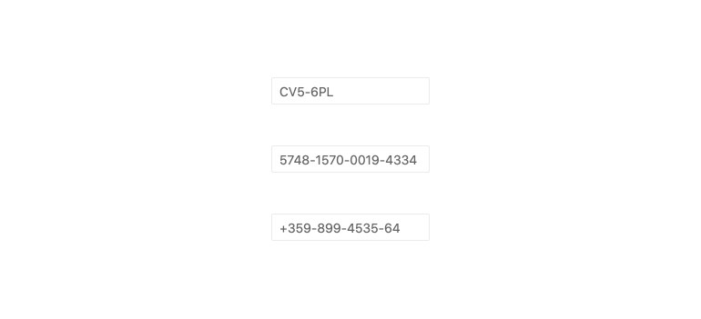
The Kendo UI for Vue MaskedTextBox supports a set of pre-defined masks like requiring digits, letters, or special characters. All built-in masks can be combined to create a custom mask that meets any data format requirement.

-
Disabled MaskedTextBox
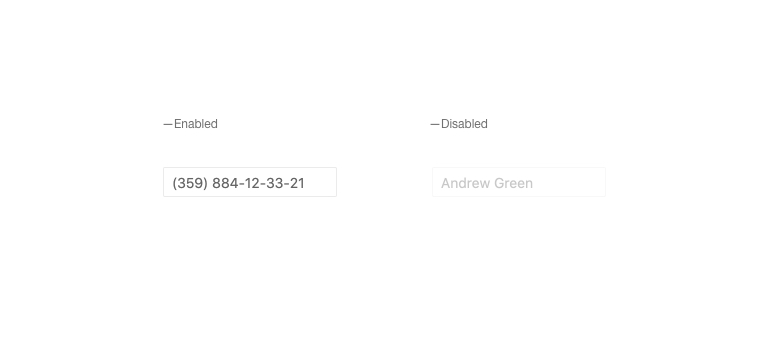
While the MaskedTextBox is enabled by default, there could be scenarios in which it should be disabled. For these cases, with a simple configuration of the disabled property, you can disable the user interaction with the component and visually indicate that the component is in a disabled state.
Kendo UI for Vue MaskedTextBox – Disabled mode example
-
Read Only MaskedTextBox
The Kendo UI for Vue MaskedTextBox can be used in read-only mode, preventing the user from entering data in the input. In this mode, the component will display a pre-defined value and will only allow the selection of the available text.
Kendo UI for Vue MaskedTextBox – Read-only mode example
-
Form Integration and Validation
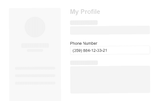
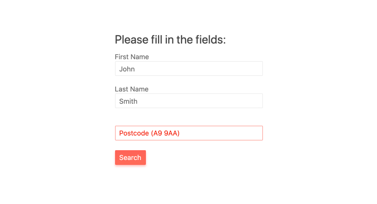
The Kendo UI for Vue MaskedTextBox supports a native Kendo UI for Vue implementation of HTML5 form validation making it easy to be used inside a form. With its built-in features, you can configure basic or complex validation scenarios with a minimum effort.
Kendo UI for Vue MaskedTextBox - Form integration demo
-
Accessibility
The MaskedTextBox is designed to be accessible by on-screen readers. It provides full WAI-ARIA accessibility support and meets the Section 508 requirements.

Native Vue Components
Common Features
Data Management
File Management
Labels
ScrollView
TreeView
Editor
Charts
- Area Chart
- Bar Chart
- Box Plot
- Bubble Chart
- Bullet Chart
- Charts
- Donut Chart
- Funnel Chart
- Heatmap
- Line Chart
- Pie Chart
- Polar Chart
- Pyramid Chart
- Radar Chart
- Range Area Chart
- Sankey Diagram
- Scatter Chart
- Sparkline
- Waterfall Chart
Indicators
Dropdowns
Inputs
Scheduling
Editors
Date Inputs
Dialogs
Progress Bars
Gauges

Get Started with Kendo UI for Vue
