
Kendo UI for Vue
Vue DatePicker
- Offers a highly customizable interface for the user to enter and pick dates supporting different locales.
- Part of the Kendo UI for Vue library along with 110+ professionally-designed components.
- Includes support, documentation, demos, virtual classrooms, learning resources and more!
-
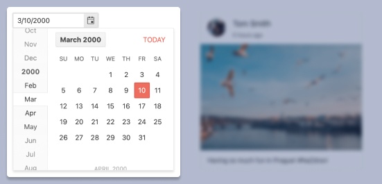
Overview
The Kendo UI for Vue DatePicker allows the end-users to manually insert a date or intuitively pick one from a popup calendar. The component supports different locales and has a highly customizable interface.
Kendo UI for Vue DatePicker – Overview Demo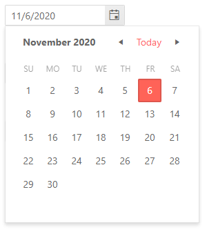
-
Default Value
By default Kendo UI for Vue DatePicker doesn’t have a selected value and the calendar popup is closed. Using the default-value and default-show props, we can pre-define the default value for the component and initially render it with an opened popup calendar.
Kendo UI for Vue DatePicker – Default Value Demo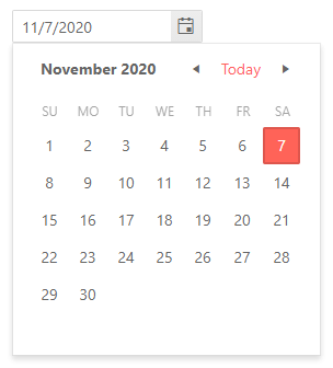
-
Focused Date
The popup calendar of the DateInput component always has a focused date that is rendered differently from the other dates in the calendar. The default highlighted date is today’s date but the component allows you to change the default focused date by passing a value to a single property.
-
Disabled DatePicker
For the scenarios in which the DatePicker needs to be disabled and the user’s input should be prevented, the component has a built-in configuration that not only disables it but also changes its design to visually indicate that the component is not in its default state.
Kendo UI for Vue DatePicker – Disabled State Demo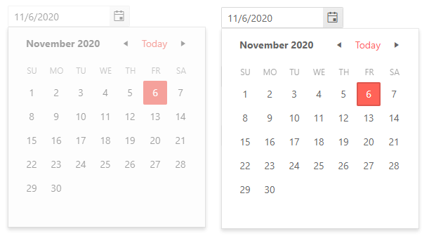
-
Date Limits
The DatePicker can handle any past or future date out of the box. For the applications that require a narrower date range, the component can be configured to allow the selection of dates that are within a particular range. With this configuration, the component will limit what dates can be manually entered into it and also what dates can be navigated in its calendar.
Kendo UI for Vue DatePicker – Date Limits Demo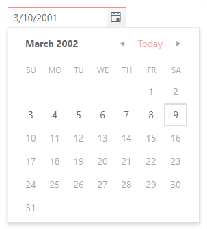
-
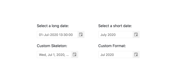
Formats
The DatePicker accepts all valid date and time formats. If it is required by the application, the format can even be updated on the fly.
-
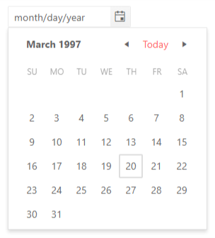
Placeholders
When working with dates, one of the most useful features for the users is to know exactly what data input is expected from them to enter in the DatePicker. This is where the placeholder configuration of the component comes into play. The component has a few predefined placeholder formats that can be used out of the box but also allows the definition of a completely custom placeholder when the business scenario requires it
-
Week Number Column
The Kendo UI for Vue DatePicker component has a built-in configuration option that allows the developer to show or hide a “week number” column, next to each week in the popup calendar.
Kendo UI for Vue DatePicker – Week Number Column Demo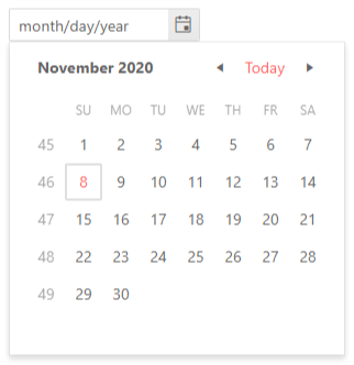
-
Custom Rendering
The DatePicker provides many customization options that allow you to create your unique component. While many of the options are available through props, there are scenarios in which the component needs a deeper level of customization. The DatePicker is designed with this complex customization in mind. It offers a custom rendered for every aspect of the UI component – DateInput, Calender, Popup, ToggleButton, and more. With these options available, the developer has the freedom to control the look and feel of every part of the DatePicker.
-
Forms Support
The Kendo UI for Vue DatePicker is probably the best choice for selecting a date value inside a form. On top of its default behavior, the component has built-in validation rules and styles and can prevent form submission if it is in an invalid state.
Kendo UI for Vue DatePicker – Form Support Demo -
Globalization
The DatePicker component supports Globalization out of the box. With this feature, the date input placeholder and formats, together with the texts in the popup calendar, can be changed based on the locale of the user. The changes are applied automatically and there is no need to make any additional reconfigurations of the component.
Kendo UI for Vue DatePicker – Globalization Demo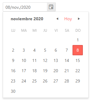
-
Keyboard Navigation & Accessibility
The Kendo UI for Vue DatePicker has different ways to select dates using just keyboard navigation - typing in the date input, incrementing the value of each slot of a date with the arrow keys, or opening the calendar and traversing through the displayed days to select a particular date. In addition to the keyboard navigation, the component is tested against the popular screen readers, providing full WAI-ARIA accessibility support and Section 508 compatibility.
Kendo UI for Vue DatePicker – Keyboard Navigation Demo

Get Started with Kendo UI for Vue
