
Kendo UI for Vue
Vue MultiSelectTree
- Easily display data in a tree-like structure and enable multiple selection.
- Part of the Kendo UI for Vue library along with 110+ professionally-designed components.
- Includes support, documentation, demos, virtual classrooms, learning resources and more!
-
Overview
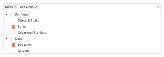
The Vue MultiSelectTree component gives you a quick and easy way to enable users to select one or more items from a hierarchical list of data. The component automatically organizes your data in a tree format and displays it in a dropdown that users can easily access and select items from.
-
Data and Value Binding
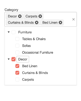
The Vue MultiSelectTree component enables you to set up a predefined list of options and selected values. To configure a predefined option list, simply use the dataItems property. To set up the value, you can either use the v-model directive or use the value property along with a change event.
See the Vue MultiSelectTree Data and Value Binding demox
-
Filtering
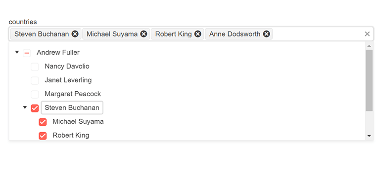
In case the list of options displayed in the MultiSelectTree is long, you can easily add a filtering option for a more user-friendly experience. When filtering is enabled, the component will render an input field in the dropdown list, filtering its contents with each keystroke of the user. You can also toggle a loading indicator to provide a visual cue of the filtering process.
See the Vue MultiSelectTree Filtering demo

-
Adaptive Rendering
The Vue MultiSelectTree supports an adaptive mode which provides a mobile-friendly rendering of its popup. When enabled, the component will automatically adapt to the current screen size and will change its rendering accordingly.
-
Custom Rendering
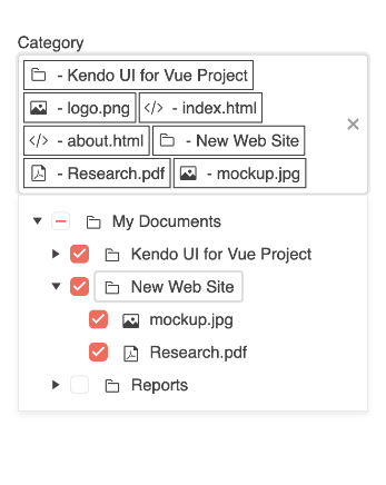
You can easily customize the Vue MultiSelectTree by using the built-in customization options. You can customize the items and value elements (e.g., with a custom icon), the content of the header and footer, as well as the content of the option list when no data is present.
See the Vue MultiSelectTree Custom Rendering demo
-
Forms Support
The MultiSelectTree component supports a native Kendo UI for Vue implementation of HTML5 form validation. This type of forms support enables you to validate input values and prevent the submission of invalid data. To integrate the MultiSelectTree component into any form element, you can use a few simple properties to set validation requirements, custom validation messages and implement advanced validation scenarios.
See the Vue MultiSelectTree Forms Support demo
-
Appearance
The MultiSelectTree component offers a set of predefined styling options, enabling you to customize each individual aspect of the component based on your needs. You can customize the size, fill mode, border radius and category appearance.
See the Vue MultiSelectTree Appearance demo
-
Floating Labels
The Vue MultiSelectTree is compatible with the FloatingLabel component. Floating labels start as a placeholder in an input element and, upon focus on the input, the label floats to the top of the input element.
See the Vue MultiSelectTree Floating Labels demo

-
Accessibility
The Vue MultiSelectTree component offers extensive accessibility support and enables users with disabilities to have complete control over the component features. The MultiSelectTree is compliant with the Web Content Accessibility Guidelines (WCAG) 2.2 AA standards and Section 508 requirements, follows the Web Accessibility Initiative - Accessible Rich Internet Applications (WAI-ARIA) best practices and is also tested against the most popular screen readers.
See the Vue MultiSelectTree Accessibility demo

-
Keyboard Navigation
The Vue MultiSelectTree component supports several different ways to interact with the component using just the keyboard. This includes opening and closing the popup, as well as navigating through the value tags to select a particular tag.
See the Vue MultiSelectTree Keyboard Navigation demo
-
Globalization
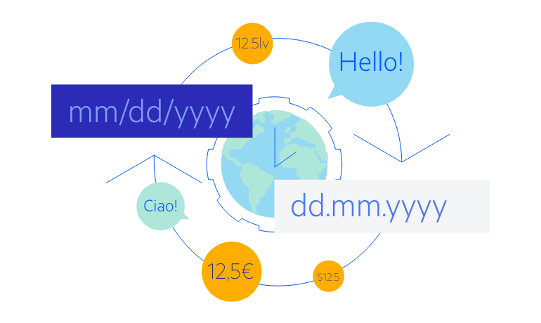
For applications that require support for multiple cultures, the Vue MultiSelectTree component has built-in support for updating internal messages to a different language and can be used in a right-to-left setup by setting a single attribute.
See the Vue MultiSelectTree Globalization demo
Native Vue Components
Common Features
Data Management
File Management
Labels
ScrollView
TreeView
Editor
Charts
- Area Chart
- Bar Chart
- Box Plot
- Bubble Chart
- Bullet Chart
- Charts
- Donut Chart
- Funnel Chart
- Heatmap
- Line Chart
- Pie Chart
- Polar Chart
- Pyramid Chart
- Radar Chart
- Range Area Chart
- Sankey Diagram
- Scatter Chart
- Sparkline
- Waterfall Chart
Indicators
Dropdowns
Inputs
Scheduling
Editors
Date Inputs
Dialogs
Progress Bars
Gauges

Get Started with Kendo UI for Vue
