
Kendo UI for Vue
Vue AutoComplete
- Form component that provides suggestions depending on the typed text.
- Part of the Kendo UI for Vue library along with 110+ professionally-designed components.
- Includes support, documentation, demos, virtual classrooms, learning resources and more!
-
Overview
The Kendo UI for Vue AutoComplete is a component that provides suggestions depending on the typed text and is a richer version of the <input> element. Part of the main features of the component are data binding, filtering, and custom rendering. Tested against the popular screen readers, the AutoComplete follows the WAI-ARIA best practices.
-
Data and Value Binding
The AutoComplete component can be bound both to a collection of primitive data types (int, string, etc.) or Datasets of objects.

-
Filtering
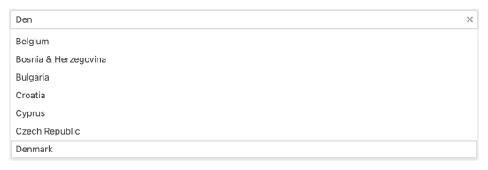
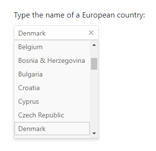
The Filtering functionality of the Kendo UI for Vue AutoComplete provides various configuration options. The component comes with a number of built-in filter operators (“startswith”, “contains”, etc.) that can be directly used. In addition to this, you can easily define functionality like “Minimum Filter Length” or “Delay“ of the result.

-
Suggestions
The AutoComplete supports automatic item suggestions based on the input entered by the user. With this option turned on, the component suggests the first result item that matches the entered value and the filter operator.

-
Custom Rendering
The custom rendering supported by the Kendo UI for Vue AutoComplete gives you the freedom to customize different sections of the component. By defining custom templates, you can implement a design that best fits the needs of your application. The parts of the component for which custom templates can be defined are:
- The items in the suggestion list under the AutoComplete
- The header and footer elements inside the suggestion list
- The way the suggestion list will look like when there are no matching results
-
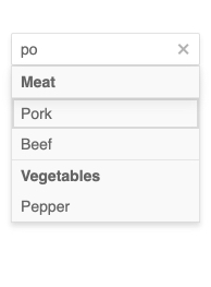
Grouping
Group similar data items in logical categories to help users quickly and easily navigate through the drop-down list. Specify the field responsible for each category while you bind your dataset to the Vue AutoComplete component.
See the Vue AutoComplete Grouping demo
-
Floating Labels
The label is the text that appears inside the AutoComplete when it is initialized. The Floating label functionality, the AutoComplete is shipped with, moves the initial label above the component’s input once the user enters a value. Thus the label “floats” above the input. This feature is available for each of the themes(Default, Bootstrap, and Material) provided by the Kendo UI for Vue suite.
-
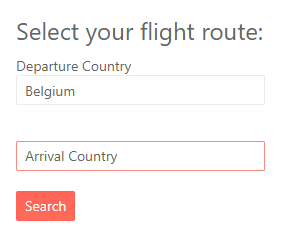
Form Integration and Validation
The Kendo UI for Vue AutoComplete can be easily validated when used inside a Form. The flexibility of the component allows the developers to configure both simple and complex validation scenarios with a minimum effort.
Define the component’s value as a ‘required’ field, set custom validation messages, or implement complex validation scenarios, these are just a part of the AutoComplete’s built-in validation functionalities!
-
Right-to-Left Support
The AutoComplete, like the other Kendo UI for Vue DropDown components, supports RTL working mode.
Kendo UI for Vue AutoComplete Right-to-Left Support example
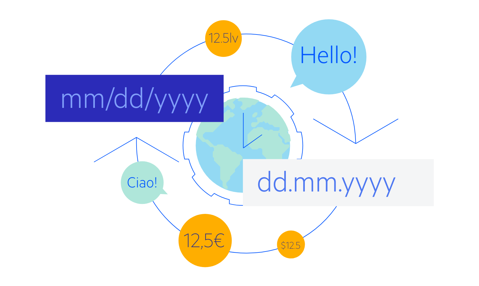
Globalization and Localization
The AutoComplete control can be easily localized to any language, meeting the translation requirements of your application.
-
Globalization and Localization
The AutoComplete control can be easily localized to any language, meeting the translation requirements of your application.
-
Keyboard Navigation & Accessibility
The implementation of the AutoComplete component follows the WAI-ARIA and Section 508 standards, making it accessible by screen readers and other assistive technologies. In addition to this, the component also has an integrated Keyboard Navigation. It enables the navigation inside the component and the selection of values using just a keyboard.
Kendo UI for Vue AutoComplete Accessibility example

Get Started with Kendo UI for Vue
