
Kendo UI for Vue
Vue Pager
- With just a single component, you can automatically split data sets into consumable pages and provide navigation for browsing them.
- Part of the Kendo UI for Vue library along with 110+ professionally-designed components.
- Includes support, documentation, demos, virtual classrooms, learning resources and more!
-
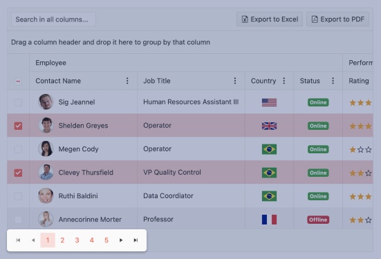
Overview
The Vue Pager gives users a great experience when browsing a large number of data items. It splits the data collection into pages and gives buttons for going backwards and forwards, the ability to select a specific page, and a count of total pages.
-
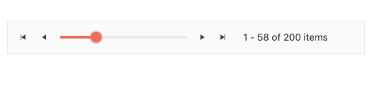
Responsive Design
A huge time saver, the Vue Pager supports responsive design. The component will automatically resize and reconfigure to a layout appropriate for the screen size.
-
Templates
Much like most of the component in Kendo UI for Vue, the Pager allows you to take complete control over the design and implement custom components. For example, you make want to use a slider instead of numeric buttons.
-
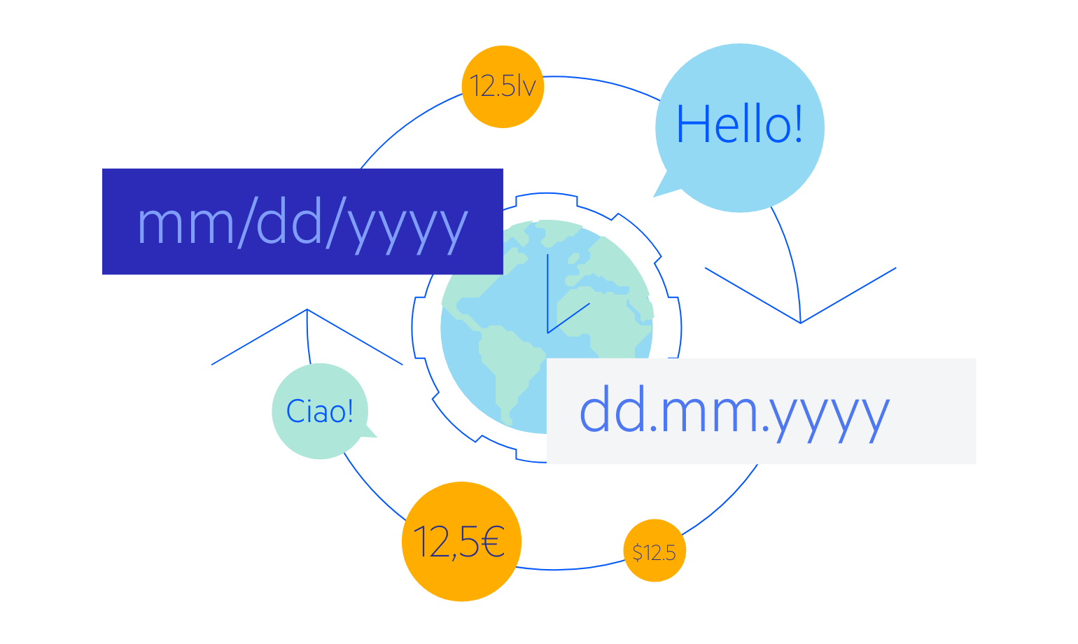
Globalization
All components in Kendo UI for Vue support globalization through its internationalization package and localization options. The internationalization package provides services for parsing and formatting dates and numbers. Localization options provide the infrastructure for rendering the messages of the components and applying right-to-left (RTL) support.

Get Started with Kendo UI for Vue
