
Kendo UI for Vue
Vue ComboBox
- Designed to allow the user to choose an option from a predefined set of choices.
- Part of the Kendo UI for Vue library along with 110+ professionally-designed components.
- Includes support, documentation, demos, virtual classrooms, learning resources and more!
-
Overview
The Kendo UI for Vue ComboBox is a component that lets you choose a single predefined value from a list and is a richer version of the <select> element. Data filtering, data virtualization, and appearance customization are part of the key features of the component. Tested against the popular screen readers, the ComboBox follows the WAI-ARIA best practices, has built-in keyboard navigation, and is compliant with the Section 508 requirements.
-
Data Binding
The ComboBox component can be bound to an array of primitive data types(int, string, etc.) or Datasets of objects.

-
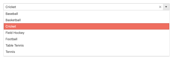
Filtering
When scrolling through long lists of items is not an option, the ComboBox is here to help you. Start typing the text you’re looking for, and it will filter the data to show you only the relevant items to choose from. Define the number of characters the user should enter before they get the filtered list, use built-in filter operators, or implement your own filtering logic by, for example, requesting the items from the server every time.
Kendo UI for Vue ComboBox filtering example
-
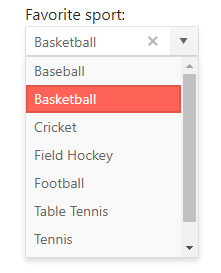
Suggestions
The Combobox provides suggestions that appear while the user types in its input field. It automatically completes the user input with the first result that matches the entered text.
Kendo UI for Vue ComboBox suggestions example
-
Adaptive Rendering
The Vue ComboBox supports an adaptive mode which provides a mobile-friendly rendering of its popup. When enabled, the component will automatically adapt to the current screen size and will change its rendering accordingly.
-
Custom Rendering
With the custom rendering of Kendo UI for Vue ComboBox, you can customize different sections of the component through templates. You can modify the:
- Item template – defines how the individual items will be rendered. Make the item more attractive by displaying more than just their text
- Header – custom design above the list of items in the dropdown
- Footer – always visible below the list of items
- No data template – what data will appear in the popup when there are no matching records
-
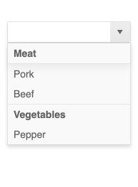
Grouping
Group similar data items in logical categories to help users quickly and easily navigate through the drop-down list. Define the field responsible for each category while you bind your dataset to the Vue ComboBox component.
See the Vue ComboBox Grouping demo
-
Floating Labels
The Floating label functionality, moves the initial text inside the ComboBox above the component’s input, once the user enters a value. Thus the label “floats” above the input. This feature is available for each of the themes(Default, Bootstrap, and Material) provided by the Kendo UI for Vue suite.

-
Virtualization
The virtual scrolling provided by the ComboBox component is an alternative to the paging and is useful for displaying large sets of data. When the popup list is scrolled, the ComboBox reuses the existing items to display the relevant data instead of creating new ones.
Kendo UI for Vue ComboBox virtualization example
-
Validation
The Kendo UI for Vue ComboBox supports a native Kendo UI for Vue implementation of HTML5 form validation. With its built-in features, you can construct your basic or complex validation scenarios with a minimum effort.
Kendo UI for Vue ComboBox Validation example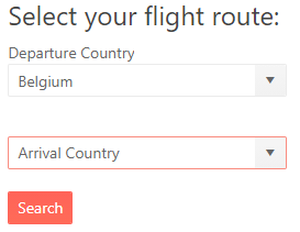
-
Right-to-Left Support
The ComboBox, like the other Kendo UI for Vue DropDown, components supports RTL working mode.
Kendo UI for Vue ComboBox Right-to-Left Support example -
Globalization and Localization
No matter the ComboBox has a few UI strings that can be translated, this translation can be done with a minimum effort and thus your international users will have a lozalized content.
See the Kendo UI for Vue ComboBox Globalization example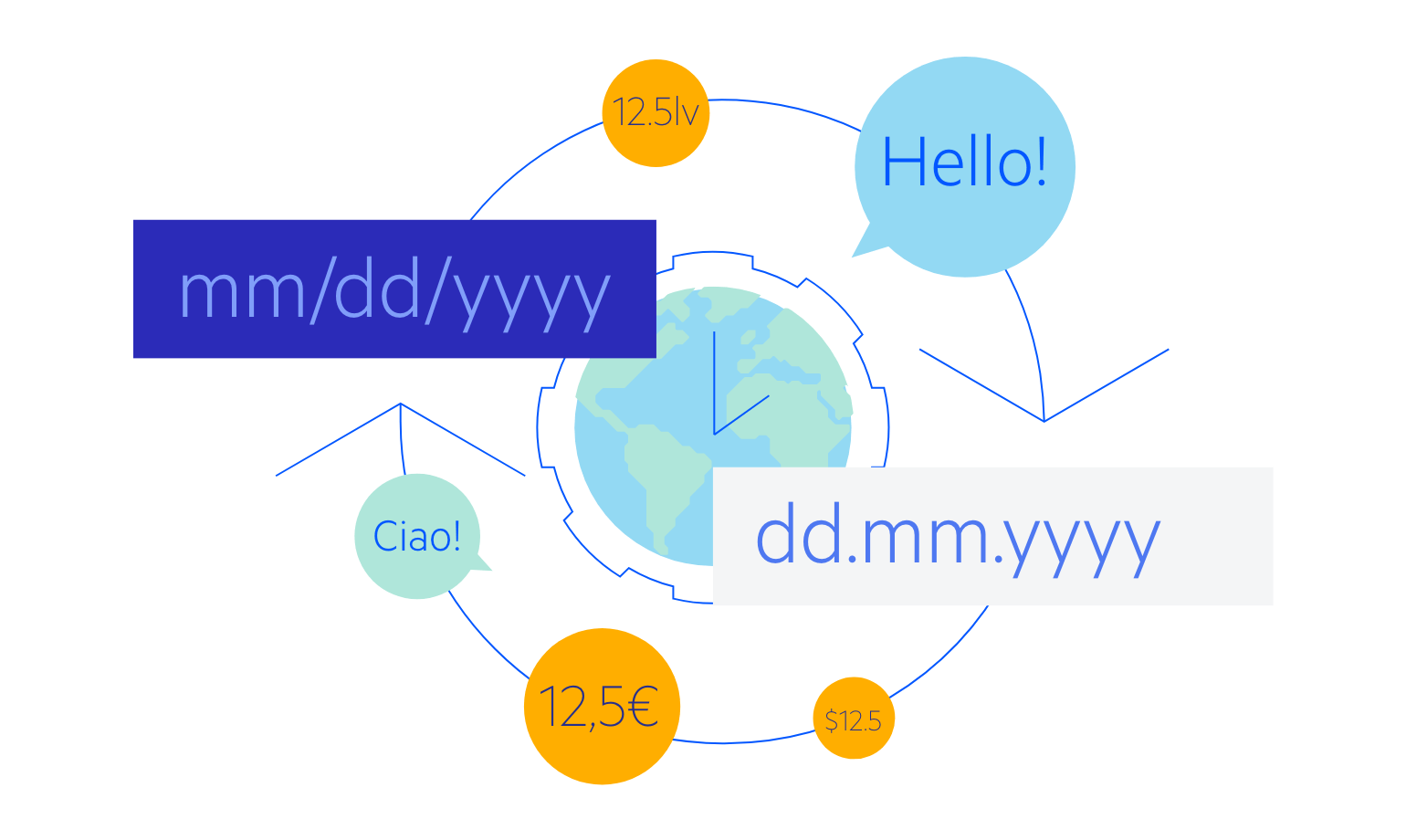
-
Keyboard Navigation & Accessibility
The ComboBox component provides full WAI-ARIA accessibility support and is compliant with the Section 508 requirements. It is accessible by screen readers and has an integrated Keyboard Navigation that lets you navigate the component and select the desired item without having to touch a pointing device.


Get Started with Kendo UI for Vue
