
Kendo UI for Vue
Vue Breadcrumb
- Streamline navigation and enhance user orientation with Kendo UI for Vue Breadcrumb component.
- Part of the Kendo UI for Vue library along with 110+ professionally-designed components.
- Includes support, documentation, demos, virtual classrooms, learning resources and more!
-
Breadcrumb for Enhanced App Navigation
Designed to provide users with a clear path of their location within your app's hierarchy, the Breadcrumb component offers an intuitive way to navigate back to previous sections effortlessly. Whether you're dealing with complex folder structures or multi-level pages, the Kendo UI for Vue Breadcrumb adapts to your needs, offering customization options like custom delimiters, SVG icons, disabled states and more.
-
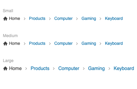
Appearance
The Kendo UI for Vue Breadcrumb component offers extensive customization options, allowing you to align its appearance seamlessly with your application's design. With predefined size options (small, medium, and large) you can adjust the component's dimensions to fit various layouts and devices effortlessly. Further enhance navigation clarity by incorporating SVG icons or custom icons into your breadcrumb items.
-
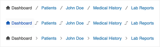
Delimiter
By default, the Breadcrumb uses a slash ("/") as the separator between items. To customize this, simply use the Breadcrumb Delimiter property. You can pass any valid Vue element such as a custom icon, character, or SVG to replace the default.
-
Disabled Mode
The Kendo UI for Vue Breadcrumb component offers granular control over user navigation by allowing both the entire breadcrumb and individual items to be disabled. This functionality is essential for scenarios where certain navigation paths are restricted or inactive.
- Disable entire Breadcrumb: Set the disabled property to true to render the entire breadcrumb as non-interactive, effectively preventing any user navigation through it.
- Disable specific items: Within the breadcrumb's data configuration, set the disabled property to true for individual items to make them non-clickable. This is particularly useful for indicating steps that are unavailable or pending.

-
Routing
The Kendo UI for Vue Breadcrumb integrates easily with any routing library. You can pass a custom route property to each item in the data collection, mapping it to the desired path. On selection, use the route value to programmatically redirect the user.
-
Collapse Mode
Control how items behave when the Breadcrumb width is exceeded using the Collapse Mode property:
- Auto (default): Collapses middle items; first and last remain visible.
- Wrap: Wraps items into multiple rows.
- None: Keeps all items in a single row; enables horizontal scrolling.
-
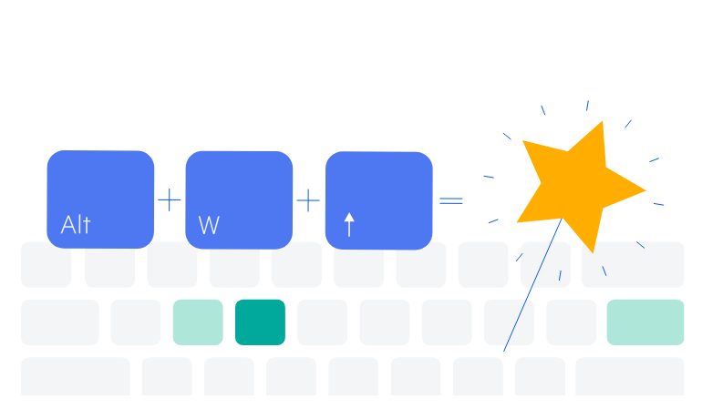
Keyboard Navigation
The Kendo UI for Vue Breadcrumb incorporates built-in keyboard functionality, allowing users to interact with the component solely using a keyboard.
-
Accessibility
The Vue Breadcrumb comes with comprehensive accessibility support, ensuring that the component is accessible to all users. The Breadcrumb is compliant with the Web Content Accessibility Guidelines (WCAG) 2.2 AA standards and Section 508 requirements, follows the Web Accessibility Initiative - Accessible Rich Internet Applications (WAI-ARIA) best practices, provides options for managing component's focus and is tested against the most popular screen readers.

Get Started with Kendo UI for Vue
