
Kendo UI for Vue
Vue Calendar
- Allows the user to navigate through different views and select one or more dates.
- Part of the Kendo UI for Vue library along with 110+ professionally-designed components.
- Includes support, documentation, demos, virtual classrooms, learning resources and more!
-
Overview
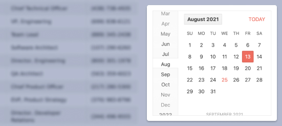
The Kendo UI for Vue Calendar is a form component that represents the Georgian calendar. It provides intuitive date or date range selection and easy navigation between dates with just a few clicks. To improve the traditional calendar-looking design, each date cell inside the component can be fully customized to fit the needs of your business requirements. The component is tested against the popular screen readers and provides full WAI-ARIA accessibility support.
Kendo UI for Vue Calendar – Overview Demo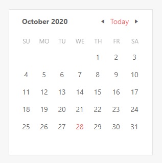
-
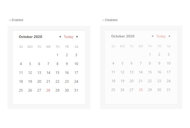
Disabled Calendar
The Calendar component can be easily enabled/disabled just by changing the value of its disabled property. With this prop, the Calendar can also be used in scenarios where a given event must happen before the user can select a value in the component. When disabled, the component’s design changes, and all interactions with it are prevented.
-
Active View
The Active View feature of the Vue Calendar defines the depth of date selection with which the component will be initialized. The Active View initialization options that can be set for the Calendar are to display days of a month, months of a year, or years in a decade.
-
Date Limits
By default, the Calendar allows the users to select any past or future dates. As this range could be too wide in some scenarios, the component provides an option to limit it. This configuration can be set by defining values for the min and max properties. With these props, only the dates in the defined range will be visible in the Calendar.
Kendo UI for Vue Calendar – Date Limits Demo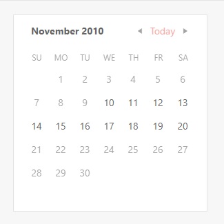
-
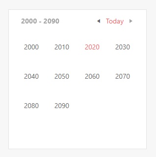
View Selection Depth
This feature of the Kendo UI for Vue Calendar allows you define the depth of the calendar. The “depth” in the current context describes the components functionally of how far out it can be zoomed or how granular we can be with the dates’ selections. Talking with examples, with this feature the component can be limited to show only years, without the ability to display decades. Another limitation could be to allow the users to select only a month instead of the default “day of a month” selection.
-
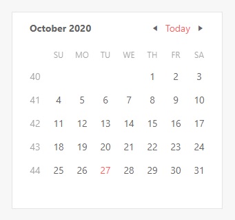
Week Number Column
The number of the week can be crucial when discussing upcoming plans, events, or a vacation. The Calendar component can display a week number column next to each week, just by configuring a single property.
-
Custom Rendering
The default user interface of the Kendo UI for Vue Calendar can be configured to use various themes that fit into design systems. However, apart from setting a font color or padding, there may be scenarios where more complex customization needs to be applied. The Calendar gives you this freedom. All parts of the Calendar can be overridden with a custom renderer – individual day cells, week cells, navigational items, or the title of the component. We can add an icon or emoji to a particular day to indicate a birthday or a special holiday, or predefine the way the month names are displayed inside the component.
Kendo UI for Vue Calendar – Custom Rendering Demo
-
Globalization
The Calendar interface can be changed in a way it will adhere to the locale of the user. The language of the placeholders, the messages that appear in the component and the names of the months can be changed based on a language selection or a user location. The changes can be applied on the fly, giving you the ability to provide the same component in different languages just by a single click.
Kendo UI for Vue Calendar – Globalization Demo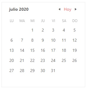
-
Keyboard Navigation & Accessibility
The Vue Calendar component provides full WAI-ARIA accessibility support and is compliant with the Section 508 requirements. Accessible by the popular screen readers, the component also has built-in Keyboard navigation that allows the users to interact with it without the usage of a pointing device.


Get Started with Kendo UI for Vue
