
Kendo UI for Vue
Vue Tooltip
- Hassle-free and super customizable Vue tooltips for consistent UI and great UX.
- Part of the Kendo UI for Vue library along with 110+ professionally-designed components.
- Includes support, documentation, demos, virtual classrooms, learning resources and more!
-
Overview
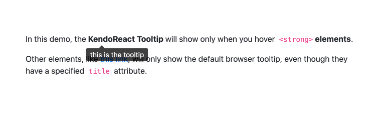
The Kendo UI for Vue Tooltip provides a brief message with information related to a specific UI element. The Tooltip can be triggered upon either element hover or element click.
-
Anchor Elements
With flexibility at its core, the Vue Tooltip component can be anchored to any HTML element on a page. This allows you to attach it to any element and provide additional information as users hover over the distinct parts of your Vue application.
-
Positioning
By default, the Vue Tooltip comes with built-in logic to help use the available space around the component and automatically determine where and how to display it on the page. You can also specify the position.

-
Templates
By default, the Vue Tooltip shows the title of the associated anchor element. You can take it a step further by using a template to populate virtually anything.

Get Started with Kendo UI for Vue
