
Kendo UI for Vue
Vue Badge
- Add a visual indicator, or badge, to any element or component. Often used to show status (ex: online/offline) or notifications (ex: number of messages) in your Vue apps.
- Part of the Kendo UI for Vue library along with 110+ professionally-designed components.
- Includes support, documentation, demos, virtual classrooms, learning resources and more!
-
Overview
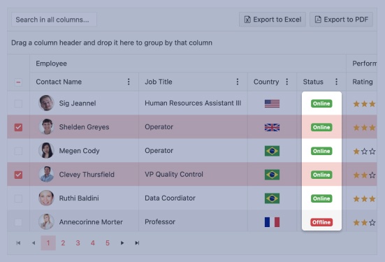
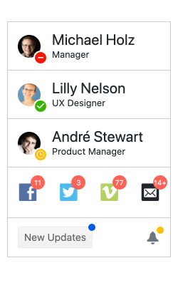
The Kendo UI for Vue Badge component renders a visual indicator common to many apps. It attaches to any element or Vue component and shows the user critical information such as online status or unread messages. A common scenario is the online status displaying your avatar in popular messaging apps.
-
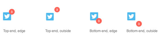
Positioning and Alignment
the Vue Badge provides a number of options that help you place the badge exactly where you want it. These include placing it inside or outside the element, choosing the corner, and more.
-
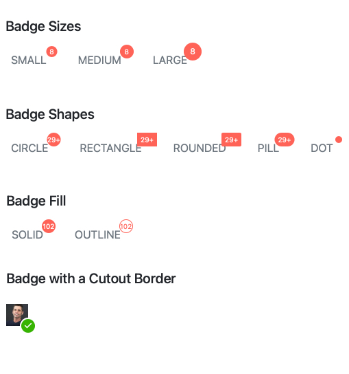
Appearance
The Vue Badge provides a number of configuration options to help you style the component the way you need. These options include:
- themeColor: apply the appropriate color from the theme with properties such as primary, secondary, inherit, info, success, and more.
- rounded: set the radius of rounded corners to create a shape ranging from a square to an oval.
- size: set the size of the Badge.
- Fill: choose whether you'd like your Badge to be a solid color or just an outline.
- cutoutBorder: choose a transparent border for a "cut out" look.
See the Vue Badge Appearance demo

Get Started with Kendo UI for Vue
