
Kendo UI for Vue
Vue BottomNavigation
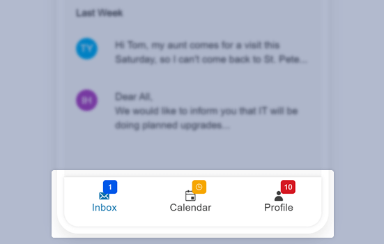
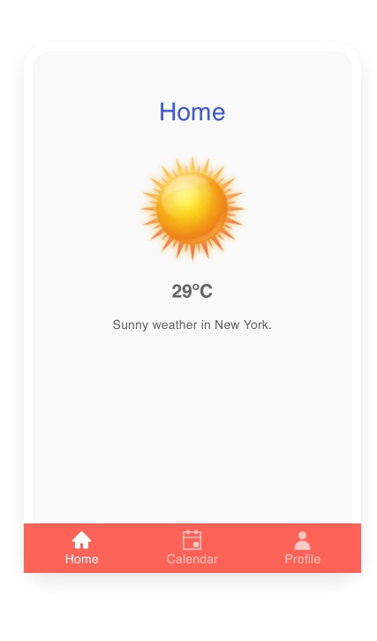
- The Kendo UI for Vue BottomNavigation component gives users a convenient iPhone-style way to navigate apps on small screens.
- Part of the Kendo UI for Vue library along with 110+ professionally-designed components.
- Includes support, documentation, demos, virtual classrooms, learning resources and more!
-
Add a Bottom Menu Designed for Touch Screens
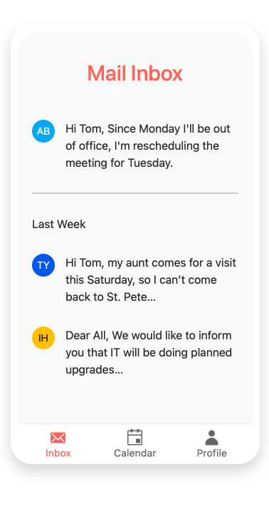
The Vue BottomNavigation component is perfect for adding a convenient way for users to navigate between primary screens on touch devices. Typically used in responsive applications and Progressive Web Applications, bottom navigation places three to five items, consisting of text and an optional image, across the bottom of the screen where they are easily accessible.
-
Content Types
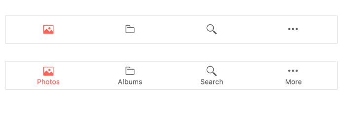
The Vue BottomNavigation component can display its item as text, icons, or a mix of both. If you are using a mix, you can specify that the text be rendered above or below the icon.
-
Positioning
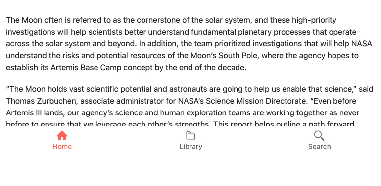
Positioning HTML elements can be tricky, but the Vue BottomNavigation component can be easily positioned through a single configuration option. Choose if the menu should be fixed and always remain at the bottom of the viewport or sticky and only remain at the bottom of the viewport after a certain position has been scrolled past.
-
Appearance
Configuring the appearance of the Vue Bottom Navigation component is a breeze. Options like filling in each item with a solid color or just rendering an outline, as well as appearance options associated with success, warning, error, and primary and more common scenarios let you make the React Bottom Navigation component fit any design requirements.

-
Routing
The Vue BottomNavigation component's primary purpose is navigating between app screens. To make this as easy as possible, it can integrate with any routing library.
-
Custom Rendering
The Vue BottomNavigation menu is professionally styled by default but you can override or modify its styles to make it your own. You just need to use the item property. You can make customizations as simple as style and color or you can add other Kendo UI for Vue components.
Native Vue Components
Common Features
Data Management
File Management
Labels
ScrollView
TreeView
Editor
Charts
- Area Chart
- Bar Chart
- Box Plot
- Bubble Chart
- Bullet Chart
- Charts
- Donut Chart
- Funnel Chart
- Heatmap
- Line Chart
- Pie Chart
- Polar Chart
- Pyramid Chart
- Radar Chart
- Range Area Chart
- Sankey Diagram
- Scatter Chart
- Sparkline
- Waterfall Chart
Indicators
Dropdowns
Inputs
Scheduling
Editors
Date Inputs
Dialogs
Progress Bars
Gauges

Get Started with Kendo UI for Vue
