
Kendo UI for Vue
Vue DateInput
- Represents an input field that recognizes and formats scheduling values such as dates.
- Part of the Kendo UI for Vue library along with 110+ professionally-designed components.
- Includes support, documentation, demos, virtual classrooms, learning resources and more!
-
Overview
The Vue DateInput, as it stands from its name, is a component that allows the user to fast and efficiently handle the date input in any use-case scenario. The component has built-in formatting and strict date handling that doesn’t allow the input of letters or special symbols.

-
Disabled DateInput
By default, the DateInput is enabled. For the scenarios where the component needs to stay disabled until a given event is triggered or a condition is met, there is the “disabled” property. Setting it to “true”, the appearance of the component will change in a way indicating that the component is disabled, preventing any interaction with it.
Kendo UI for Vue DateInput – Disabled State Demo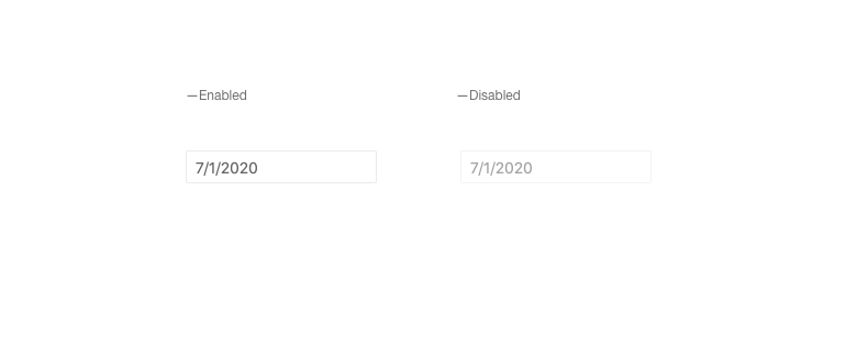
-
Spin Buttons
The Spin Buttons of the DateInput quickly increase and decrease the currently selected date segment. With this functionality enabled by a single property, the users can change the value of the days, months, and years inputs through the spin buttons by click on each input or using the tab button.
Kendo UI for Vue DateInput – Spin Buttons Demo
-
Incremental Steps
With this feature, the values of the Kendo UI for Vue DateInput can be incremented or decremented with a predefined step. The component allows you to define different steps on every part of the date. Using the incremental steps, the days could be changed by one while the years are incremented in steps of ten or other.
Kendo UI for Vue DateInput – Incremental Steps Demo
-
Date Limits
The DateInput allows the developer to limit the date range in which the component will accept values. When the min and max properties are defined, dates outside the range can’t be entered in the DateInput.
Kendo UI for Vue DateInput – Date Limits Demo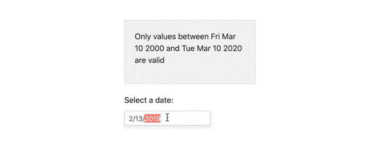
-
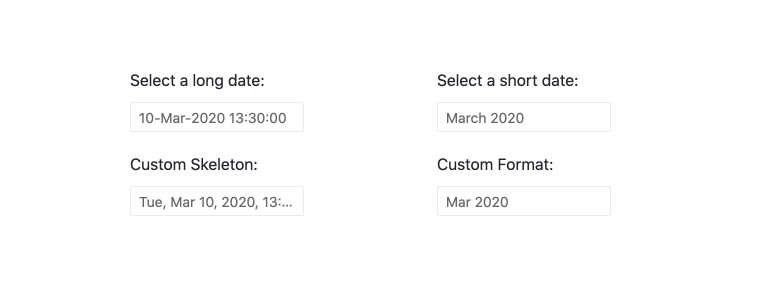
Formats
The Kendo UI for Vue DateInput supports any valid date and time string. The desired formatting can be easily defined by configuring just a single property.
-
Placeholders
The idea behind the Placeholders is to indicate to the end-users what date format the DateInput expects to be entered. The component has a few predefined placeholder formats that can be used out of the box. The component is not limited to the pre-defined placeholders. If the business scenario requires it, the component allows the customization of each part of the placeholder.
Kendo UI for Vue DateInput – Placeholders Demo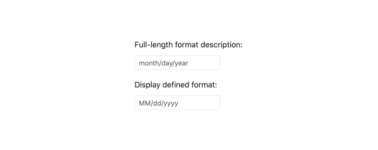
-
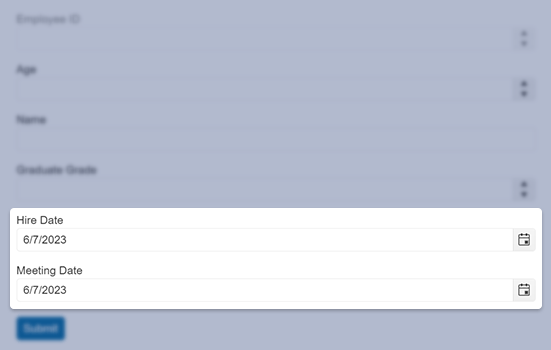
Forms Support
The DateInput can be integrated within any form with zero efforts. Thanks to its validation options(min, max, required), built-in validation messages, and styles, the component can validate its input values and prevent form submission if such is in an invalid state.
Kendo UI for Vue DateInput – Forms Support Demo
-
Globalization
The DateInput component supports Globalization out of the box. With this feature, the date, and the date placeholder formats can be changed based on the locale of the user. This change is applied automatically and there is no need to make any additional reconfigurations of the component.
Kendo UI for Vue DateInput – Globalization Demo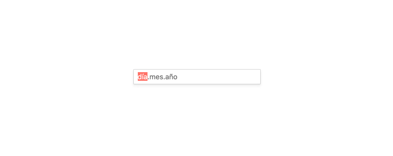
-
Keyboard Navigation & Accessibility
The DateInput component provides full WAI-ARIA accessibility support and is compliant with the Section 508 requirements. Accessible by the popular screen readers, the component also has built-in Keyboard navigation that allows the users to interact with it without the usage of a pointing device.


Get Started with Kendo UI for Vue
