
Kendo UI for Vue
Vue Stepper
- Show the progress of a user-oriented process in your Angular apps as a chronological order of steps. Often used in complex forms and surveys.
- Part of the Kendo UI for Vue library along with 110+ professionally-designed components.
- Includes support, documentation, demos, virtual classrooms, learning resources and more!
-
Overview
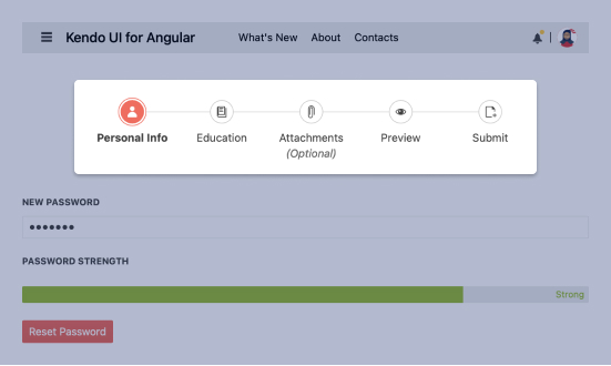
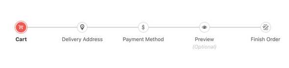
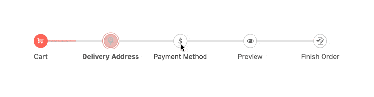
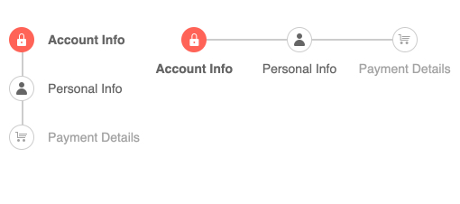
The Vue Stepper component visualizes the progress of a process by dividing it into chronological steps. The Vue Stepper provides several features out of the box, including the ability to define the appearance of each step, validation of content at each step, strict linear flow and templates.
-
Steps Layout
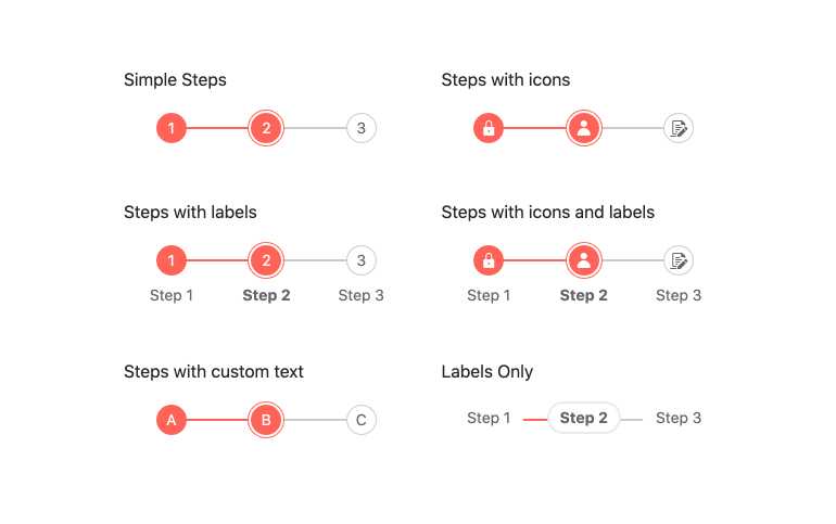
The Vue Stepper gives you a variety of layouts that you set with a combination of properties:
- Simple steps: If you don’t set layout properties, the component will default to numbers in sequence order.
- Steps with labels: If you only set a label property the steps will render numerically with labels below them.
- Steps with custom text: If you set the text property, each step will use your assigned value.
- Steps with icons: If you specify an image or icon, that will be used in place of text.
- Steps with icons and labels: Setting image and label properties will render this scenario.
- Labels only: Setting only the label property will set the step text as the label.
-
Step Types
The Vue Stepper comes with Various types of steps built in. Some of which include disabled, optional, and steps with validation.
-
Linear Mode
You can choose to require the user to complete the steps in visual order or not. This is done simply by setting the “linear” property.
-
Orientation
Fit the Vue Stepper into your layout by choosing horizontal (default) or vertical display.
-
Validation
The Vue Stepper enables you to set validation logic for each step. Based on it, a success or error icon will be rendered. Validation icons are rendered either in the step indicator or as part of the step label, depending on the current Stepper configuration options.
-
Custom Rendering
In addition to the large list of built-in configurations, the Vue Stepper allows you to apply your own rendering to the steps.
-
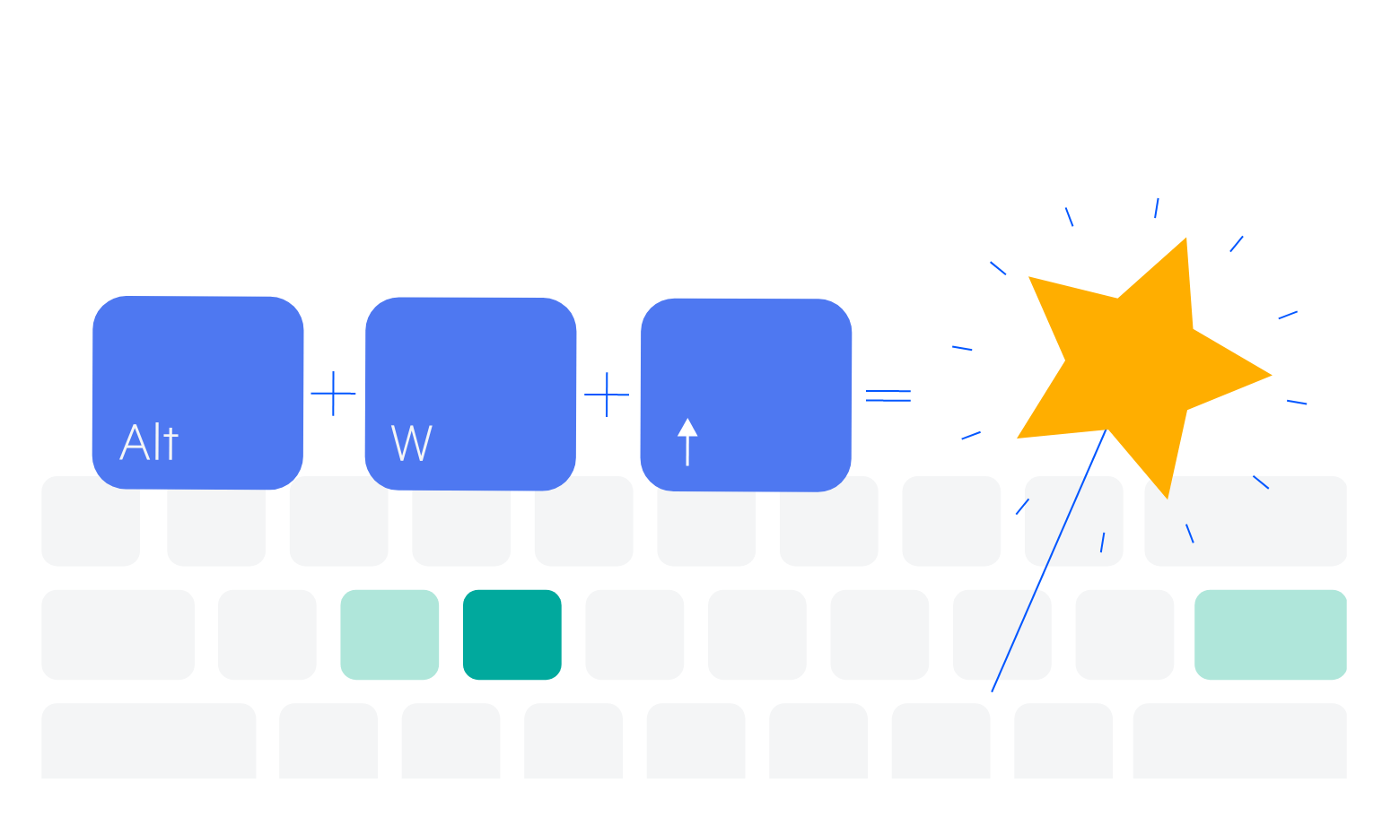
Keyboard Navigation
For users who prefer to use the keyboard or cannot use a mouse, this component fully supports keyboard interactions. See the demo for a complete list of supported shortcuts.
-
Accessibility
Like the rest of Kendo UI, the Vue Stepper is fully accessible to help you build software for everyone. It provides full WAI-ARIA support as well as Section 508 compliance.


Get Started with Kendo UI for Vue
