
Kendo UI for Vue
Vue Card
- The easiest way to display information groups in the modern, popular and interactive card format.
- Part of the Kendo UI for Vue library along with 110+ professionally-designed components.
- Includes support, documentation, demos, virtual classrooms, learning resources and more!

-
Overview
The Vue Card component gives you a layout mechanism common across all web applications that need to display content and actions about a subject grouped in a container. Whether you use the Card to display a single subject or multiple, the cards of completely customizable and interactive.
-
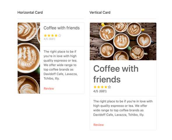
Orientation
By default, the Vue Card component lays out content vertically, but you can choose to lay it out horizontally. Change the property any time, and each target card will automatically be updated.
-
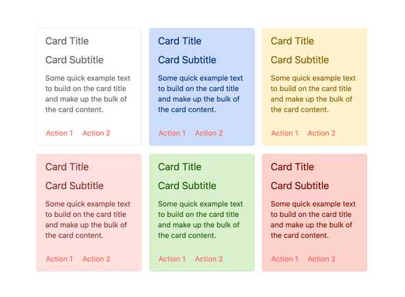
Types
To help speed up the styling process, the Vue Card component includes a set of predefined styles. These include default, warning, error, and more.
-
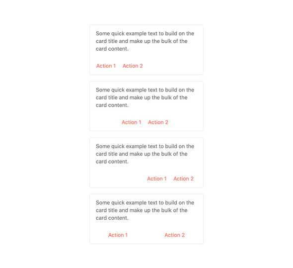
Action Buttons
The Vue Card creates an area for actions buttons much like a tool bar. The content of this area is completely customizable. Configure layout, buttons, images, styles, and more.
-
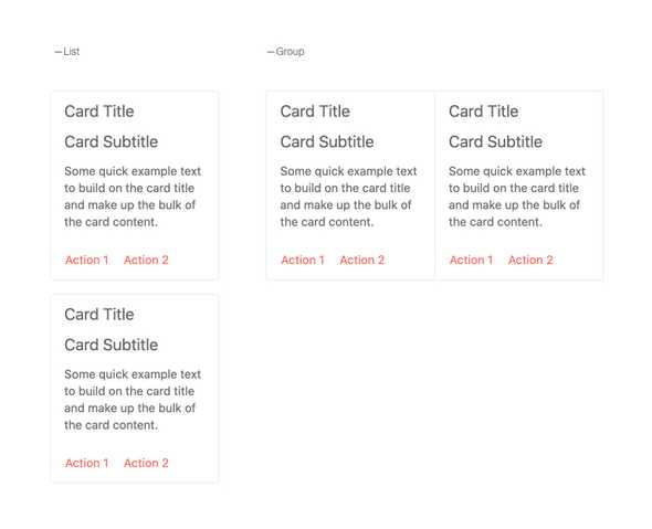
Layouts
When arranging a collection of cards, the Kendo UI for Vue component has three built-in options. “Group” and “deck” are variations of side-by-side layout while “list” arranges them top to bottom. You can also create your own custom layout.

Get Started with Kendo UI for Vue
