
Kendo UI for Vue
Vue Drawer
- Add a familiar slide in/slide out Vue navigation popular for use on small screens. With built-in routing, display modes, and customization options, implementation is hassle-free.
- Part of the Kendo UI for Vue library along with 110+ professionally-designed components.
- Includes support, documentation, demos, virtual classrooms, learning resources and more!
-
Overview
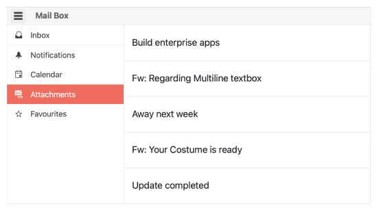
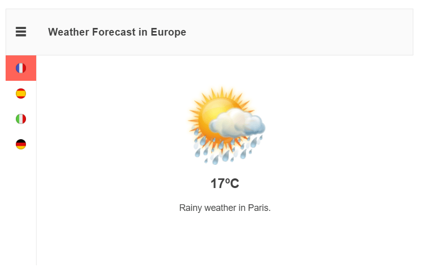
A staple as a navigation element in many modern applications, the Kendo UI for Vue Drawer offers a side navigation element that can be toggled to be displayed or hidden, often with a hamburger menu. Each menu item can be represented as an image and text combination, just text, just an image.
-
Expanded State
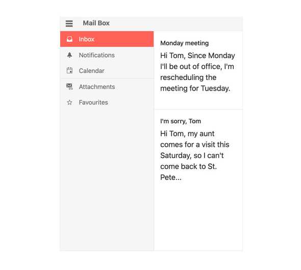
By default, the Vue Drawer initially displays with its menu collapsed. You can change that to initially display expanded or permanently display expanded.
-
Overlay and Push Modes
The Vue Drawer offers several display modes, allowing developers to customize how the component behaves. You can choose to overlay the Angular Drawer content on top of existing content, push the content over as the Angular Drawer expands.
-
Header, Footer and Content Templates
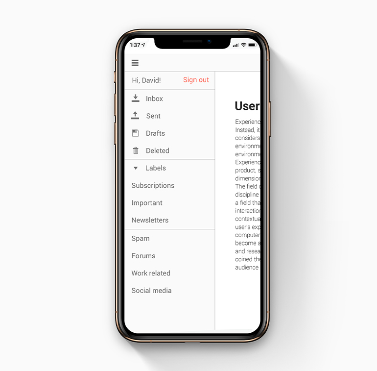
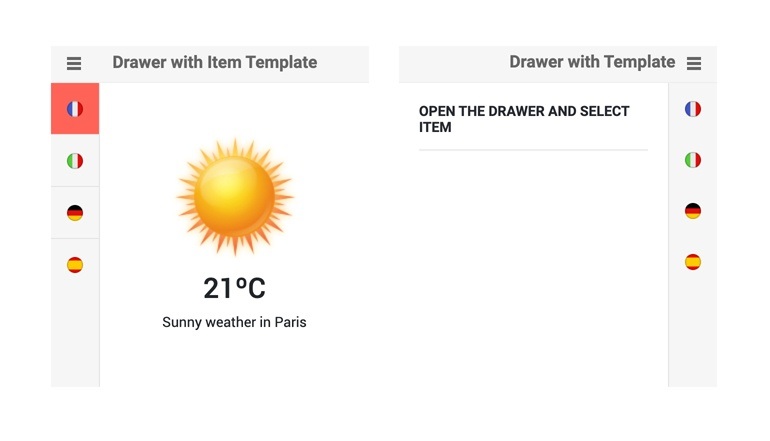
The Kendo UI for Vue Drawer enables you to easily customize its appearance. You can add custom content above and below the rendered items by using the navigationHeader and navigationFooter properties. You can also display custom content within the navigation by using the navigationContent property.
-
Mini Mode
Mini Mode is a semi-collapsed state in which the Vue Drawer only shows the top-level item icons. When collapsing, you can choose to show this view or completely collapse.
-
Position
With a single property, the Vue Drawer component can be rendered on either the left-hand side or right-hand side of the current page.
-
Routing
Since the Drawer is a Vue component, it supports any Vue router library, so you don’t have to spend unnecessary time on routing.
-
Custom Rendering
As with all components in Kendo UI for Vue, the Drawer supports custom rendering of menu items. This allows you to customize the appearance of individual items, but also allows you to show hierarchy.
Native Vue Components
Common Features
Data Management
File Management
Labels
ScrollView
TreeView
Editor
Charts
- Area Chart
- Bar Chart
- Box Plot
- Bubble Chart
- Bullet Chart
- Charts
- Donut Chart
- Funnel Chart
- Heatmap
- Line Chart
- Pie Chart
- Polar Chart
- Pyramid Chart
- Radar Chart
- Range Area Chart
- Sankey Diagram
- Scatter Chart
- Sparkline
- Waterfall Chart
Indicators
Dropdowns
Inputs
Scheduling
Editors
Date Inputs
Dialogs
Progress Bars
Gauges

Get Started with Kendo UI for Vue
