
UI for ASP.NET Core
ASP.NET Core MultiViewCalendar
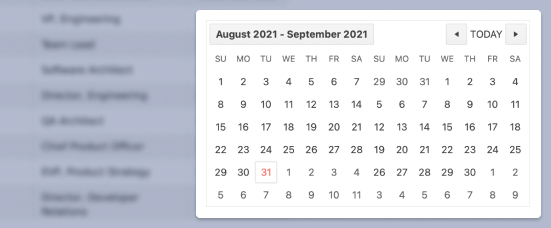
- Effortlessly display two calendars side by side with the ASP.NET Core MultiViewCalendar component.
- Part of the Telerik UI for ASP.NET Core library along with 120+ professionally designed UI components.
- Includes support, documentation, demos, virtual classrooms, Visual Studio Code Extensions and more!
-
Overview
The MultiViewCalendar component is one of the scheduling controls that we offer as a part of our UI set. It provides the ability to display multiple months side by side. You can control the number and depth of the calendar views, make selection of dates, as well as display disabled dates and a week column.
See ASP.NET Core MultiViewCalendar in action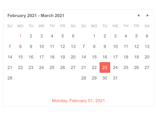
-
Calendar Views
The MultiViewCalendar provides different view options and calendar depths. As for views, you can set the initial rendering as well as the depth of the calendar by choosing from month, year, decade and century. This navigation depth is controlled from the Depth option. See our demo on view selection. The component also supports multiple views which lets you display several calendars rendered horizontally.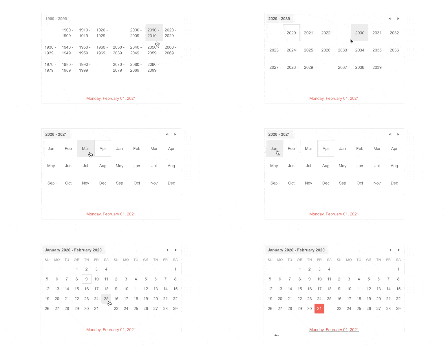
-
Reverse Selection
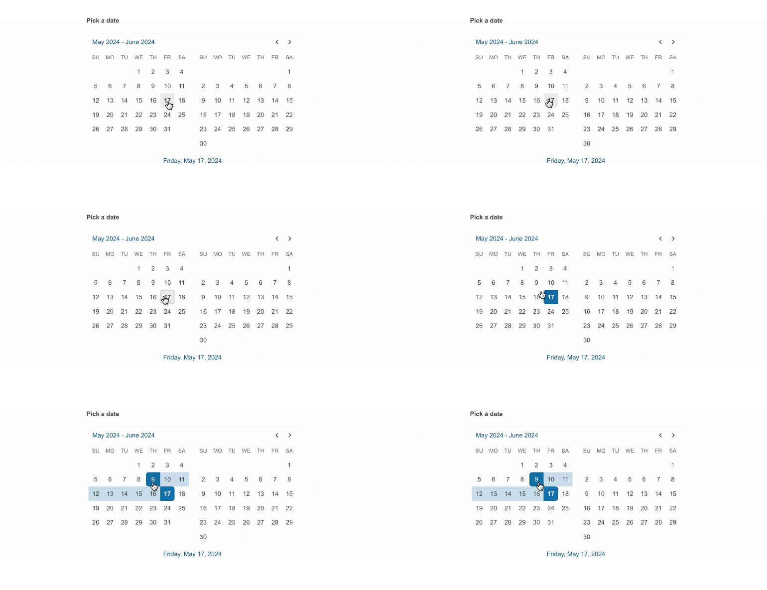
Empower users to select an end date that is before the selected start date, thus boosting flexibility.
See Telerik UI for ASP.NET Core MultiViewCalendar reverse selection demo
-
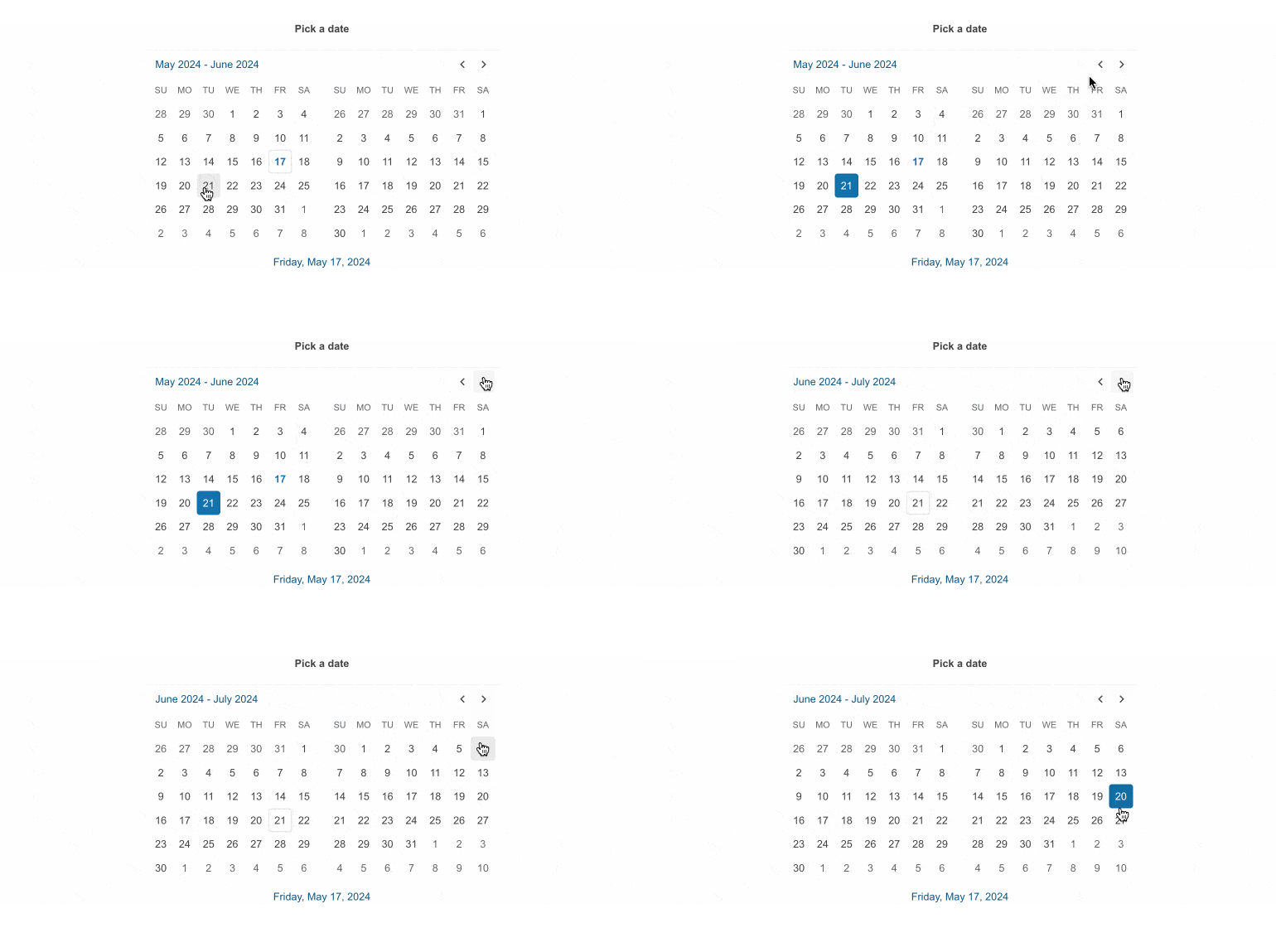
Show Other Month Days
The Telerik UI for ASP.NET Core MultiViewCalendar allows you to explicitly render days from the previous and next months in the current Calendar view.
See Telerik UI for ASP.NET Core MultiViewCalendar show other month days demo
-
Century Cell Formats
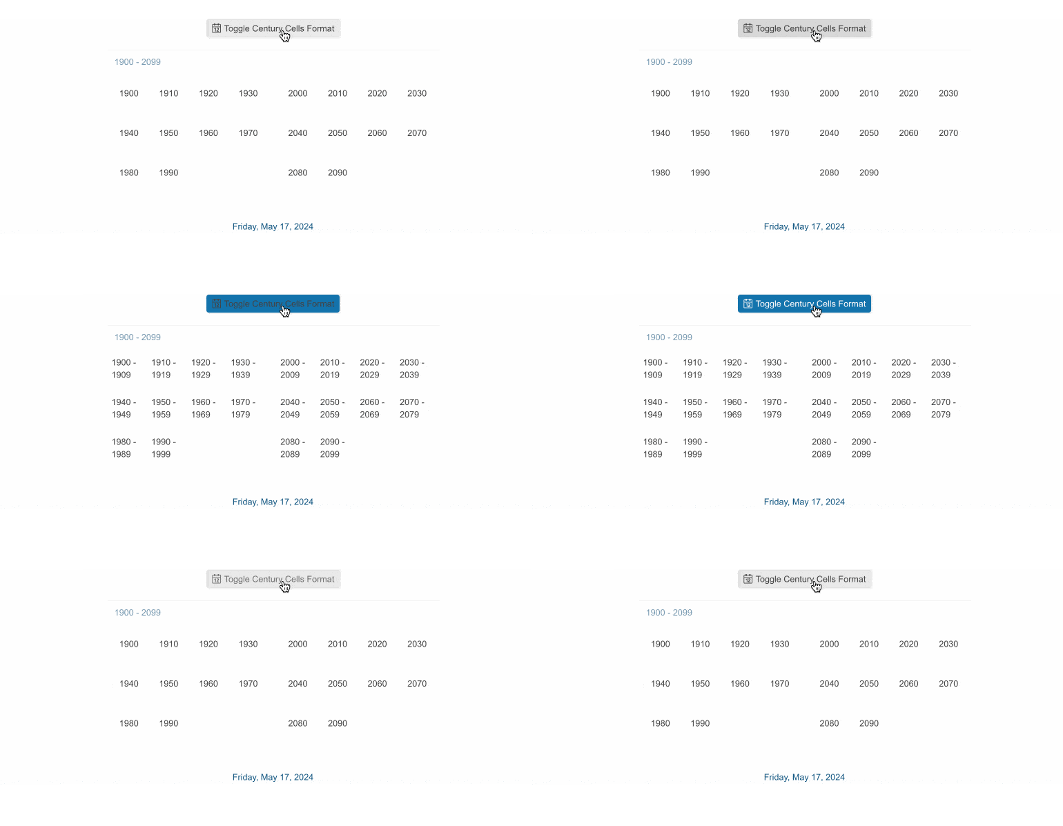
Specify the formatting behavior of the century cells in the century view with ease. Two supported formats are available:
- Long: The cells will display a decade range 2000-2009, 2010-2019.
- Short: The cells will display just the starting year of the decade 2000, 2010.
See Telerik UI for ASP.NET Core MultiViewCalendar century cell formats demo
-
Selection
Selection in Calendars is among the most important features, that’s why the MultiViewCalendar performs not only single but also multiple dates selection. This is controlled from the Selectable property of the component. Setting it to range allows you to choose the length of the selected period with mouse clicks for start and end date. Using the Ctrl key lets you separately pick multiple dates by clicking on them. Holding the Shift key + mouse clicks allow you to define the whole range in between selected dates.
See how Selection works in ASP.NET Core MultiViewCalendar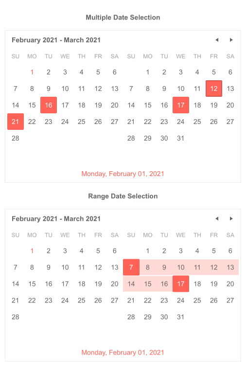
-
Disabled Dates
For national holidays, weekends and other days which may not be intended to be selected by the user, the Telerik MultiViewCalendar provides disabled dates functionality. You can configure this from the DisabledDates property – see our documentation page to learn more.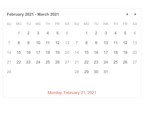
-
Week Column
In the ASP.NET Core MultiViewCalendar you can also showcase the week number in the year. This is visible from the week column which is rendered after setting the WeekNumber property.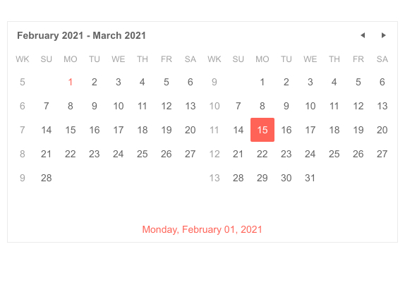
-
Keyboard Navigation
The MultiViewCalendar is fully supported in terms of keyboard navigation and you can easily operate the component by using just your keyboard.
See how Keyboard Navigation works in ASP.NET Core MultiViewCalendar
All ASP.NET Core Components
Data Management
- Grid
- Filter
- ListView
- Pager
- PivotGrid
- PivotGrid v.2
- PropertyGrid
- Rating
- Spreadsheet
- TaskBoard
- TreeList
Scheduling
Editors
- AutoComplete
- Captcha
- CheckBoxGroup
- Color Picker
- ColorGradient
- ColorPalette
- ComboBox
- Date & Time Pickers
- DateInput
- DateRangePicker
- DropDownList Updated
- DropDownTree
- Editor
- FlatColorPicker
- Image Editor
- ListBox
- MaskedTextBox
- MultiColumnComboBox
- MultiSelect
- Numeric TextBox
- OTP Input
- RadioGroup
- Signature
- Switch
- TextArea
- TextBox
- TimeDurationPicker
- TimePicker
Navigation
Data Visualization
Layout
- Avatar
- Badge
- Dialog
- DockManager
- Form
- GridLayout
- Notification
- Popover
- Responsive Panel
- Splitter
- StackLayout
- TileLayout
- Tooltip
- Window
- Wizard
File Upload & Management
Interactivity & UX
- Chat (Conversational UI)
- Circular Progress Bar
- Loader
- Progress Bar
- Ripple
- Skeleton Container
- Slider
- Sortable
- Template
Productivity Tools
Media
Geo Visualization
Document Processing
MVC & Razor Pages
