
UI for ASP.NET Core
ASP.NET Core Tooltip
- The ASP.NET Core Tooltip component displays information upon click or hoover.
- Part of the Telerik UI for ASP.NET Core library along with 120+ professionally designed UI components.
- Includes support, documentation, demos, virtual classrooms, Visual Studio Code Extensions and more!
-
Overview
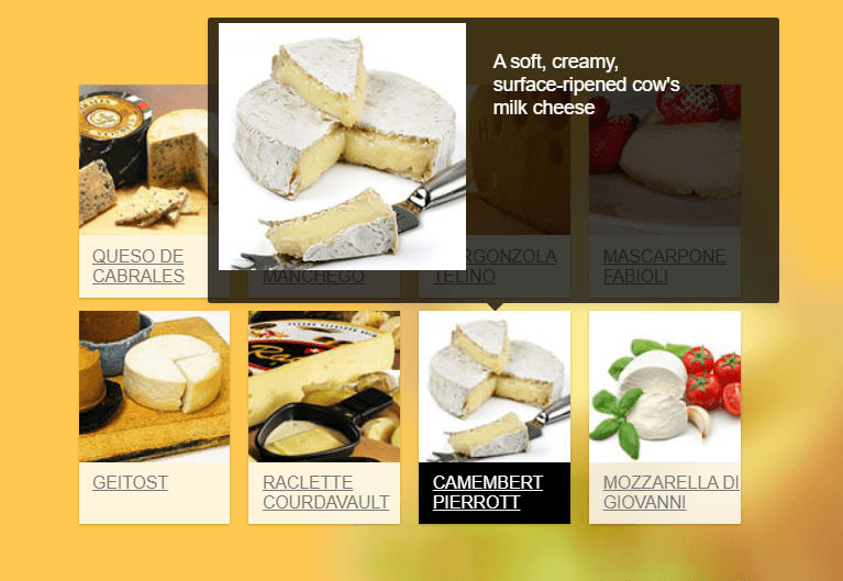
The Tooltip is a layout component that displays a popup hint for a specific HTML element on hover. It can show information with text, images and custom HTML. Its content can be defined either as static or loaded dynamically with AJAX. You can easily customize the tooltip through its templates, positioning configuration and different styling themes.
See the ASP.NET Core Tooltip demo
-
Tooltip Positions
The Tooltip can be positioned in five different ways relative to the target element at which the ToolTip will be displayed—bottom, top, left, right and center. -
Events
The Telerik UI for ASP.NET Core Tooltip component fires events OnHover or OnClick, such as Show, Hide and many others.

-
Loading Content with AJAX
The Telerik UI for ASP.NET Core Tooltip comes with built-in support for asynchronously loading content from remote URLs. These URLs then return HTML content that can be loaded in the content area of the Tooltip. To see how to load content with AJAX, read the documentation.
Check out the demo on Tooltip Loading content with AJAX -
Content Template
The content layout of the Tooltip can be specified using the ContentTemplateId configuration method. This enables styling with text, images or HTML.
-
Server- and Client-Side API for Max Flexibility
Telerik UI for ASP.NET Core comes with a complete server-side API. With simple API calls, you can configure all features of the ASP.NET Core Tooltip control. Since the server wrappers output the JavaScript, you also have full access to the client-side API for maximum control in the browser.

-
HTML and Tag Helpers
Telerik UI for ASP.NET Core provides two ways for you to declare UI components. You can choose between using HTML or Tag helpers to help you implement the ASP.NET Core Tooltip component in your project.

-
Accessibility
The Telerik UI for ASP.NET Core Tooltip is compliant with Section 508 and WCAG guidelines, perfect for scenarios where accessibility is a concern.
-
Tooltip Theming
The Tooltip component has several built-in themes, such as Material (based on the Material Design guidelines), Bootstrap, Default (our own style) and Fluent. You can easily customize any of the out-of-the-box themes with a few lines of CSS or create a new theme to match your colors and branding, using the Telerik SASS ThemeBuilder application.
-
Razor Pages
The Telerik UI for ASP.NET Core Tooltip component is one of the many controls in the suite supported in both MVC and Razor Pages applications. To view the complete list of Telerik components that you can plug in ASP.NET Core Razor Pages projects, check out the documentation article or visit the Razor Pages examples in our GitHub project repository.
