UI for ASP.NET Core
ASP.NET Core BottomNavigation
- Allow users to quickly access their preferred destinations within your app with the ASP.NET Core BottomNavigation.
- Part of the Telerik UI for ASP.NET Core library along with 120+ professionally designed UI components.
- Includes support, documentation, demos, virtual classrooms, Visual Studio Code Extensions and more!
-
Overview
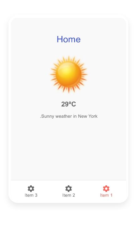
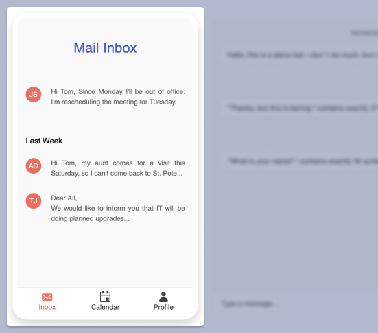
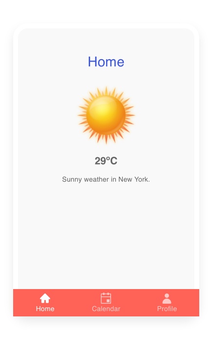
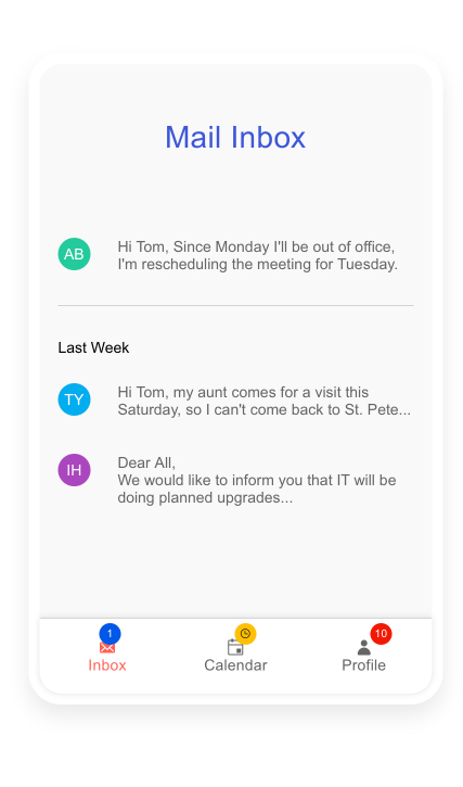
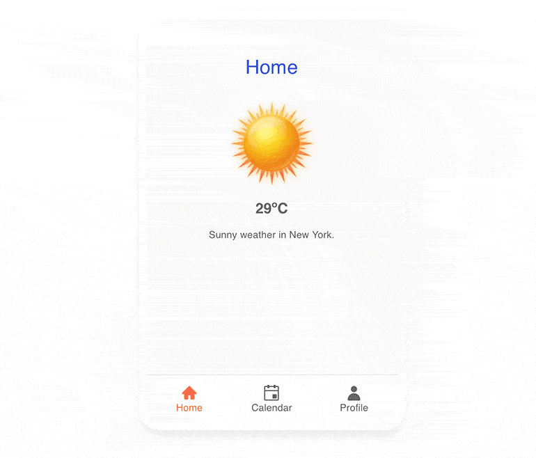
The Telerik UI for ASP.NET Core BottomNavigation component is a top-level navigation component, perfect for your mobile, single-page or progressive web apps. It is best used with three to five items, which take users directly to a new screen where they can focus their full attention on it without distractions. The component brings fast navigation and lets users build muscle memory where to touch in order to immediately switch over to the screen they care about.
See the ASP.NET Core BottomNavigation Demo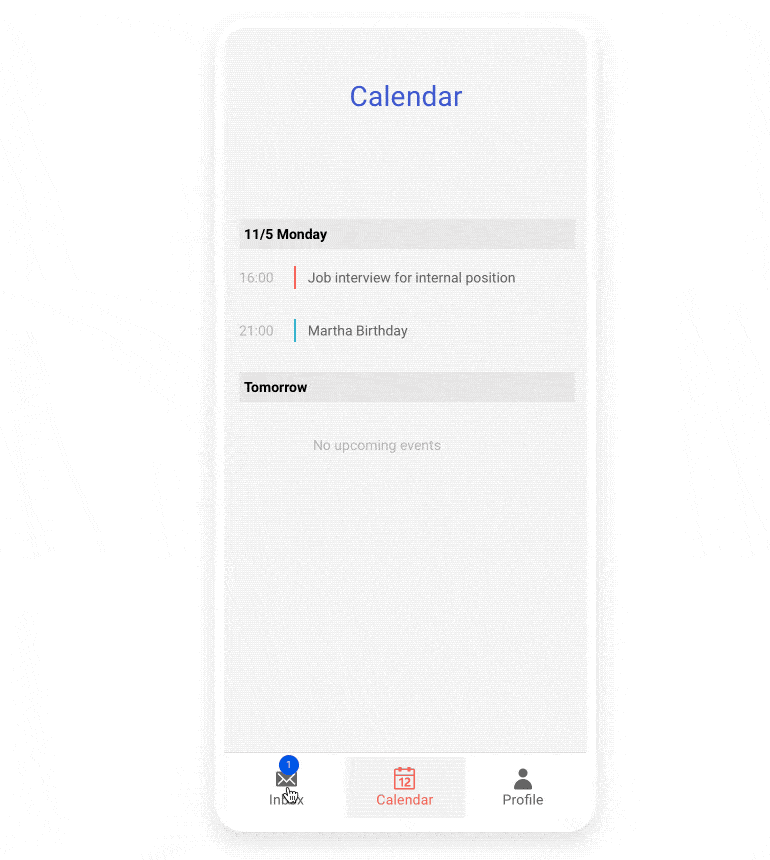
-
Appearance
The component provides multiple built-in configuration options for modifying the item flow, the exact color to use from the theme, fill, border and shadow colors.
-
Items
The items of the BottomNavigation component are flexible in both form and function. They can display text, an icon or a combination of the two, each designed with aesthetics in mind. You can even opt to have icons only on the non-active elements, while displaying the text label on the selected item. Items might be disabled when unneeded.
Check out how to configure BottomNavigation Items -
Templates
The appearance of items in the control can be further customized by supplementing templates. Templates can easily contain other controls, icons, images and more—just make sure they fit the limited space at the bottom of the screen.
-
Theming
The BottomNavigation component has several built-in themes such as Default (our own styling), Material (based on the Material Design guidelines), Bootstrap (which looks like the Bootstrap styling to integrate better) and Fluent (based on Microsoft Fluent UI). You can easily customize any of out-of-the-box themes with a few lines of CSS or create new theme to match your colors and branding by using the Telerik SASS ThemeBuilder application.
-
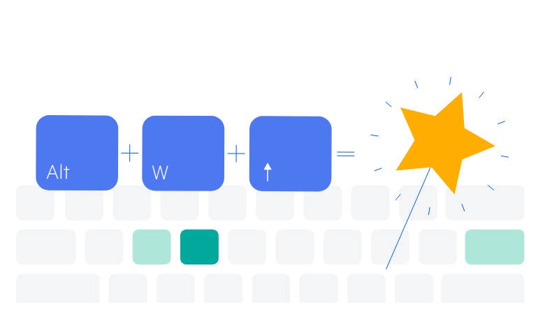
Keyboard Navigation
The component is accessible to all users thanks to the built-in keyboard navigation that allows easy navigation and interaction with the form. Once the control is focused, users can use TAB / SHIFT+TAB to go back and forth between items.
-
RTL Support
The ASP.NE Core BottomNavigation component supports right-to-left (RTL) language scripts. When enabled, it automatically reverses the order of the items in the navigation to match the text.