UI for ASP.NET Core
ASP.NET Core OrgChart
- Effortlessly create rich and interactive organizational charts with the Telerik UI for ASP.NET Core OrgChart component.
- Part of the Telerik UI for ASP.NET Core library along with 120+ professionally designed UI components.
- Includes support, documentation, demos, virtual classrooms, Visual Studio Code Extensions and more!

-
Overview
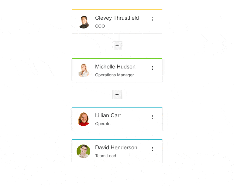
The Telerik UI for ASP.NET Core OrgChart component allows users to interact with organizational structures and easily navigate to people or positions of interest. The control helps visualize hierarchical data in a sophisticated manner and allows expansion and collision of multiple nodes. It features grouping, remote data binding, editing, load on demand, custom content rendering through templates, accessibility, keyboard navigation, RTL support and more.
See the Telerik UI for ASP.NET Core OrgChart in action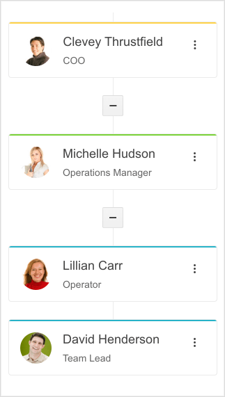
-
Data Binding
The OrgChart component for ASP.NET Core can be bound to two types of data sources:
- Local data
- Remote AJAX data
Explore the Telerik UI for ASP.NET Core OrgChart Data Binding options
-
OrgChart Grouping
Items in the Organizational chart can be grouped in two different ways:
- Group by a dedicated Field in your data source. This can come in handy for people with identical categories, for example job titles (e.g. Quality Assurance, Senior Developer etc.)
- Grouping by parent. Items can be grouped by their ParentID, useful for grouping employees who report to the same manager.
-
Load on Demand
When dealing with big datasets, it is not always practical to have all the data loaded from the start as it may slow down the process. That is why the Telerik OrgChart component can be bound to a remote data source and when a node is expanded, its child items can be loaded on demand.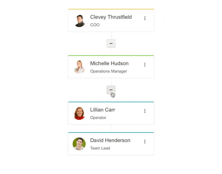
-
Editing
The Telerik UI for ASP.NET Core OrgChart component supports CRUD operations out of the box. Items can be edited, created or deleted from a context menu, which can be opened from any item on the chart by clicking the three dots at the upper right corner. If you choose to edit an item, you can change its parent, name, title and avatar. -
Templates
To allow further customization, the OrgChart component supports two types of templates—Template and GroupHeaderTemplate. Using TemplateId enables you to render custom content in the body of the node, while with the GroupHeaderTemplateId, you can customize the node header.
-
Events
The OrgChart component can fire a variety of events OnExpand, OnColapse, OnSelect, OnChange, OnEdit and many more. To further explore the component’s capabilities, check out the Events demo or read more in the documentation.
-
HTML and Tag Helpers
Telerik UI for ASP.NET Core provides two ways to declare UI components—by using HTML or Tag helpers. You can choose between the two approaches based on your technology background or personal preferences and practice and plug the OrgChart component in your applications.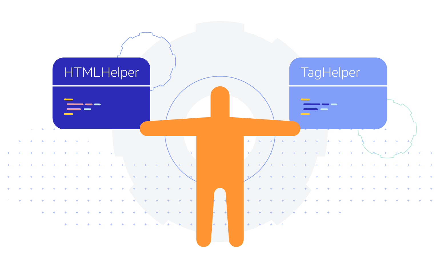
-
RTL Support
Right-to-left support is available for cultures where people read from right to left. You can satisfy any cultural preference with the ASP.NET Core OrgChart component by changing the alignment between left-to-right and right-to-left with only a few settings.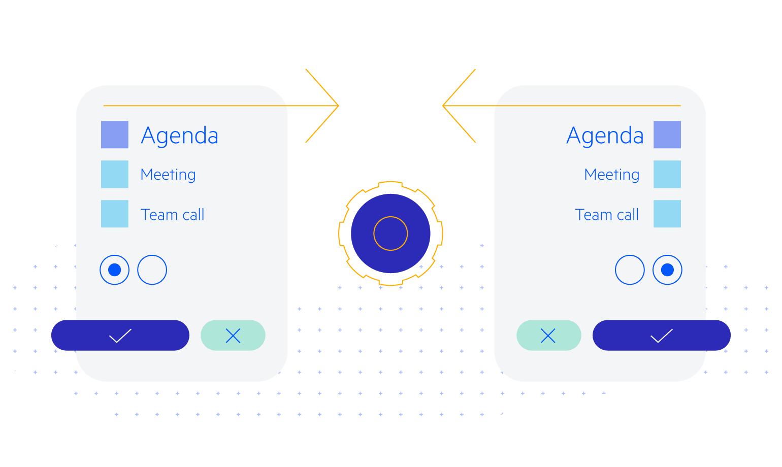
-
Accessibility
The OrgChart component is Section 508 and WCAG 2.1 guidelines compliant, thus you can rest assured that your application will meet the needs of all users.
-
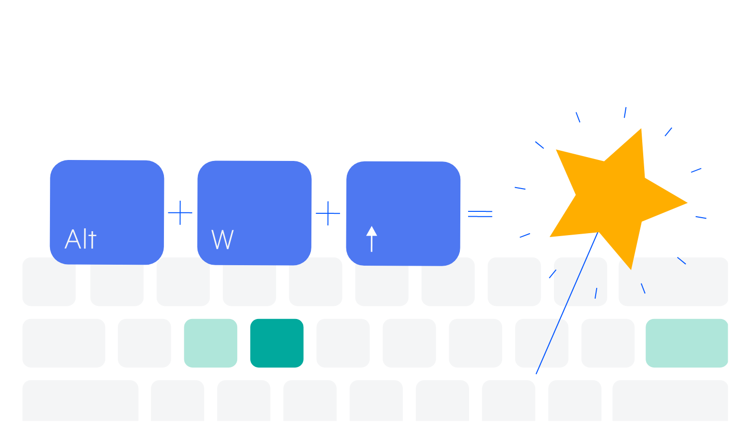
Keyboard Navigation
The ASP.NET Core OrgChart is one of the many components in the suite with out-of-the-box support for keyboard navigation. Users can use the arrows to open or close a node on focus or to navigate to other items in the chart.
-
OrgChart Theming
The Telerik UI for ASP.NET Core OrgChart has several built-in themes and swatches. Explore the Default (our own styling), Material (based on the Material Design guidelines), Bootstrap (which looks like the Bootstrap styling to integrate better) and Fluent (based on Microsoft Fluent UI) themes and choose the swatch that best suits your application. You can easily customize any theme with a few lines of CSS or create a new one to match your colors and branding with the Progress SASS ThemeBuilder application.