
UI for ASP.NET Core
ASP.NET Core Chip
- Create informational displays in the shape of chips or pills leveraging the Telerik UI for ASP.NET Chip component.
- Part of the Telerik UI for ASP.NET Core library along with 120+ professionally designed UI components.
- Includes support, documentation, demos, virtual classrooms, Visual Studio Code Extensions and more!
-
Overview
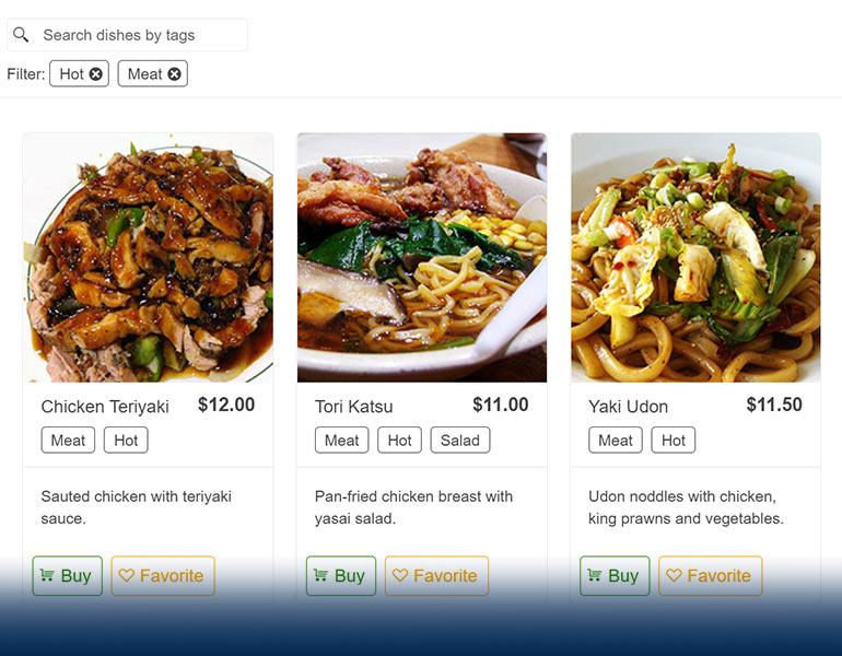
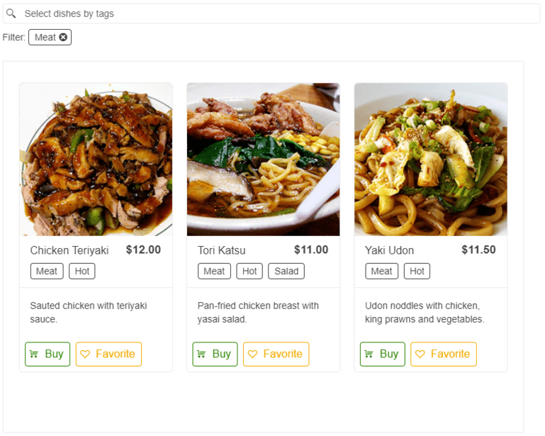
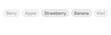
Display information in small containers called chips or pills and create compelling UX with the Telerik UI for ASP.NET Core Chip component. Based on your preferences the small building block can show text, a built-in icon such as an “X”, or images. Whether used in social media platforms or in emails to indicate the different users in the recipient’s field, the ASP.NET Core Chip component is your perfect choice.
-
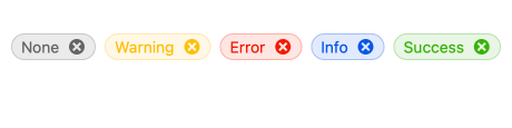
Chip Types
For your convenience several ready to use chip types with unique styles are available within the Telerik UI for ASP.NET Core Chip component. Benefit from the available base, info, error, success, and warning chip types to save time and efforts.
-
Appearance
Two predefined appearance options are available for you to choose from, based on your design needs and preferences:
- Filled Chip sets a background color to its content via the ChipFillMode property
- Outlined Chip sets a transparent background color and an outline via the ChipRoundaded property

-
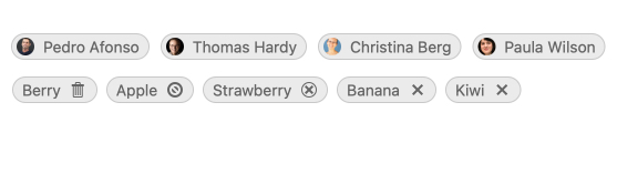
Customization
Benefit from the available customization options to align the look and feel of the Telerik UI for ASP.NET Core Chip component to your preferred look and feel. Adding icons, images, avatars, custom icons, links, or any other content to the chip is a piece of cake.
-
Removable Chip
Leverage the removable property to configure if the Telerik UI for ASP.NET Core Chip component should provide a built-in “X” icon to allow users to remove the chip with a single click. In case you set the property to false, the ASP.NET Core Chip will render without this close / delete icon.

-
Disabled Chip
Easily disable the ASP.NET Core Chip component if the specific scenario requires it. By default, the component is enabled, but leveraging the disabled property you can quickly make certain items non-selectable. This is useful in cases when an item from the available list is not present at the time.
-
Events
To ensure smooth interaction, the Telerik UI for ASP.NET Core Chip component exposes different events related to user interaction - clicking, selection and removal.
-
Chip Theming
The Telerik UI for ASP.NET Core Chip component has four built-in themes including Default (our own styling), Material (based on the Material Design guidelines), Bootstrap (which looks like the Bootstrap styling to integrate better) and Fluent (based on Microsoft Fluent UI).
You can easily customize any of out-of-the-box themes, style a specific component instance or create new theme to match your colors and branding by using the Telerik SASS ThemeBuilder application.
