
UI for ASP.NET Core
ASP.NET Core Rating
- Integrate a flexible option for rating your web content with the ASP.NET Core Rating component.
- Part of the Telerik UI for ASP.NET Core library along with 120+ professionally designed UI components.
- Includes support, documentation, demos, virtual classrooms, Visual Studio Code Extensions and more!

-
Overview
The Telerik ASP.NET Core Rating allows users to rate items with a certain number of stars or any other preferred shape, such as hearts, circles and more. The component features Selection, Precision, Labels, Tooltip and Templates settings for full customization. It lets users use keyboard navigation with enhanced accessibility to give their vote and supports RTL rendering.
-
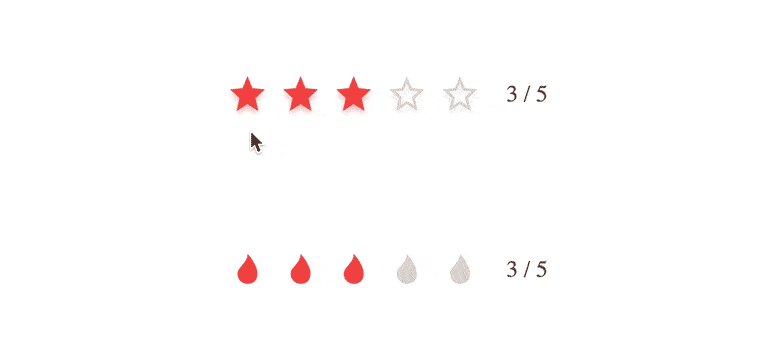
Selection
Selection of a rating or stars can be configured in two different ways. You can allow either all stars up to the one selected or only the chosen star to be highlighted.
See the ASP.NET Core Rating Selection demo
-
Label
Depending on your preference, you can add a label to the component to show the current rating’s numeric value. It can be displayed either as “3/6” or “3 out of 6”. If you prefer, you can also disable labels altogether. -
Tooltip
Enabled by default, the tooltip feature allows you to display the text equivalent of the rating’s numeric value upon hovering over the rating shape. You can easily disable the tooltip by setting the Tooltip property of the component to false.
See the Telerik UI for ASP.NET Core Rating Tooltip in action -
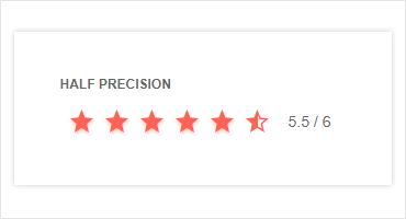
Precision
Users are not always set on a round number when it comes to rating products, that is why the Telerik ASP.NET Core Rating has the option of adding halves. By modifying the precision property, you can enable users to give a 4.5/5 rating or constrain the rating to an integer value.
-
Events
The component features various events OnClick and OnHover, including Select, ChangeValue, Tooltip display and more. The full list of supported events is available in our documentation.
-
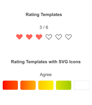
Templates
The Rating component gives you the ability to customize its appearance to fit your design requirements. By default, each rating item is rendered as a star icon. To modify the default icon, you can use the ItemTemplate, SelectedTemplate and HoveredTemplate properties. To see sample templates, visit this demo page.
-
Handling Average Values
The component’s value can be a real number precision up to a single decimal point (e.g. 0.4, 0.5, 3.9, etc.) for when you need to display an average. This number is rounded when rendering for the purpose of displaying full/half-full item. The value itself is displayed in the control's label.
-
HTML and Tag Helpers
Telerik UI for ASP.NET Core provides you with two ways to declare UI components—by using either HTML or Tag helpers. You can use them to help you easily configure the Rating component.

-
RTL Support
The Rating component has built-in support for right-to-left scripts. You can easily adapt it by changing the default alignment from left-to-right to right-to-left and vice versa with only a few settings.
-
Keyboard Navigation and Accessibility
The Telerik UI for ASP.NET Core Rating is one of the many components in the suite with out-of-the-box support for keyboard navigation. Users can easily navigate the component using the arrow keys to cast their vote. The component is compliant with Section 508 and WCAG guidelines.
Check out the ASP.NET Core Rating Keyboard Navigation demo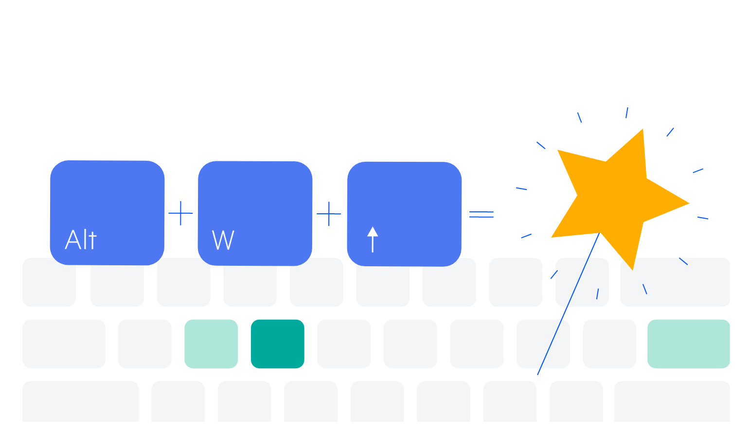
-
Rating Theming
The Rating component has 20+ built-in themes. You can easily customize any of the out-of-the-box themes with a few lines of CSS or create new themes to match your colors and branding with the Telerik SASS ThemeBuilder application.
-
Razor Pages
The Rating component is compatible with the ASP.NET Razor Pages framework. It is one of the many Telerik UI for ASP.NET Core controls that are supported in both MVC and Razor Pages applications. To view the complete list of Telerik components that you can plug in ASP.NET Core Razor Pages projects, check out the documentation article or visit the Razor Pages examples in our GitHub project repository.
