UI for ASP.NET Core
ASP.NET Core Progress Bar
- Use the ASP.NET Core ProgressBar to visually represent the progress of long-running operations.
- Part of the Telerik UI for ASP.NET Core library along with 120+ professionally designed UI components.
- Includes support, documentation, demos, virtual classrooms, Visual Studio Code Extensions and more!

-
Overview
The ASP.NET Core ProgressBar component visually represents the progress of any long-running operations in your application. The control can be configured to fit in a variety of scenarios such as filling out a survey or system-oriented processes like downloading. Thanks to its rich functionality, the component supports multiple types, horizontal and vertical orientation, reversed direction and more.
See the ASP.NET Core ProgressBar in action
-
Chunk Progress
You can predefine the number of steps (chunks) for the users to complete by setting a single option. It will automatically define how the progress will be visualized as part of the whole ASP.NET Core ProgressBar.

-
Orientation
The visual representation of the ProgressBar can be augmented for any specific scenario – it can stand horizontal or vertical with a switch of a setting.
See how Orientation works in ASP.NET Core ProgressBar Demo
-
Labels
Further customize the ASP.NET Core ProgressBar by adding textual description in the form of labels. You have the ability to configure the label’s position, visibility and custom content according to your app’s requirements.
-
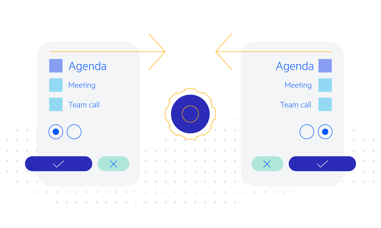
Events
The ProgressBar supports two types of events - Change and Complete. Change event fires each time a new value is set, whereas the Complete event fires when the progress of the task is completed, that is, each time the ProgressBar reaches its maximum value.
-
HTML & Tag Helpers
Telerik UI for ASP.NET Core ProgressBar offers two options for declaring UI components – through HTML or Tag Helpers. You can choose which approach to use based on preference, technology background or team development practice. Both HTML and Tag helpers allow you to lay out the ProgressBar and its configuration with a simple and easy-to-read HTML-like or Razor syntax.

-
Flexible API
Use the rich client-side API found within the ProgressBar component to implement advanced and specific scenarios. The available public methods, properties and events give you the ability to interact with the control and choose the most suitable programming approach for you.
-
RTL Support
Right-to-left support is available for languages like Arabic and Hebrew, in which users read from right to left. You can satisfy any script preference and ease user interaction by toggling between left-to-right and right-to-let alignment with only a few settings.
See how RTL Support works in ASP.NET Core ProgressBar Demo