UI for ASP.NET Core
ASP.NET Core PivotGrid v.2
- Leverage the redesigned ASP.NET Core PivotGrid v.2 for Excel-like display and analysis of OLAP or tabular data.
- Part of the Telerik UI for ASP.NET Core library along with 120+ professionally designed UI components.
- Includes support, documentation, demos, virtual classrooms, Visual Studio Code Extensions and more!

-
Overview
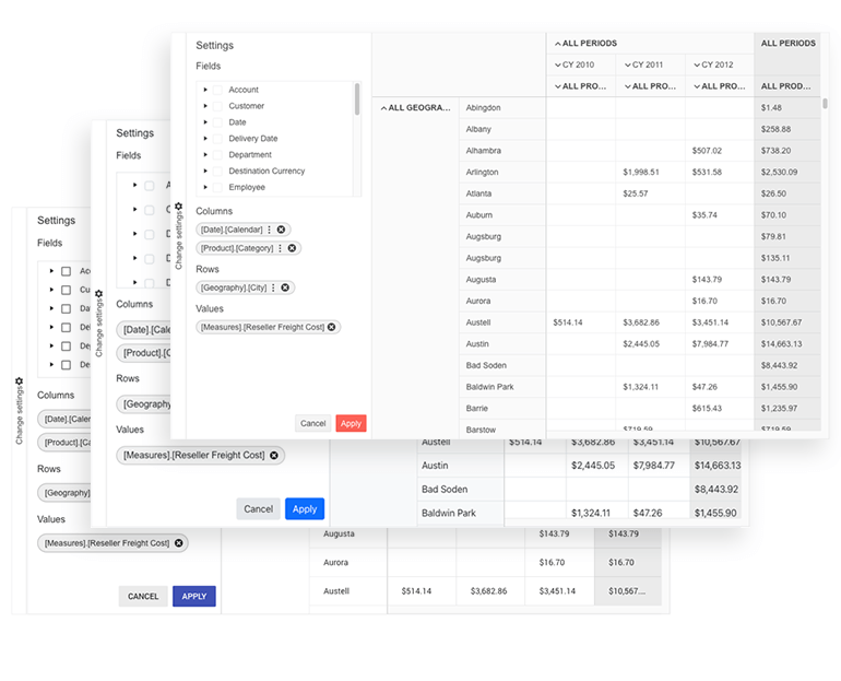
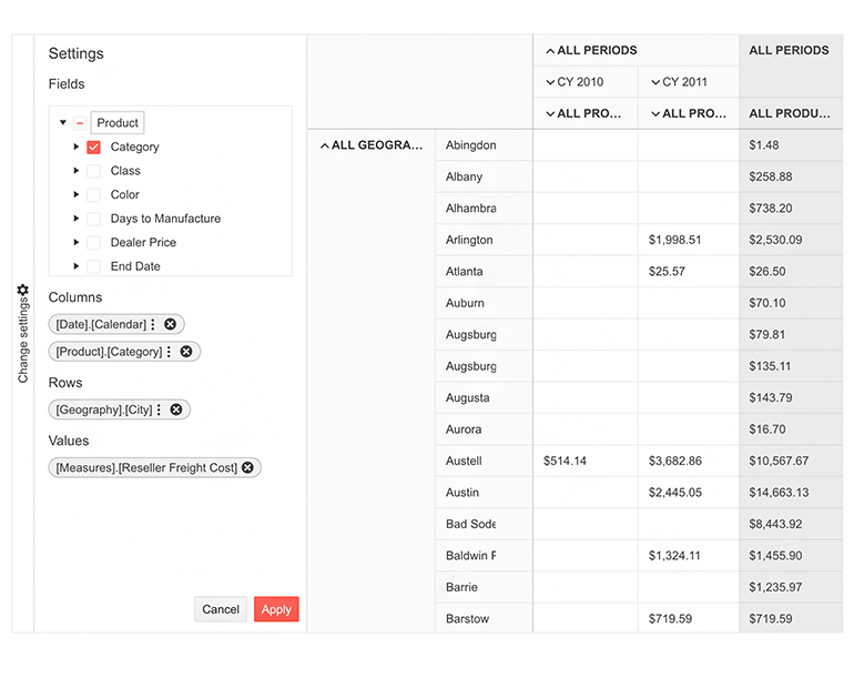
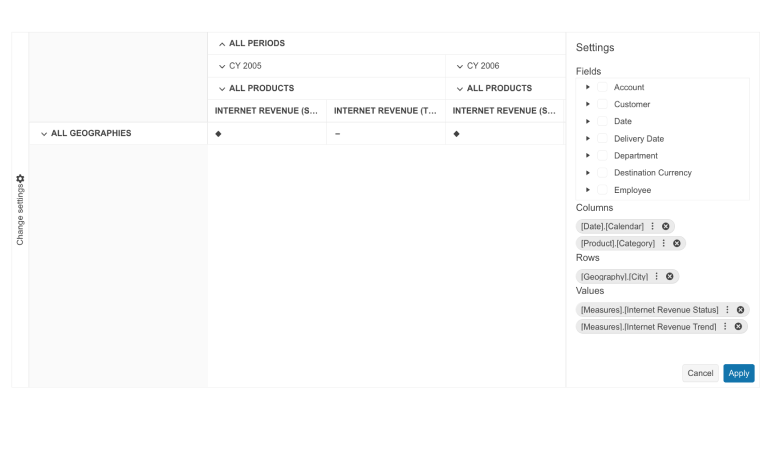
The Telerik UI for ASP.NET Core PivotGridv2 is a powerful data visualization component used to represent multidimensional data in a cross-tabular format. The updated version of the PivotGrid comes with a brand-new design and future proof architecture which guarantees easy implementation of any upcoming functionalities. The component allows you to visualize large volumes of data, display measures, KPIs and drill-down based on dimension hierarchy, sort and filter the data, configure it from the collapsible tree view settings menu, customize its appearance through templates and export to PDF.
-
The New PivotGridV2
Here's a brief overview of the PivotGridV2's features and benefits:
- Brand-new engine enables for faster feature implementation and issue repairs
- Overall performance improvement – merges data in the component with newly requested data in no time
- A fresh new look and some basic UX improvements
- Easier customization
- Improved API
-
Data Binding
Bind the ASP.NET Core PivotGrid v2 component remotely or locally to OLAP (Online Analytical Processing) cube or flat data. The component is designed to be as flexible as possible when it comes to loading, slicing, and analyzing data.

-
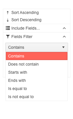
Sorting and Filtering
The component comes with a collapsible settings menu from which you can choose which columns and rows to display. For each column and row included in the Pivot you can sort data, filter, or hide fields.
-
KPI Measurements
Display key performance indicator KPI measurements with a simple configuration. The Telerik UI for ASP.NET Core PivotGrid v2 enables you to represent multidimensional data as KPI measures.
See Telerik UI for ASP.NET Core PivotGrid v2 KPI measurements demo
-
Templates
You can easily tailor the look of the PivotGridV2’s column & row headers and cell values through templates. Drag people’s attention to the positive numbers by making them green, underline outliers and color the losses in red with just a few lines of code.
See how to render custom content in the PivotGrid cells and headers.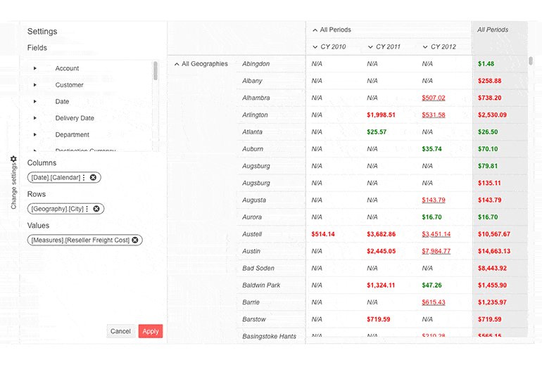
-
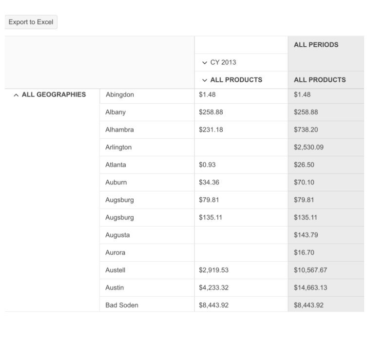
Excel Export
Extracting and downloading reports or tabular data is a piece of cake with the export to Excel option in the Telerik UI or ASP.NET Core PivotGrid v2. This built-in functionality allows you to export data to an Excel document.
-
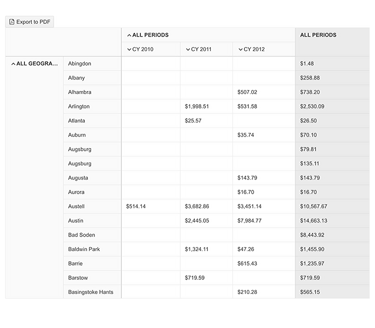
Export to PDF
The ASP.NET Core PivotGridV2 can be exported to a PDF file with the click of a button, so you can easily include it in reports, attach it to email correspondences or presentations.
-
HTML & Tag Helpers
Telerik UI for ASP.NET Core provides two ways to declare UI components—by using HTML or Tag helpers. You can choose between the two approaches based on your technological background or personal preferences and practice and implement the ASP.NET Core PivotGrid in your applications.

-
Theming
The Telerik UI for ASP.NET Core PivotGridV2 component has 20+ built-in themes and swatches you can chose from. Explore the Default (Main Dark, Turquoise, Purple), Material (Arctic, Main Dark, Nova), Bootstrap (Main, Nordic, etc.) and Fluent themes and choose the swatch that meets your design requirements. If neither of the available themes and swatches satisfies your needs, you can easily customize them with a few lines of CSS or create new themes by using the Progress SASS ThemeBuilder application.