
UI for ASP.NET Core
ASP.NET Core DataGrid
- Achieve flawless data visualization with the full-featured ASP.NET Core Grid component.
- Part of the Telerik UI for ASP.NET Core library along with 120+ professionally designed UI components.
- Includes support, documentation, demos, virtual classrooms, Visual Studio Code Extensions and more!
-
All you need in ASP.NET Core DataGrid
The Telerik UI for ASP.NET Core DataGrid is a powerful, fast, feature-rich component that can both handle large volumes of data with ease thanks to pagination, virtualization and infinite scrolling, and visualize and manipulate it in a way it makes sense for the user. Bind your data, set up a few properties and see it work in any browser and device. We’ve taken care of every scenario you can think of so your development time is reduced tremendously to just a couple of minutes.
-
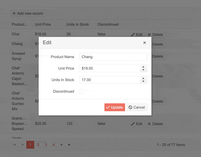
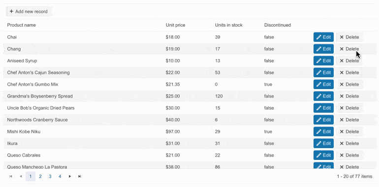
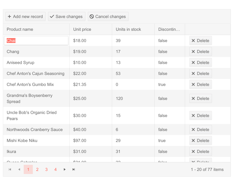
Data Editing
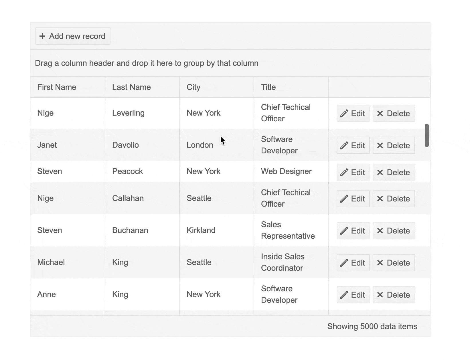
The Telerik UI for ASP.NET Core Grid component enables you to perform CRUD (create, read, update, and delete) operations and manipulate its underlying data. You have the option to choose from different edit modes like Batch, Inline and Popup. Customization is limitless by using a custom editor and showcasing your data any way you see fit.
-
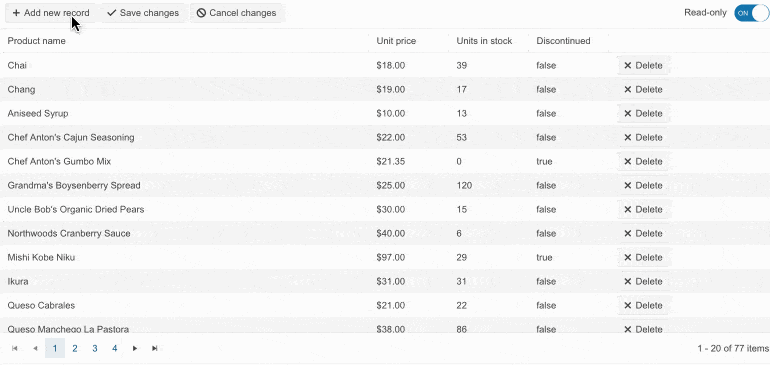
Toggle Edit Mode
Effortlessly switch the “Readonly” and “Editable” Grid modes. The Telerik UI for ASP.NET Core Grid can be initialized in either of the states and they can be toggled on the client-side, depending on the application logic.
-
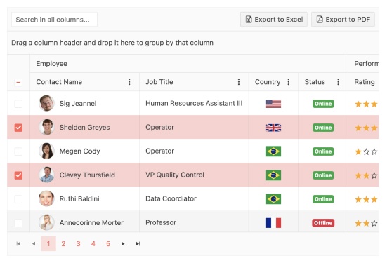
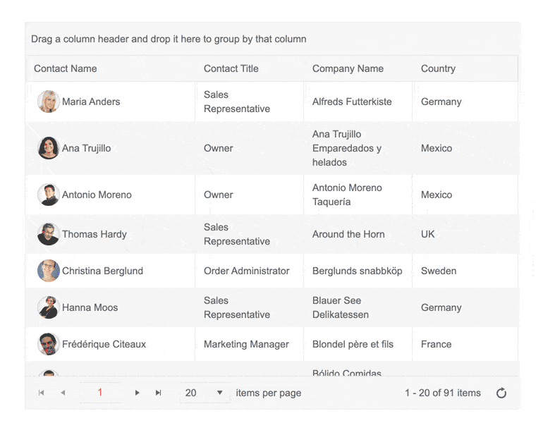
Page, Sort, Filter or Group Data in ASP.NET Core Grid
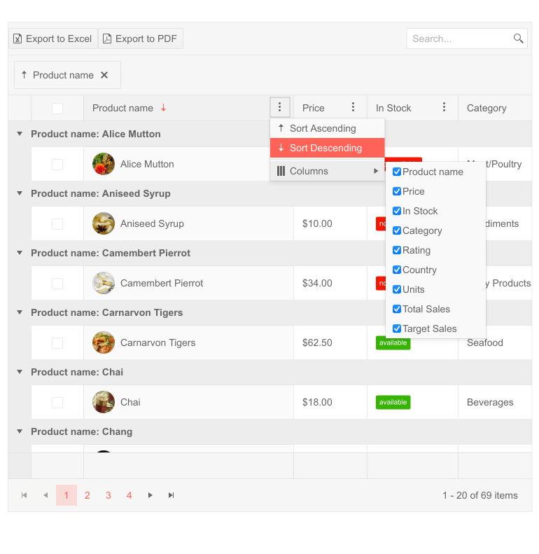
The Telerik UI for ASP.NET Core DataGrid control provides a variety of options about how to present and perform operations over the underlying data, such as paging, sorting, filtering, grouping, editing, exporting and many more. You can enable these built-in features of the ASP.NET Core Table Grid Control using just a few properties. Users can also benefit from multi-column sorting and Google-style autocomplete filtering. This makes the user experience intuitive when browsing through large quantities of data. Use the slick and intuitive interface to present users with a great looking application.
-
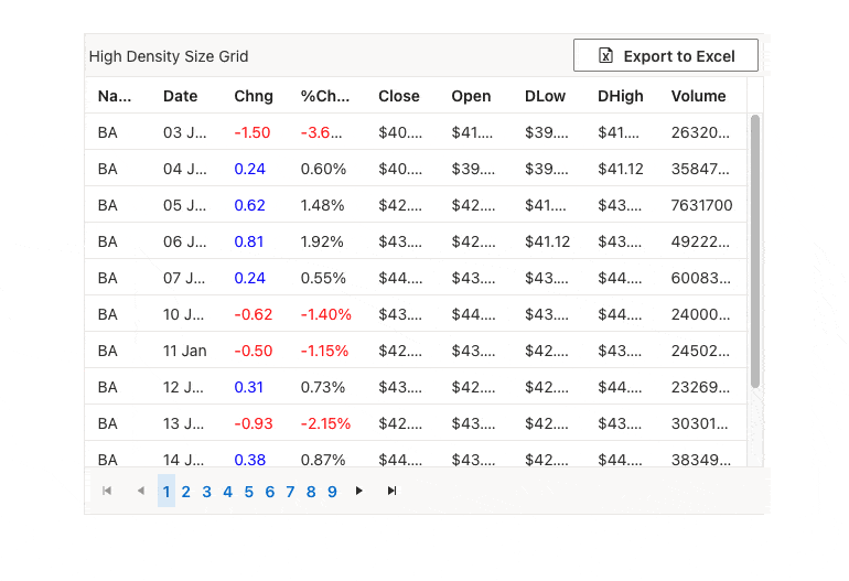
Compact Grid
Implemented via the Size parameter configuration, the Compact Grid, also known as High-Density Grid, enables you to display as much information as possible on a single screen by reducing the padding and margins used by the elements that comprise the Telerik UI for ASP.NET Core Grid component. The outcome is a data table with a more condensed look and feel that allows displaying of more data at once.
The Compact Grid feature is offered through the configuration options and can be used in combination with any of the built-in Default, Bootstrap, Material and Fluent themes.
-
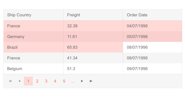
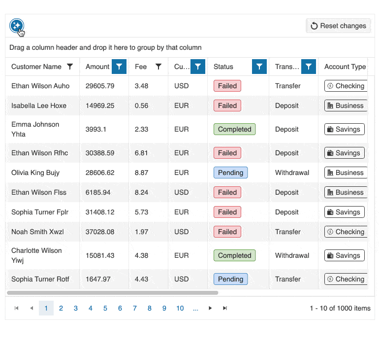
Data Range Selection, Copy and Export
The Grid supports advanced exporting options, enabling you to extract specific parts of your data. You can choose to export or copy a range of selected cells, combine them with a range of rows or in the form of a chart to match any use case.
Check out this ASP.NET Core Grid Selection and Export demo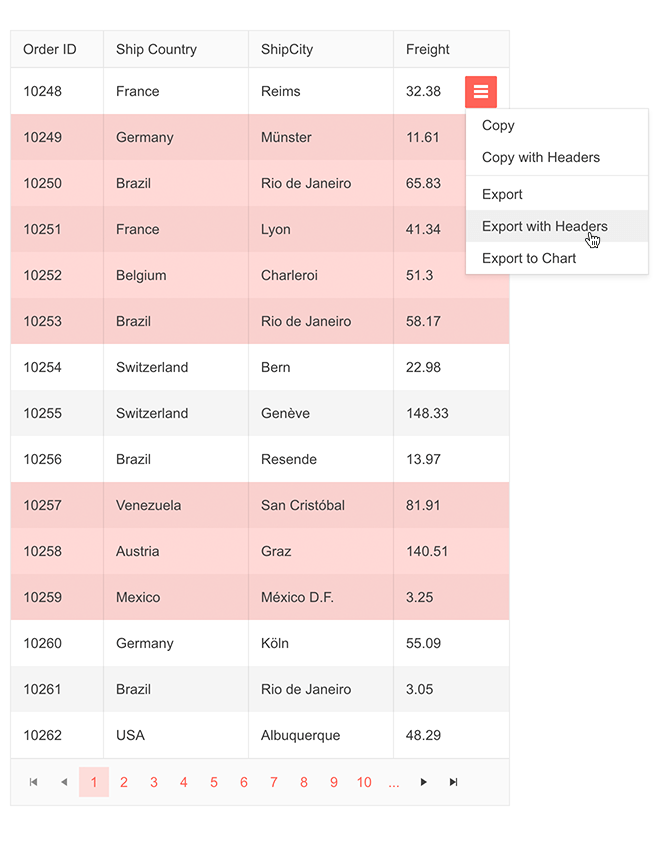
-
Selection in Grid
In addition, the Grid allows selection of rows and cells so that you can process data from them or make the needed calculations. You can enable the Selectable property and configure the selection Mode based on Single, Multiple or Checkbox as well as choose Cell or Row as selection Type. You can also get the selected data using the Change event in the Grid.
-
Foreign-Key Binding to Remote Collection
It is also possible to bind foreign-key columns directly to a remote data source. As setting this feature up can be tricky, it is recommended you first check the available sample demo.
-
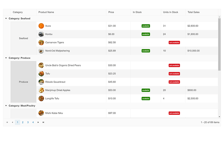
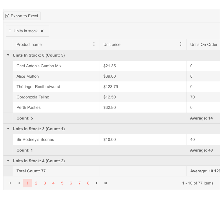
ASP.NET Core DataGrid Aggregates
Another functionality that the Telerik Grid offers is the option for aggregates. When grouping data, you can see results from calculations displayed in the grid - it can be positioned differently based on the grouping template that you decide to use. Average, Count, Sum, Min and Max are the built-in functions you can choose from to easily process numerical information. See how to define the aggregates from the available demo.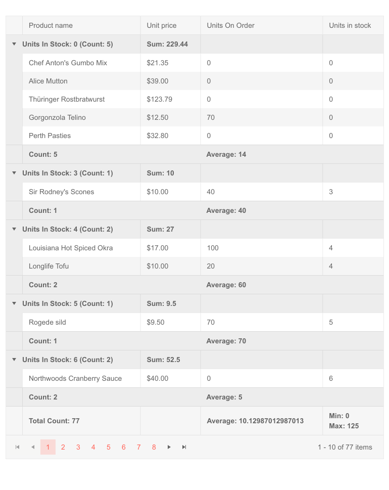
-
Selection Aggregates
The Selection Aggregates feature enables you to select a single or multiple cells or rows within the grid and calculate different metrics based on the selected data, allowing you to get a quick snapshot of key aggregates. You can utilize the built-in approach and display the metrics at the bottom of the ASP.NET Core Grid or create your own elements to present the data as needed.
See Telerik UI for ASP.NET Core Grid selection aggregates demo
-
Settings Persistence
Users can save grid settings, such as column order, sorting, filtering, or paging state, and load them in consequent app sessions. The feature is particularly useful when individual users need to view custom information when logging in.
See the ASP.NET Core Grid Persist State demo -
Data Binding to Local & Remote Data, DataSource Utilization
Bind your Telerik UI for ASP.NET Core DataGrid control to static arrays, dynamic objects, local or remote data, or even Web API endpoints or SignalR hubs – no need for extra processing. Changes will be propagated both ways without any additional effort on your side. Getting the data from the model to your view is easy as completing a couple of steps.

-
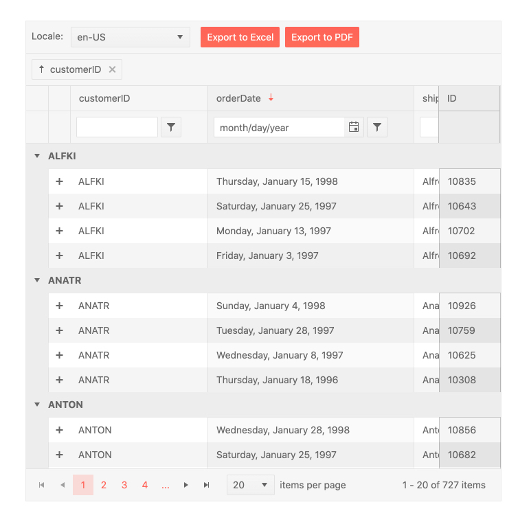
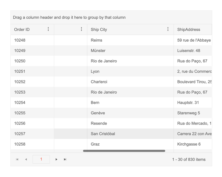
Remote (server-side) Grid Grouping
This feature was requested by many of you, our users! We are making grouping items in the Telerik UI for ASP.NET Core Grid component many times faster when working with millions of rows. By enabling one attribute, whenever users request the Grid to group some elements together (e.g. all products being sold in a certain shop), the grouping procedure will run on the server. Effectively, this frees up the client to display a loading screen while waiting for the server to process the results but also makes it faster since the server is likely to be much more powerful than the user’s machine.
See how Remote Grouping works in ASP.NET Core Grid -
Remote Validation
Leverage a custom validation method performed on the server-side. During the remote validation the Data Grid posts the values to the server and depending on the server response, the component displays a valid or invalid state.
-
Data Virtualization with CRUD operations
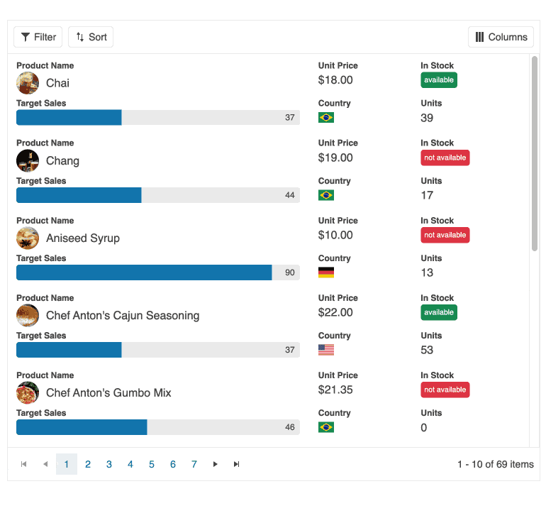
The virtualization feature of the Telerik for ASP.NET Core Grid allows you to handle large amount of data without negatively impacting the user experience and the browser performance. It comes with two types of virtualization – row and column virtualization which will render respectively the number of set items or columns. The loading time and resources needed to visualize the active view of data in the grid are significantly reduced when having many records in the source. Editing is also supported.
-
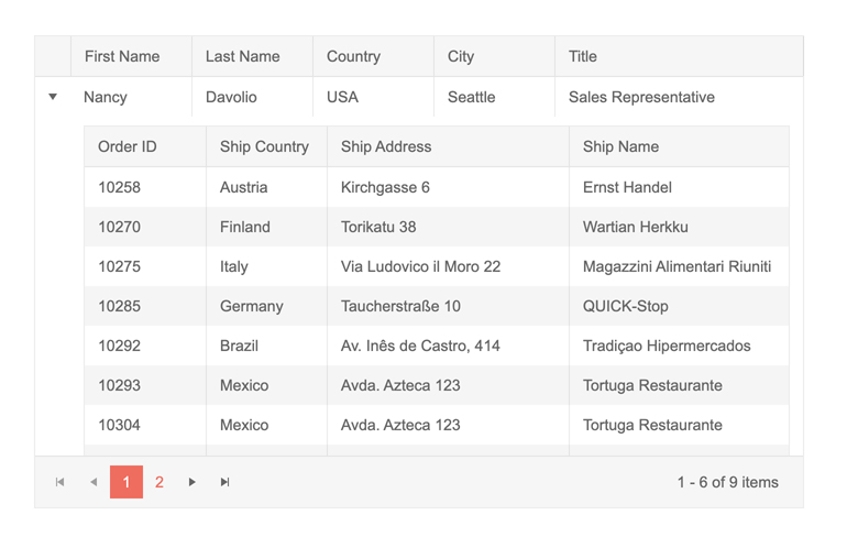
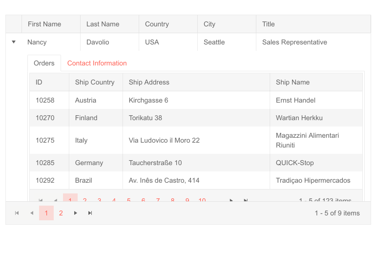
Hierarchical Grid
Some projects require displaying table data in hierarchical fashion, also called master-detail tables, in order to visualize relations between parent and child records. This is where the Telerik UI for ASP.NET Core Grid hierarchy feature comes in handy. Quickly create an N-level hierarchical Grid by specifying detail templates. Templates allow you to focus on the details in your records that are important for your user’s work and create a tailored application.
-
Freeze Grid Columns
The Frozen Columns feature of the ASP.NET Core Grid is useful when going through large amounts of data. It enables you to lock certain columns to have them displayed continuously throughout scrolling. Simply set Locked in the column properties. The ASP.NET Core Table Grid also automatically provides a menu to allow the user to execute lock operations themselves.
-
Row and Column Spanning
The Telerik UI for ASP.NET Core Grid enables you to span a cell between multiple rows, as well as span multiple columns.
See Telerik UI for ASP.NET Core Grid Row and Column Spanning demo
-
Column Interactions
Grant your users the ability to resize and reorder the columns you have provided them with on the client side, without any request to the server. As expected, the provided context menu enables them to easily hide or display, sort or filter columns. From the user’s perspective, it just works.
-
Toolbar Columns Menu
The Telerik UI for ASP.NET Core Grid enables you to render a column menu in the column headers, providing easy access to functions like sorting, grouping, filtering, and others.
See Telerik UI for ASP.NET Core Grid toolbar columns menu demo
-
Fit All Columns Width to Content
You can render a sleek Grid with minimum possible width for all/ or selected columns so that their underlying text fits nicely without empty spaces or wrapping. -
Alignment of Cell Values
The DataGrid component provides a way to specify horizontal alignment of the content using the HtmlAttributes() method. You can choose from Left, Right or Center column alignment to best structure the data in the component. The column headers and footers can be aligned as well, using the HeaderHtmlAttributes() and FooterHtmlAttributes() methods, respectively.
See more about the Telerik UI for ASP.NET Core Grid Content Alignment -
Sticky Columns
Grids with large numbers of columns might be difficult to navigate for the end user but with Sticky columns navigation becomes much easier. Marking a column as sticky, will keep it always visible on the screen while other non-sticky columns become scrollable and go out of view.
This feature is similar to the Frozen columns Grid feature. The main difference is that while frozen columns are rendered on the left side of the widget, sticky columns are displayed in the scrollable area with the non-frozen columns.
See how Sticky Columns work in ASP.NET Core Grid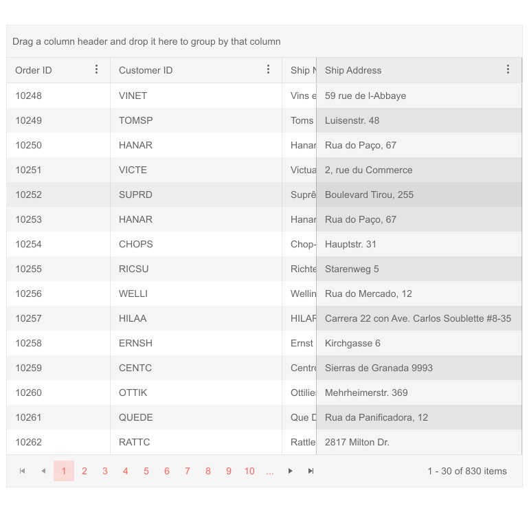
-
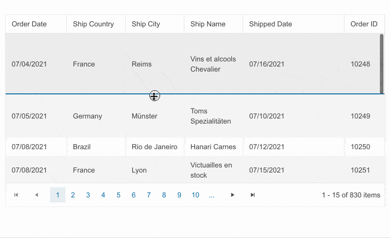
Row Interactions
The grid provides built-in functionality which allows end-users to reorder single and multiple rows by dragging and dropping them within the Grid and even between two Grids!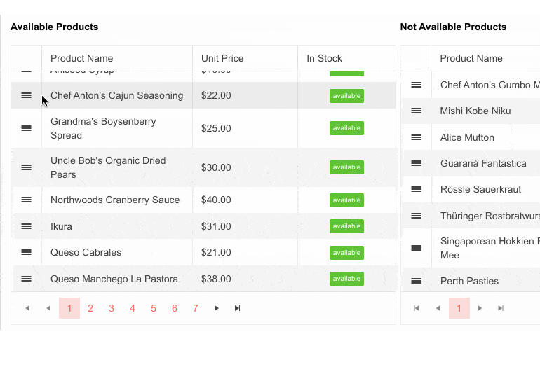
-
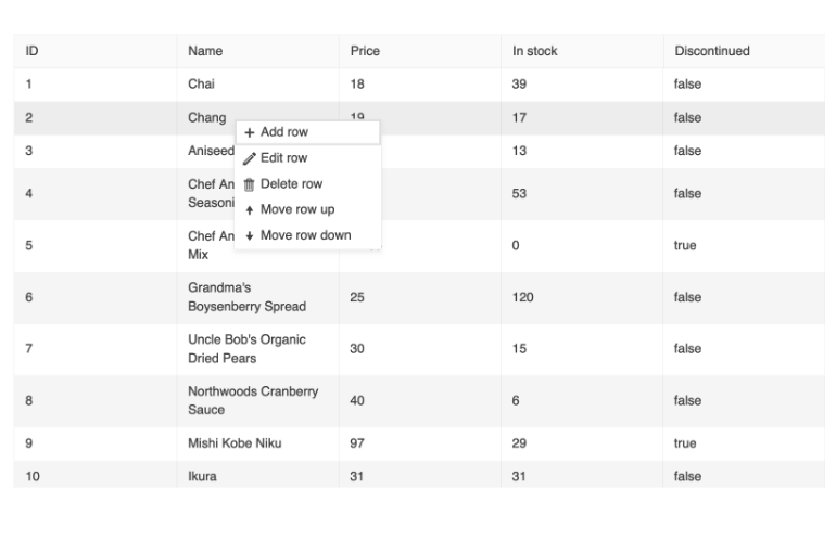
Context Menu
The Telerik UI for ASP.NET Core Grid supports displaying of a context menu within the component, providing a convenient way to apply data processing operations to specific rows. The context menu empowers users to easily add, edit and delete records, select, sort and reorder rows, and export the data grid to a PDF or Excel file.
Additionally, the context menu provides the option to use default commands or add custom ones. You can also configure the items that are displayed in the Grid's table head element and those in the Grid's table body element.
-
Row Resizing
Simply set the resizable configuration of ASP.NET Core DataGrid rows to true and enable quick and easy resizing of one, multiple or all rows.
-
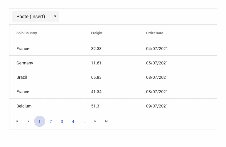
Paste from Excel
Copying cells from Microsoft Excel or another Grid control and pasting them in the desired Grid is possible with the built-in paste capability in Telerik UI for ASP.NET Core Data Grid. Based on the selected pasting operation, you can either replace the selected Grid cells with the copied cells or insert them as a new Grid row.
-
Export to PDF and Excel
Export the content of the grid control into PDF and Excel. All you need to do is display the built-in buttons for export or call a single method from an external element. You can predefine multiple styles like font, color, page size and layout to provide a unique look and feel specific to the exported file format.
-
ASP.NET Core DataGrid Export to CSV
The Grid can export its data to a CSV file, which the user can then process into other applications as needed. More information on the export feature can be found on the dedicated documentation page.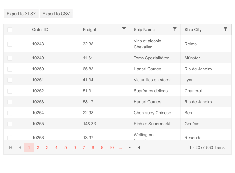
-
Exportable Property for Grid Column
Grid columns have the Exportable property. When set to false, it will cause any export actions (like exporting to PDF, Excel or CSV) to skip the selected column. You can even mark a column as only exportable when a certain file format is used (e.g. exportable for CSV but not for others). The feature comes in handy when you want the exported data to be as small as possible in size, so you skip columns displaying data aggregated from other columns (like sum or average of other columns). -
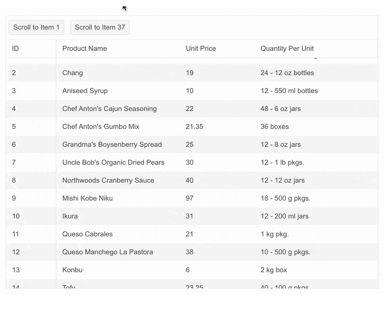
ASP.NET Core Grid Scroll to Item Method
Effortlessly guide users to any data point with the Telerik UI for ASP.NET Core Grid “scroll to item” method. Whether it needs to initially display a specific row or to auto-navigate based on certain triggers or user actions, the ASP.NET Core Data Grid scrollToItem() method makes it easy to deliver intuitive user experiences.
In a scrollable Grid case, the ID of the data item is passed to the scrollToItem() method, while in a virtual scrolling scenario, when the row is not yet loaded, the ID of the data item is passed and a callback function to the scrollToItem() is triggered.
See the Telerik UI for ASP.NET Core Grid scroll to item demo
-
Infinite Scrolling Mode
Telerik UI for ASP.NET Core Grid offers Infinite Scrolling Mode to allow large data sets to be scrolled through easily while also having grouping, hierarchy and CRUD operations enabled. By dynamically loading more data when the end of the page is reached, the user perceives the grid as if it he could scroll endlessly.
-
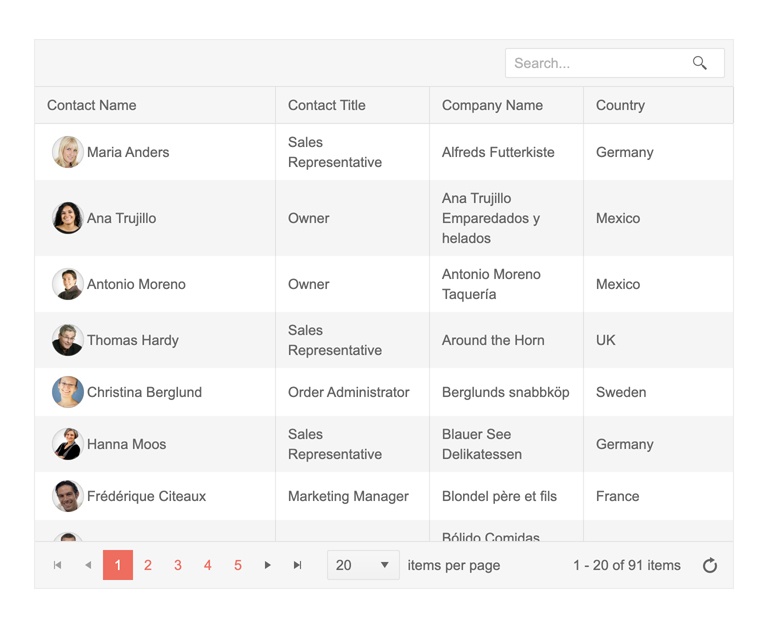
Search Panel
The Search panel feature in Telerik UI for ASP.NET Core Grid control enables users to search through the data bound to the Grid. Under the hood the Search panel uses filtering to show the relevant records.
-
Adaptive Tools
The Telerik UI for ASP.NET Core Grid offers comprehensive adaptive rendering to improve usability across all screen sizes. With AdaptiveMode set to Auto, the Data Grid automatically adjusts both editing and data operation tools (sorting, filtering, and grouping) for smaller screens.
All edit modes (Popup, Inline, and InCell) now render within a mobile-friendly ActionSheet for a smoother editing experience on mobile devices. Similarly, sorting, filtering, and grouping options are displayed in an adaptive layout that adjusts based on screen space.
-
Prompt-Controlled DataGrid
The Telerik UI for ASP.NET Core Grid integrates AI capabilities to make data interaction smarter, faster, and more intuitive.
- AI Toolbar Tool for Data Operations: Users can type natural-language prompts or select predefined requests from the Toolbar to automatically apply sorting, filtering, grouping, and other data manipulations.
- AI Toolbar Tool for Highlighting: Users can highlight specific data points, mark records matching complex conditions, or reset highlights with a single click, improving readability and visual analysis.
- AI Assistant: Add a dedicated AI column with an assistant button and inline prompt per row. Users can issue commands such as Summarize, Get Recommendations, or Analyze Condition directly on row data. Responses can be copied, discarded, or inserted into the same row for context-aware insights.
-
Stacked Layout Mode
Optimize your apps for small screens by displaying each data item as a vertical card. Choose which fields to show, include headers and action cells, and keep powerful features like sorting, filtering, and editing fully available on mobile. Provide improved readability and usability without building separate views.
See Telerik UI for ASP.NET Core Grid stacked display mode demo
-
Customize the look and feel
-
+20 Themes for ASP.NET Core Grid
If you are in a hurry and don’t have the resources to modify the built-in styling of the ASP.NET Core grid control, there’s no need to panic. The grid is bundled with more than 20 themes which cater to different needs, but all are designed with attention and care to details.
-
Theme Builder
Conforming to your brand design guidelines may sometimes be quite a burden with web libraries. Modifying who knows how many variables to get the right result easily becomes confusing and mundane. We know this is a problem, so our component suites come with a ThemeBuilder – a tool we’ve specifically created to make customization easy.
-
Adaptive Rendering (Mobile Support)
Why do you need to build a mobile version of your app when the same application can work equally well on mobile and desktop devices?
Thanks to the built-in adaptive rendering of the control, you can rest assured that your Telerik UI for ASP.NET Core Grid will work across all screens and browsers. The Grid may take more screen space and provide menus when that appear when users interact with it. Input events from touches are simulated as if they were mouse or keyboard.

-
Accessibility for ASP.NET Core Grid
The Core Grid control is perfect for scenarios where accessibility is important for your application. The Grid complies with WAI-ARIA, WCAG 2.1 and Section 508 guidelines, ensuring that individuals with disabilities can still view and interact with it.
To get more familiar with accessibility and its importance, check out our whitepaper focused on the topic to learn how accessibility affects your applications.
-
Server- and Client-Side API for Max Flexibility
Telerik UI for ASP.NET Core comes with a complete server-side API. With simple API calls designed to feel natural, you can configure all features of the ASP.NET Core Grid. Since the server wrappers output HTML and JavaScript, you also have full access to the client-side API for maximum control in the browser.

-
Right-to-Left (RTL) Support
Right out of the box, the Telerik UI for ASP.NET Core Grid provides RTL support for languages where users read starting from right to left such as Arabic or Hebrew. This mode of the ASP.NET Core Grid allows for the columns to be reversed and the rightmost column to become first. The adjustment feels more natural to the end users. The RTL feature can be adjusted for local preference by changing just a few settings.

-
HTML and Tag Helpers
Telerik UI for ASP.NET Core offers two options for declaring UI components – through HTML or Tag Helpers. You can choose which approach to use based on preference, technology background or team development practice. Both HTML and Tag helpers allow you to lay out the components and their configuration with a simple and easy-to-read HTML-like syntax. This includes binding to local and remote data and can be done with even more advanced Grid setups.

-
Organize Items in the Column Menu
Each of the Grid’s columns can have a menu with additional options for the user to pick from. These options can be programmatically controlled to display as sophisticated a choice as necessary. For example, you might want to add the ability to add or remove columns from the Grid, while at the same time group and sort the list of columns. Refer to the demo of this feature for more information.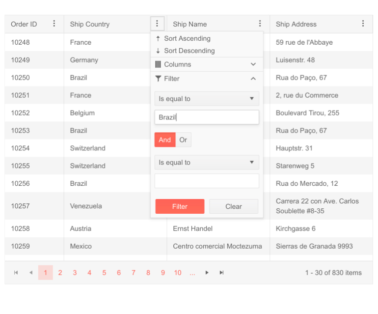
-
Touchscreen Interactions
Skyrocket user experience by allowing touchscreen interactions with the Telerik UI for ASP.NET Core DataGrid. It supports editing, selection and drag and drop gestures on mobile devices.
See the Telerik UI for ASP.NET Core Grid touchscreen interactions documentation
-
Keyboard Navigation
Give your users the opportunity to use the keyboard for almost any action that can be triggered with the mouse, including navigating items, selecting single and multiple items, going into and out of edit mode, paging, and even expanding and collapsing hierarchical grids.
See how Keyboard Navigation works in ASP.NET Core Grid
-
Globalization & Localization
The ASP.NET Core Grid supports Globalization and Localization as features and is designed to work in different cultures and respond to their requirements for number, date and time formatting, currency, week and month names. You can define the culture through the kendo.culture() method.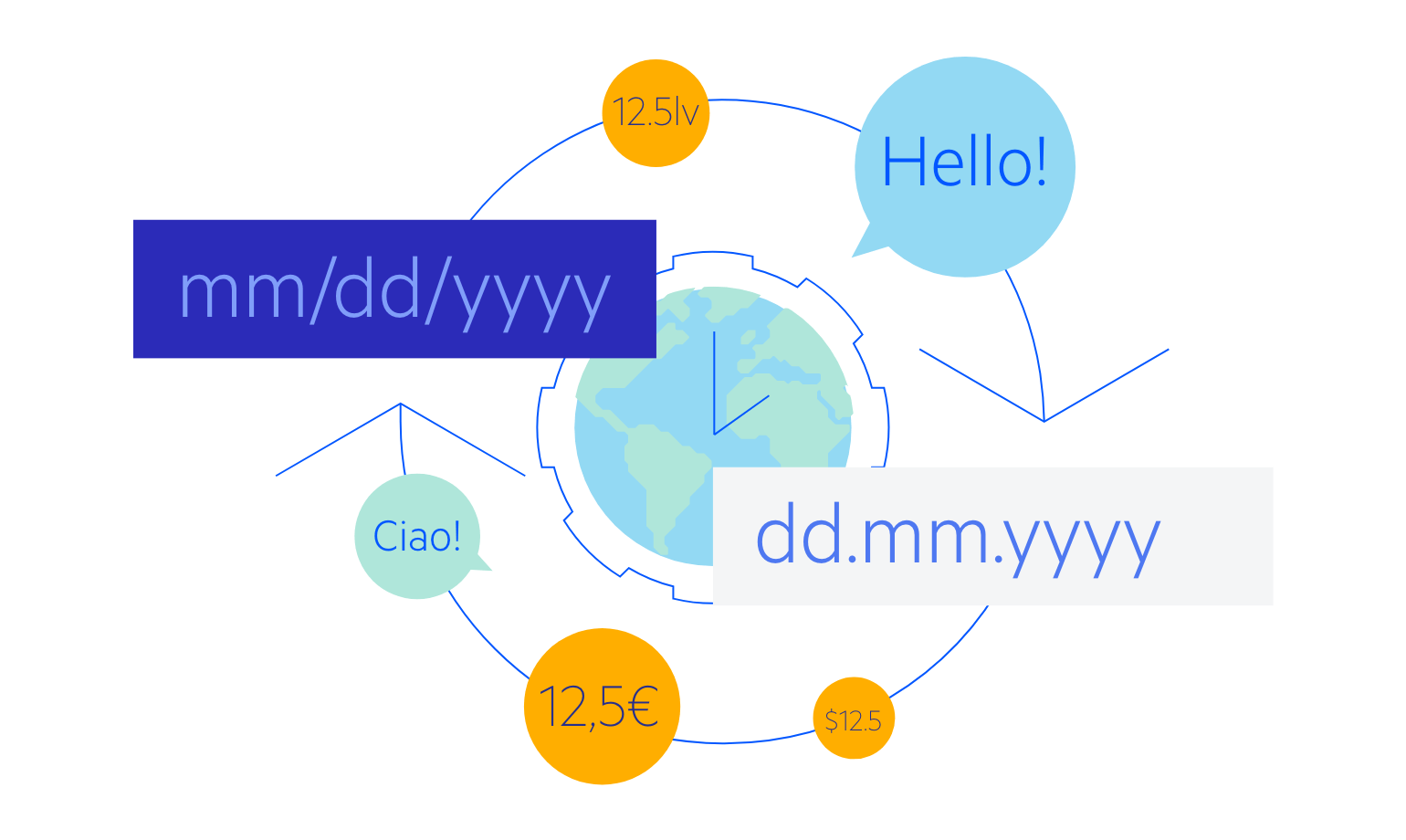
-
Cross-Browser Support
Using the Telerik UI for ASP.NET Core Grid, you can be certain that your app will look and behave as expected across all browsers. This includes all desktop and mobile browsers, with their quirks and features. You don’t need to add different browser-specific prefixes or lookup online how to position your data in the best way – it just works.

-
Also Available...
The Grid component is also available for these popular Web frameworks:
