
Kendo UI for jQuery
jQuery Data Grid (Table)
- Best-in-class jQuery Data Grid component that makes it very easy to implement full-featured, modern, and high-performance data table views.
- Part of the Kendo UI for jQuery library along with 120+ professionally-designed components.
- Includes support, documentation, demos, virtual classrooms, learning resources and more!
.svg?sfvrsn=3a69671a_6)
-
Build Responsive, Enterprise-Grade Tables with Ease
Create fast, responsive and highly customizable jQuery data grids with the Kendo UI for jQuery Data Grid. Equipped with essential and advanced features like sorting, filtering, paging, editing and exporting, the Grid component adapts to any scenario—from simple jQuery tables to complex business dashboards.
-
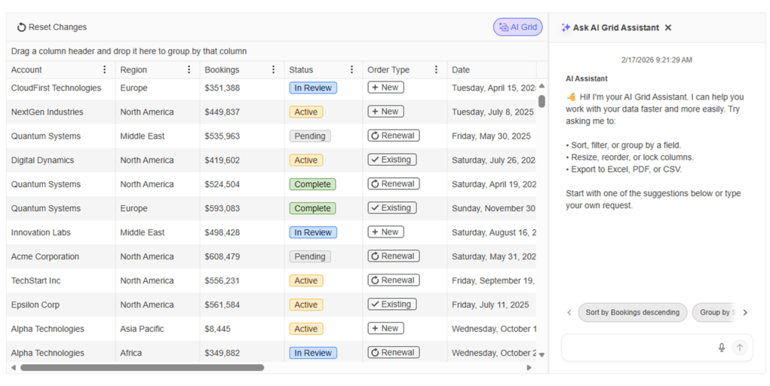
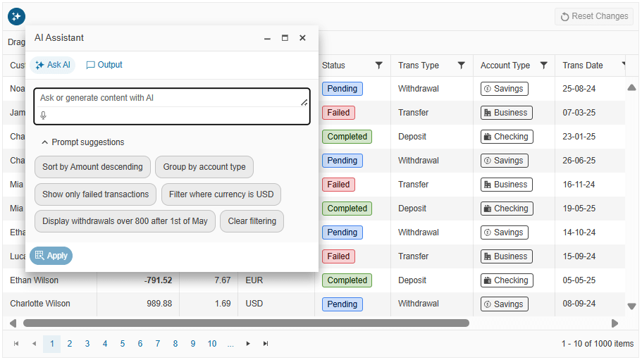
AI SmartBox
Boost user productivity with the Smartbox, an intuitive natural‑language interface built into the Kendo UI Grid. Users can quickly filter, sort, summarize, and explore data simply by typing conversational prompts, making complex actions faster and more accessible to everyone.
-
AI Chat Integration
Enhance data exploration with AI Chat Integration, enabling users to interact with the Grid through conversational, AI‑powered prompts. Whether summarizing records, generating insights, or asking questions about the data, the integrated chat experience makes analysis faster and more intuitive.
-
AI Custom Column
Add an AI assistant to a dedicated Grid column so users can ask questions about a specific record and get contextual, row-level answers. The demo integrates the InlineAIPrompt component inside the column for an interactive, per-row experience.
-
AI Toolbar Highlight
Showcase AI-assisted analysis by letting users stack multiple operations and visualize the effect row by row. Prompts like filter by status then group by customer are executed in sequence, with the Grid updating highlights to reflect the combined result.
-
AI Assistant Toolbar
Enable a built-in AI Assistant tool in the jQuery Grid toolbar so users can type prompts like “show only completed orders”, “group by customer and sort by total descending” or “highlight rows with amount over 10,000” and have the Grid respond automatically. The AI Toolbar Assistant can drive core Grid capabilities such as filtering, sorting, grouping, column show or hide, resizing, paging, selection and export to Excel or PDF, all without requiring users to understand the underlying configuration UI. You retain full control of behavior by enabling the specific Grid operations the AI is allowed to manipulate and by pointing the toolbar to your own AI service endpoint.
-
AI Semantic Search
Deliver smarter, more intuitive data discovery with the jQuery Grid Semantic Search. Instead of relying on exact keywords, users can search the Grid using natural‑language queries that understand meaning, context, and intent, returning more relevant results with fewer steps.
-
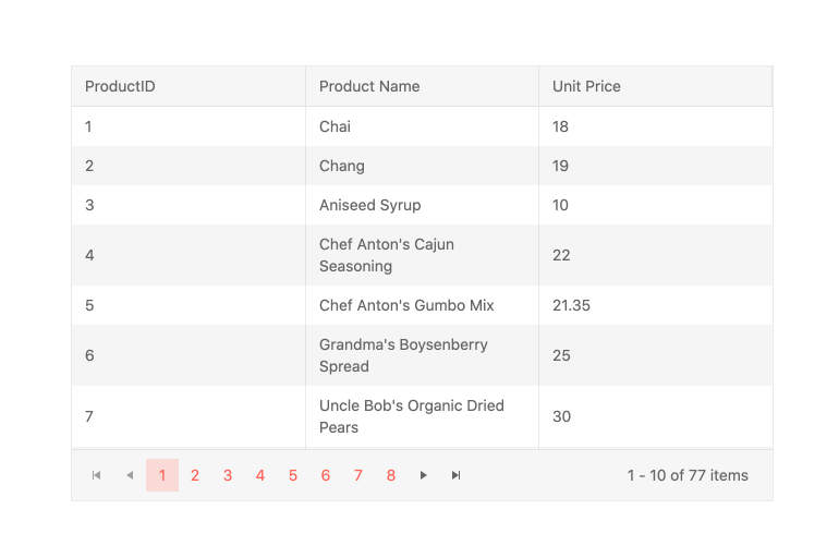
Paging and Virtualization
Improve performance by loading data in chunks with paging, virtualization and infinite scrolling. Ideal for working with large data sets without sacrificing speed.
-
Editing Modes
Choose from multiple editing approaches like inline, popup or batch editing and customize the editor for each column to match your data entry workflows.
-
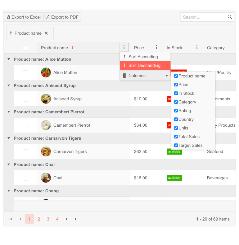
Column Interactions
Let users reorder, resize, show/hide, lock or freeze columns as needed. Enhance data exploration with sticky headers and column menus.
-
Responsive and Adaptive Rendering
Deliver a consistent experience across devices. The Grid supports adaptive rendering for smaller screens and responsive layout adjustments.
-
Accessibility and Keyboard Navigation
Fully compliant with WCAG, ARIA and Section 508 standards. The Grid supports full keyboard navigation, screen readers and high‑contrast themes.

-
Hierarchical Grid
Nest additional grids or templates within rows to display related records or master‑detail layouts. Expand and collapse detail rows easily.
-
Why Choose the Kendo UI for jQuery Grid?
Trusted by thousands of developers worldwide, the Kendo UI for jQuery Grid is optimized for performance, flexibility and extensibility. Whether you’re building enterprise admin panels, line‑of‑business apps or reporting dashboards, the Grid component delivers the functionality and reliability needed to manage complex data with confidence.
-
Flexible Data Binding
Connect your grid to local JavaScript arrays, JSON data, OData, Web API services or custom transports. The Grid makes it easy to populate and manipulate tabular data in real time.

-
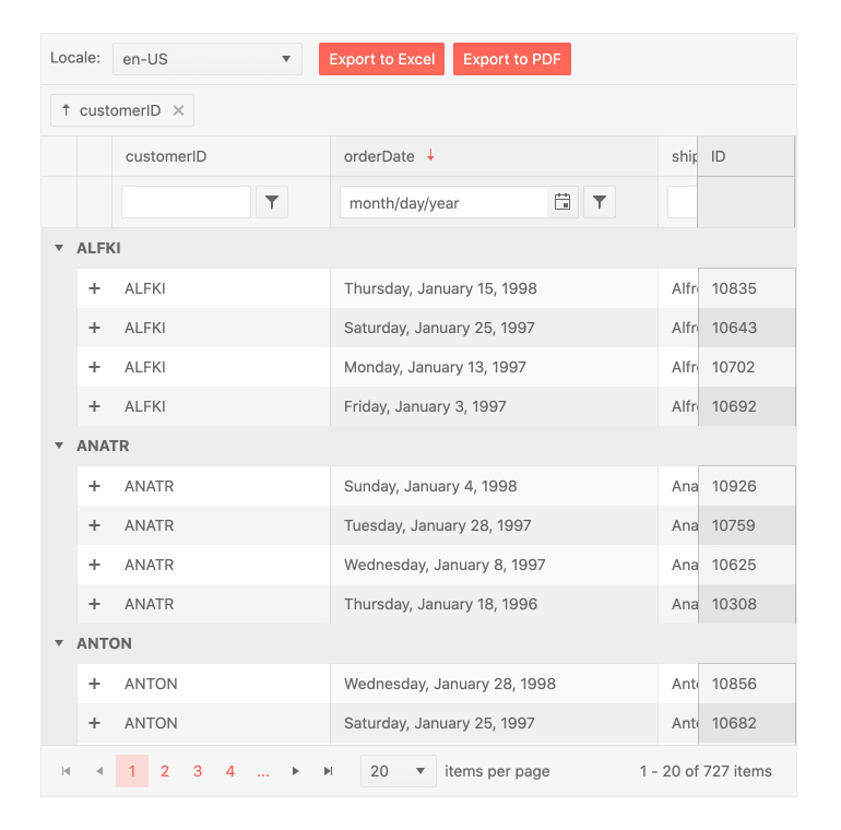
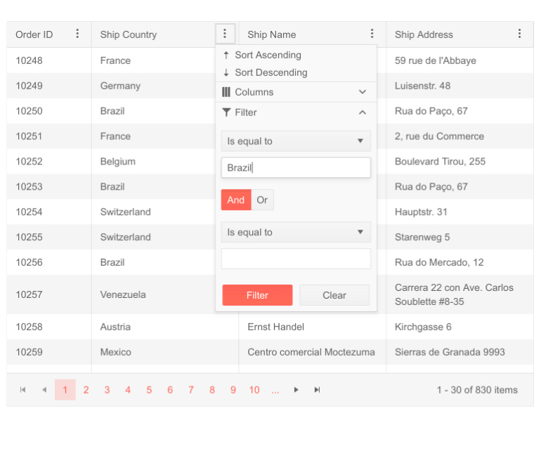
Sorting and Filtering
Enable single or multi-column sorting and apply built-in or custom filters with intuitive UI components. Filter modes include row filtering, menu filtering and checkbox selection.
-
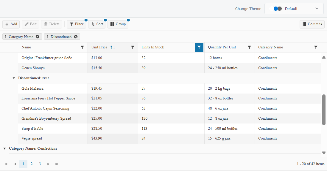
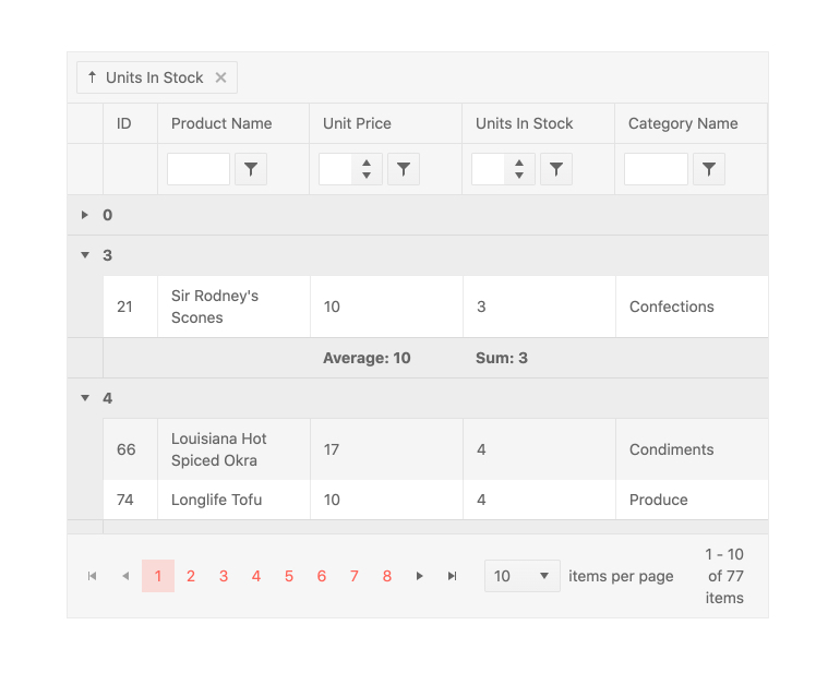
Grouping and Aggregates
Group rows by any column and display aggregates like sum, average, count, or custom calculations in group headers or footers. With sticky group headers and footers, the current group remains visible while scrolling, helping users maintain context when navigating large, grouped datasets.
-
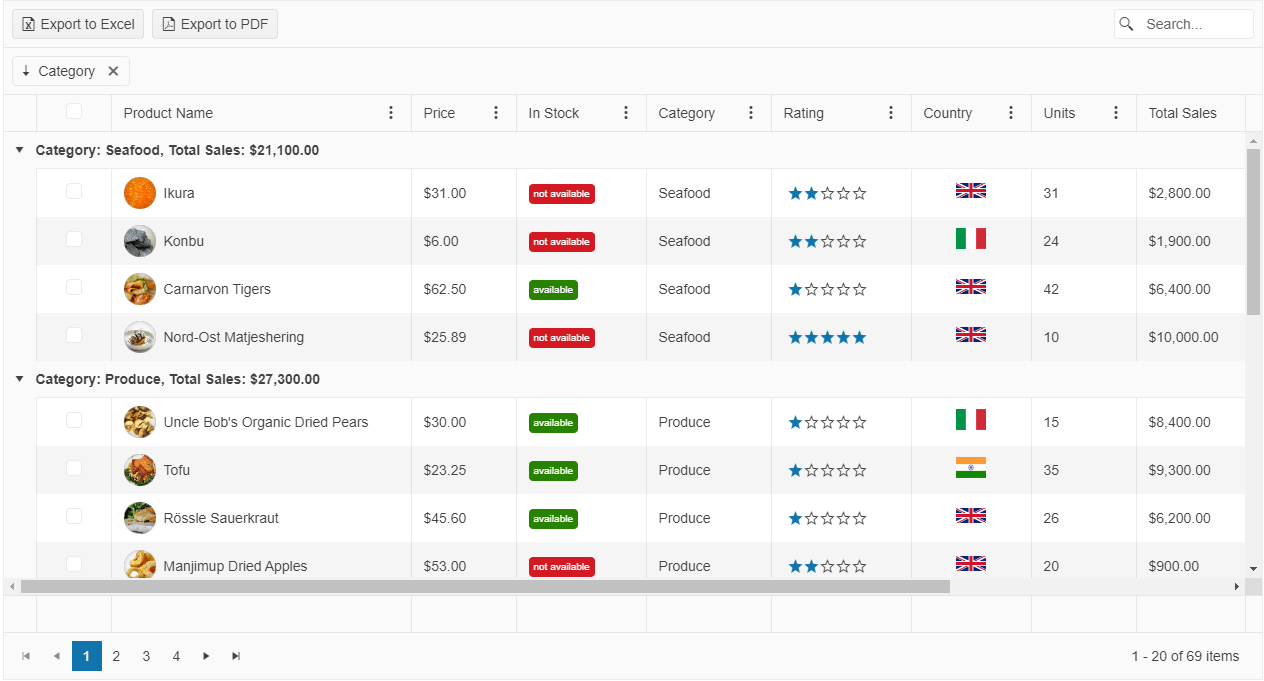
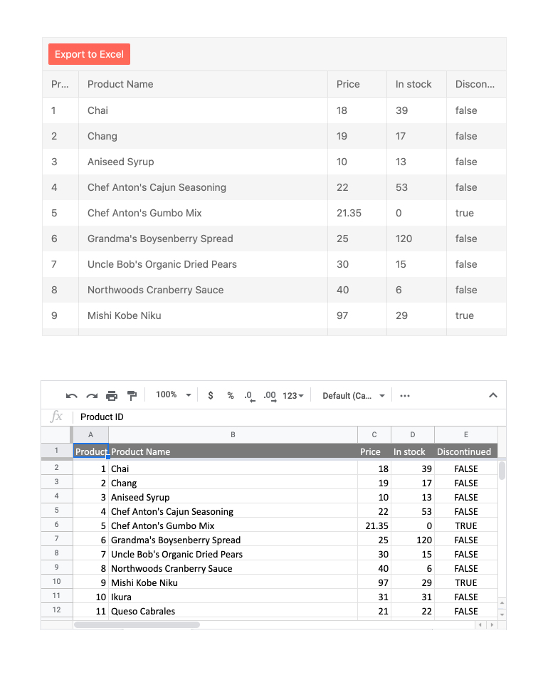
Export to PDF, Excel, and CSV
Export grid content to PDF, Excel, or CSV with customizable file names, page setup, and formatting options. Exports honor applied filters, sorting, and grouping, ensuring consistency with the current data view, while CSV provides a lightweight format for quick data extraction and integration with external tools.
See the jQuery Excel Export demo
-
Additional Features
The Kendo UI for jQuery Data Grid contains a vast number of features able to virtually any user need:
- See the jQuery Context Menu demo - Enable right-click interactions within the grid
- See the jQuery State Persistence demo - Save and restore user settings like column order and filters
- See the jQuery Selection Aggregates demo - Show totals or averages for selected rows
- See the jQuery Clipboard Support demo - Copy and paste directly from Excel
- See the jQuery Scroll to Row demo - Jump to a specific row programmatically or scroll endlessly
- See the jQuery Custom Editors demo - Replace default editors with dropdowns, date pickers, or any custom input
- See the jQuery Row Pinning demo - Allow users to fix specific rows at the top or bottom of the component.
- See the jQuery Column Templates demo - Display formatted values or interactive components in grid cells
- See the jQuery Toolbar demo - Add search boxes, custom buttons, or export tools to the grid header
- See the jQuery Column Menu demo- Offer sorting, filtering and visibility toggles from a unified dropdown
- See the jQuery Globalization and RTL demo- Localize strings, formats and layout for any culture or language
