
Kendo UI for jQuery
jQuery DropDownList
- A rich jQuery dropdown list complete with data binding, templates, event, validation, globalization, and accessibility.
- Part of the Kendo UI for jQuery library along with 120+ professionally-designed components.
- Includes support, documentation, demos, virtual classrooms, learning resources and more!

-
Overview
The jQuery DropDownList is a form component which enables users to select a single item from a popup list of options. A richer version of the HTML <select> element, the DropDownList provides flexible data binding, virtualization, cascading lists, appearance customization through templates, events, validation, accessibility, RTL support and keyboard navigation.
-
Data Binding
The jQuery DropDownList enables you to bind it to various forms of data, including datasets of complex items (objects) or an array of primitive items. Data can be locl or remote. As a part of this binding, fields can be defined to represent the text displayed to the user as well as a separate underlying value to be used by developers.
-
Server Filtering
Avoid loading unneeded data items by binding a subset of data through server filtering. This helps the DropDownList perform better and helps the user discover information by presenting a more narrow set of options.
-
Virtualization
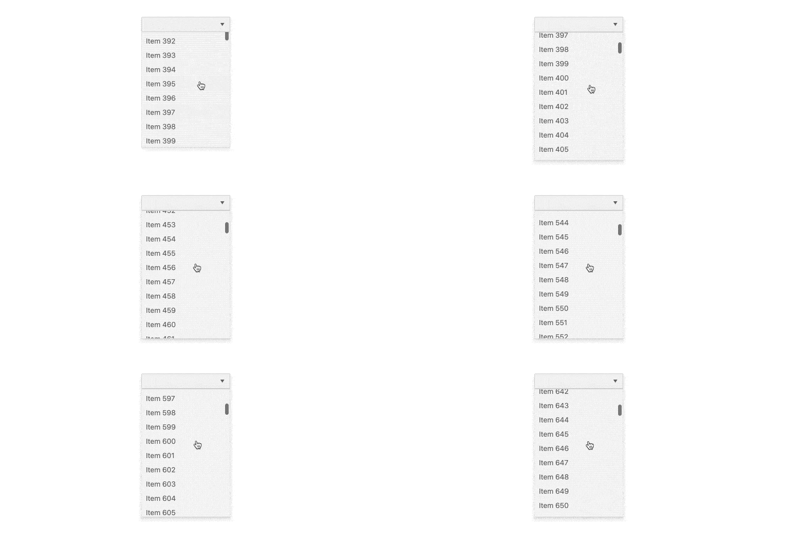
The Kendo UI for jQuery DropDownList can handle large datasets without compromising performance. It comes with built-in virtualization that can easily process hundreds of thousands of data items at the speed of the users scrolling through the available options.
-
Floating Label
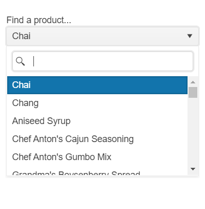
Save space while retaining the context of the form field with the DropDownList Floating Label feature. Create smoother and more efficient experience for end-users by adding a label that moves above the input upon clicking.
-
Grouping
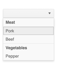
Group similar data items in natural categories to help users quickly and easily navigate and understand drop-down list. Define the field responsible for each category while you bind your dataset to the Kendo UI for jQuery DropDownList.
-
Adaptive Mode
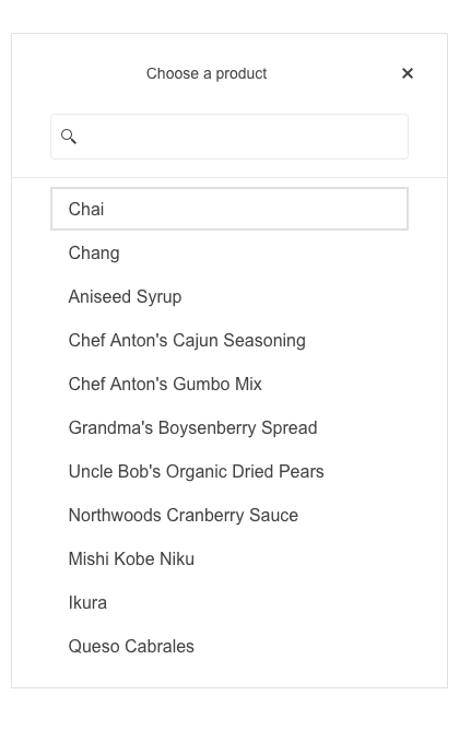
The jQuery DropDownList UI component supports an adaptive mode that provides a mobile-friendly rendering of the component popup. When enabled, the component will automatically adapt to the current screen size and will change its rendering accordingly.
-
Templates
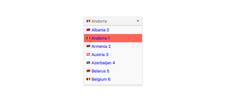
Out of the box, the DropDownList renders items as plain text. You can utilize templates to create a custom layout for each element, including the list items, the list value, the header and footer areas, as well as the message displayed when no data is connected to the jQuery DropDownList.
-
Cascading DropDownLists
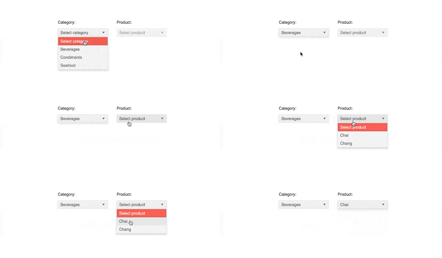
You can connect several jQuery DropDownLists to act as a data filtering mechanism—selecting a value in one affects the available options in the other. This is often referred to as Cascading DropDownLists.
-
Add New Item
The Add New Item feature is a very convient way for you to allow users to update the data set. When a user types a value in the filter box that does not exist, they will be presented with the option to add the item to the data.
-
Globalization
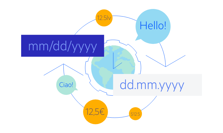
The jQuery DropDownList supports any globalization or localization scenarios. You can also enable RTL mode to display the control’s text and UI elements from left to right.
-
Keyboard Navigation
Improve accessibility and productivity with keyboard-only navigation. This component supports keyboard navigation to help navigate and interact with items.

-
Accessibility
The jQuery DropDownList is compliant with Section 508 standards, is AA rated with WCAG 2.0 and follows WAI-ARIA standards.

All Kendo UI for jQuery Components
Data Management
- Data Grid (Table)
- FileManager
- Filter
- ListView
- Pager
- PivotGrid
- PivotGrid v2
- PropertyGrid
- Spreadsheet
- TreeList
Charts
Scheduler
Media
Conversational UI
Gauges
Layout
Editors
- AutoComplete
- Captcha
- Checkbox
- CheckBoxGroup
- ColorGradient
- ColorPicker
- ComboBox
- DateInput
- DatePicker
- DateTimePicker
- DropDownList
- DropDownTree
- Image Editor
- ListBox
- MaskedTextBox
- MultiColumnComboBox
- MultiSelect
- NumericTextBox
- OTP Input
- RadioButton
- RadioGroup
- RangeSlider
- Rating
- Rich Text Editor
- Signature
- Slider
- Switch
- TextArea
- TextBox
- TimeDurationPicker
- TimePicker
- Validator
Interactivity & UX
Bar & QR Codes
Document Processing
Scheduling
Navigation
File Management
Diagrams and Maps
Barcodes
Framework
