Kendo UI for jQuery
jQuery CircularProgressBar
- Instead of using the typical linear progress bar, use this jQuery component to show progress on a circular gauge.
- Part of the Kendo UI for jQuery library along with 120+ professionally-designed components.
- Includes support, documentation, demos, virtual classrooms, learning resources and more!

-
Overview
The jQuery CircularProgressBar functions just as a typical linear progress bar except it shows progress of process on a circle, much like a gauge. This is great for any process where you need to show users progress. It is commonly used for loading pages, files, or data, but can also be used for user processes such as multi-step forms.
-
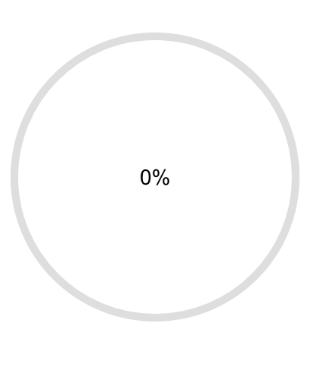
Indeterminate Progress
In cases where the total time a loading process will take is not determined, you can use this mode to show infinite progress. It essentially becomes a loading indicator. All you need to do is set the “indeterminate” property to true.
See the jQuery CircularProgressBar Indeterminate Progress demo

-
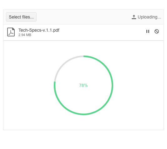
Center Templates
Much like the circular gauge, the jQuery CircluarProgressBar allows you to display custom text or HTML in the center. This is typically used to show percentage progress.
-
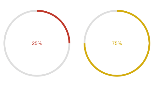
Colors
The colors feature helps you make this version of the progress bar really stand out. By setting a few properties, you can render the indicator in a different color based on the value.