Kendo UI for jQuery
jQuery MultiColumnComboBox
- Display selectable options in a drop-down table with full support for data binding, filtering. sorting, and more.
- Part of the Kendo UI for jQuery library along with 120+ professionally-designed components.
- Includes support, documentation, demos, virtual classrooms, learning resources and more!
-
Overview
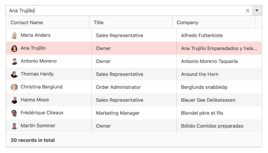
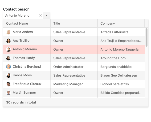
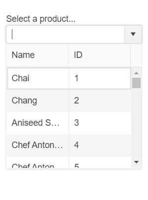
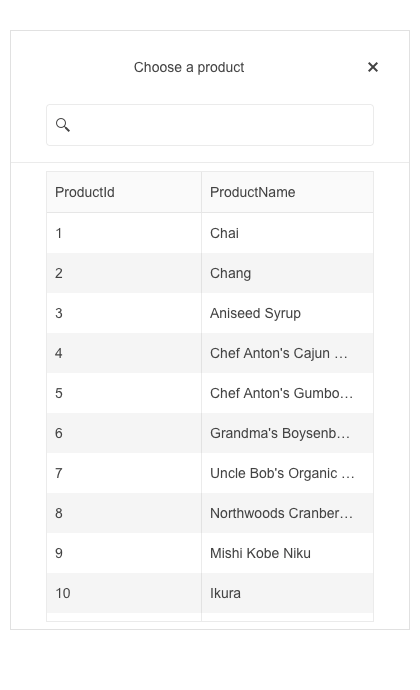
The jQuery MultiColumnComboBox is a form component that lets you choose from a table-structured list of options from a popup. It is a richer version of the <select> element and supports data binding, filtering, templates, and the entering of custom values.
-
Data Binding
The MultiColumnComboBox supports binding of data objects to fill columns of data from local or remote sources. All you need to do is define text, value, and columns and the MultiColumnComboBox will fill in the popup table for you.
Read the jQuery MultiColumnComboBox Data Binding documentation
-
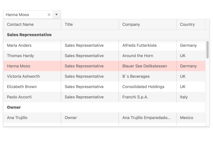
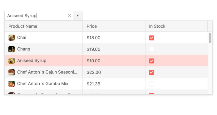
Filtering
Ensure users have an intuitive experience when looking for info with the built-in filtering feature. It helps you reduce the available data items inside the dropdown and you can configure the filtering settings by including conditional rules such as “starts with” or “contains”. You can also set default filters on the server level.
-
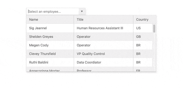
Virtualization
The jQuery MultiColumnComboBox can handle large datasets without compromising performance. It comes with built-in virtualization that can easily process hundreds of thousands of data items by loading information as the user scrolls.
-
Floating Label
Providing a smoother and more efficient experience to end-users is available to you with the MultiColumnComboBox floating label feature. It allows you to add a label that moves above the input upon clicking, thus saving space and retaining the context of the form field.
-
Adaptive Mode
The jQuery MultiColumnComboBox UI component supports an adaptive mode that provides a mobile-friendly rendering of the component popup. When enabled, the component will automatically adapt to the current screen size and will change its rendering accordingly.
-
Grouping
Organize data in categories to easily skim datasets. You can define what field in your data is responsible for the group and the component will automatically group the underlying data accordingly.
-
Templates
Out of the box, the MultiColumnComboBox renders items as plain text. You can use templates to create custom layouts for every element of the component including columns, headers, footers, groups, and even elements with no data.
-
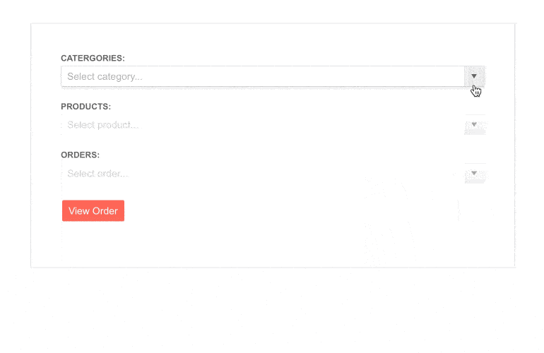
Cascading MultiColumnComboBoxes
Use multiple MultiColumnComboBoxes to help users drill down to the data they need. In this scenario selections in each combo box will filter the available options in the next.
-
Add New Item
The MultiColumnComboBox includes a text field in which users can input text when looking for items. If the item is not found, the component will automatically present the user with a “Add New Item” button that will update the list.
-
Prefix and Suffix Adornments
Elevate user interactivity leveraging the option for adding prefix and suffix adornments. These are custom items, usually an icon or button, inside the field before or after the input area. Typical prefix adornments are currency symbols or unit indicators, while suffix adornments are often used for password visibility toggles, formatting or clearing the input.
-
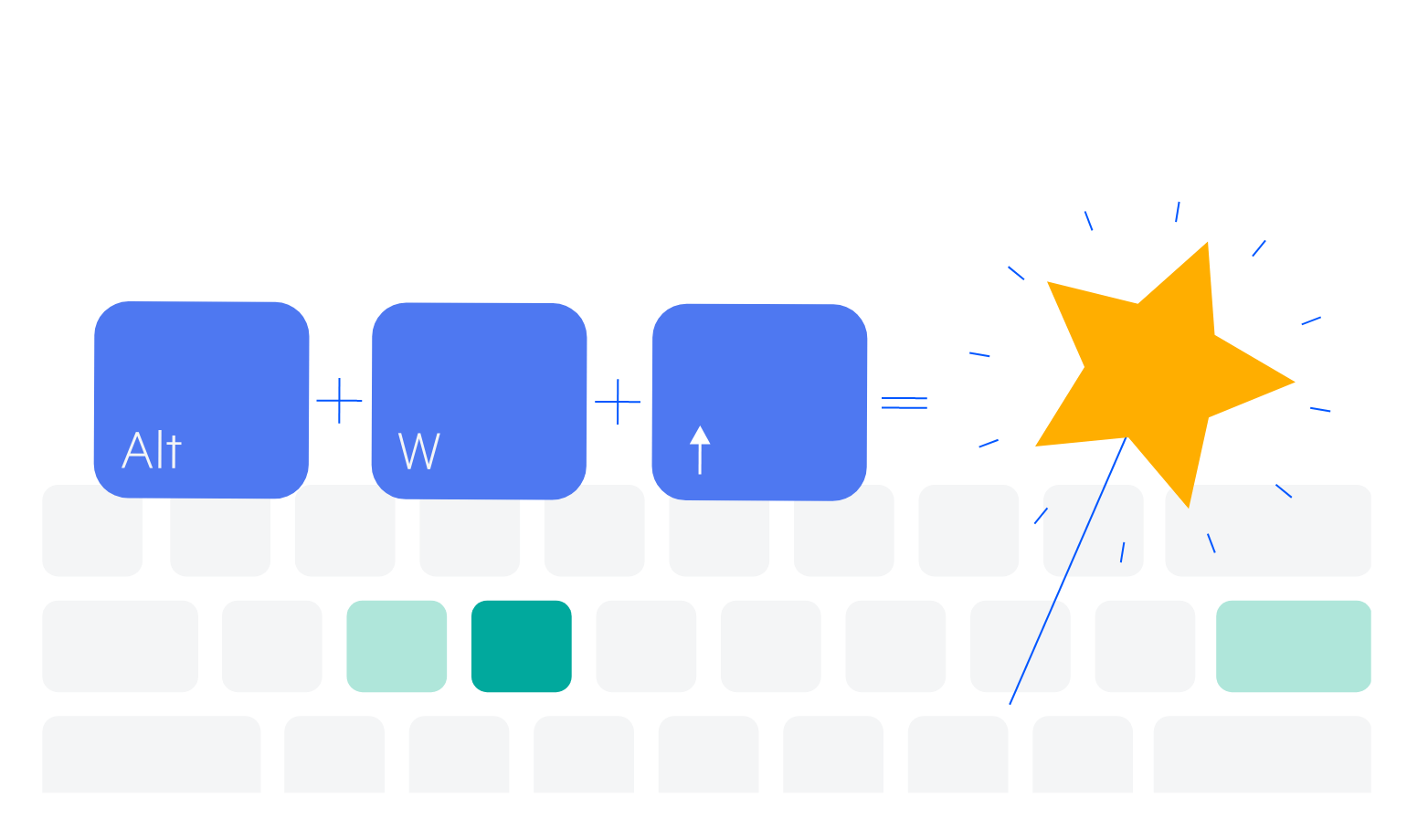
Keyboard Navigation
Improve accessibility and productivity with keyboard-only navigation. This component supports keyboard navigation to help navigate and interact with items.
-
Accessibility
The jQuery Menu is compliant with Section 508 standards, is AA rated with WCAG 2.0 and follows WAI-ARIA standards.
Read the jQuery MultiColumnComboBox Accessibility documentation