Kendo UI for jQuery
jQuery DatePicker
- Give users the choice to manually enter or pick dates from a calendar with this ready-to-use jQuery component.
- Part of the Kendo UI for jQuery library along with 120+ professionally-designed components.
- Includes support, documentation, demos, virtual classrooms, learning resources and more!

-
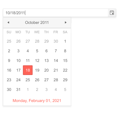
Overview
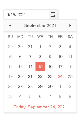
The Kendo UI for jQuery Date Picker component provides a sleek and intuitive interface for users to enter and select dates. It renders as a simple input element that allows users to either manually type in dates or quickly and visually pick dates and date ranges from a popup calendar.
-
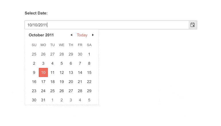
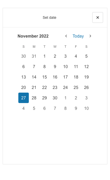
Classic and Modern Modes
Make the jQuery DatePicker fit your look and feel by choosing from a traditional or modern layout and design.
-
Templates
Customize the look and feel of the different Kendo UI for jQuery DatePicker child components with templates. You can specifically tailor the built-in Calendar elements all the way to the cell level to match your brand and application style.
-
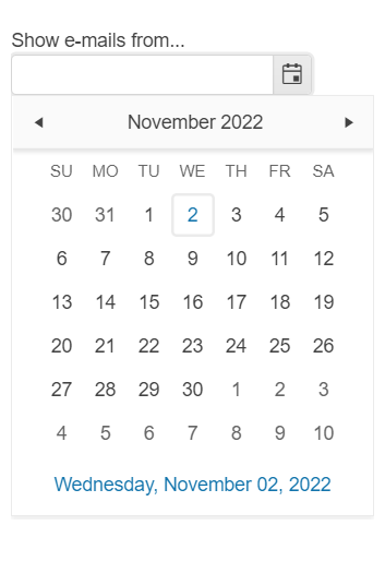
Floating Label
Ensure a smoother and more efficient experience for users with the jQuery DatePicker floating label feature. The floating label moves above the input when it is focused, thus saving space and keeping the context of the form field.
-
Disabled Dates
By default, the jQuery DatePicker is enabled and fully interactive. You can prevent date selection by setting a simple disableDates property. Common uses are disabling weekends and holidays. In a more advanced case, you can disable dates already booked in a reservations system.
-
Adaptive Mode
The jQuery DatePicker supports an adaptive mode thatwhich provides a mobile-friendly rendering of its popup. When enabled, the component will automatically adapt to the current screen size and will change its rendering accordingly.
See the jQuery DatePicker Adaptive Mode demo
-
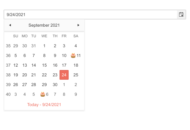
Week Column
You can add the week number, one through 52, to any date or date range with the Week Column feature. The Kendo UI for jQuery DatePicker component can show or hide a column responsible for displaying the week number next to each week displayed in the calendar.
-
Start View and Navigation Depth
The Start View Selection Depth feature of the Kendo UI for jQuery DatePicker enables you to set the initial view and limit or expand the depth of the calendar to which the user can navigate. You can define how far users can zoom in on a date selection or zoom out of a date by for example narrowing down the selection options to only selecting a year and a month or only a month of a particular year.
Read the jQuery DatePicker Start View and Navigation Depth documentation
-
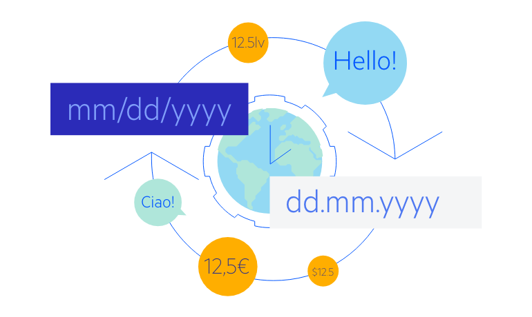
Globalization
The jQuery DatePicker supports any globalization or localization scenarios. You can also enable RTL mode to display the control’s text and UI elements from left to right.
-
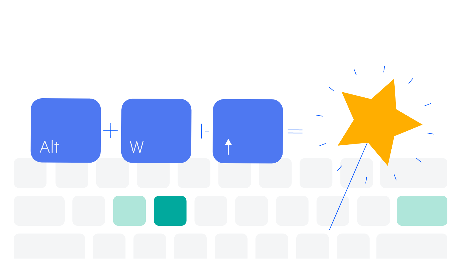
Keyboard Navigation
Improve accessibility and productivity with keyboard-only navigation. This component supports keyboard navigation to help navigate and interact with dates.
-
Accessibility
The jQuery DatePicker is compliant with Section 508 standards, is AA rated with WCAG 2.0 and follows WAI-ARIA standards.