Kendo UI for jQuery
jQuery Card
- Group information and related actions in a modern card format. Supports multi-media, drag-and-drop, and more.
- Part of the Kendo UI for jQuery library along with 120+ professionally-designed components.
- Includes support, documentation, demos, virtual classrooms, learning resources and more!

-
Overview
The jQuery Card is a common layout element in modern web applications. It groups together content and actions about a single subject in a visually pleasing container. The Card can stand alone, but really shines when combined with components such as the jQuery ListView or TaskBoard to display a collection of cards. Each Card comes with content, title and subtitle, action button areas, images and footers.

-
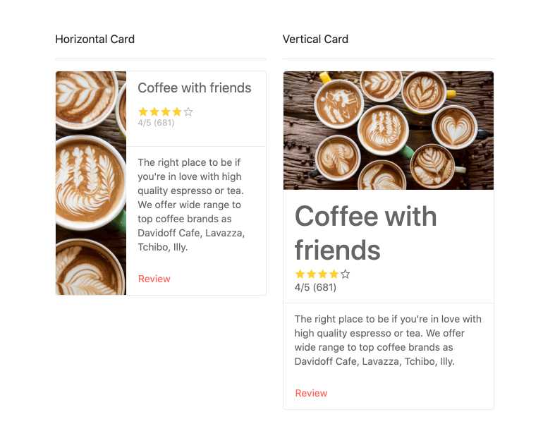
Orientation
Each jQuery Card is made of building blocks such as image and text. You can choose to direct the component to lay these out either horizontally or vertically.
-
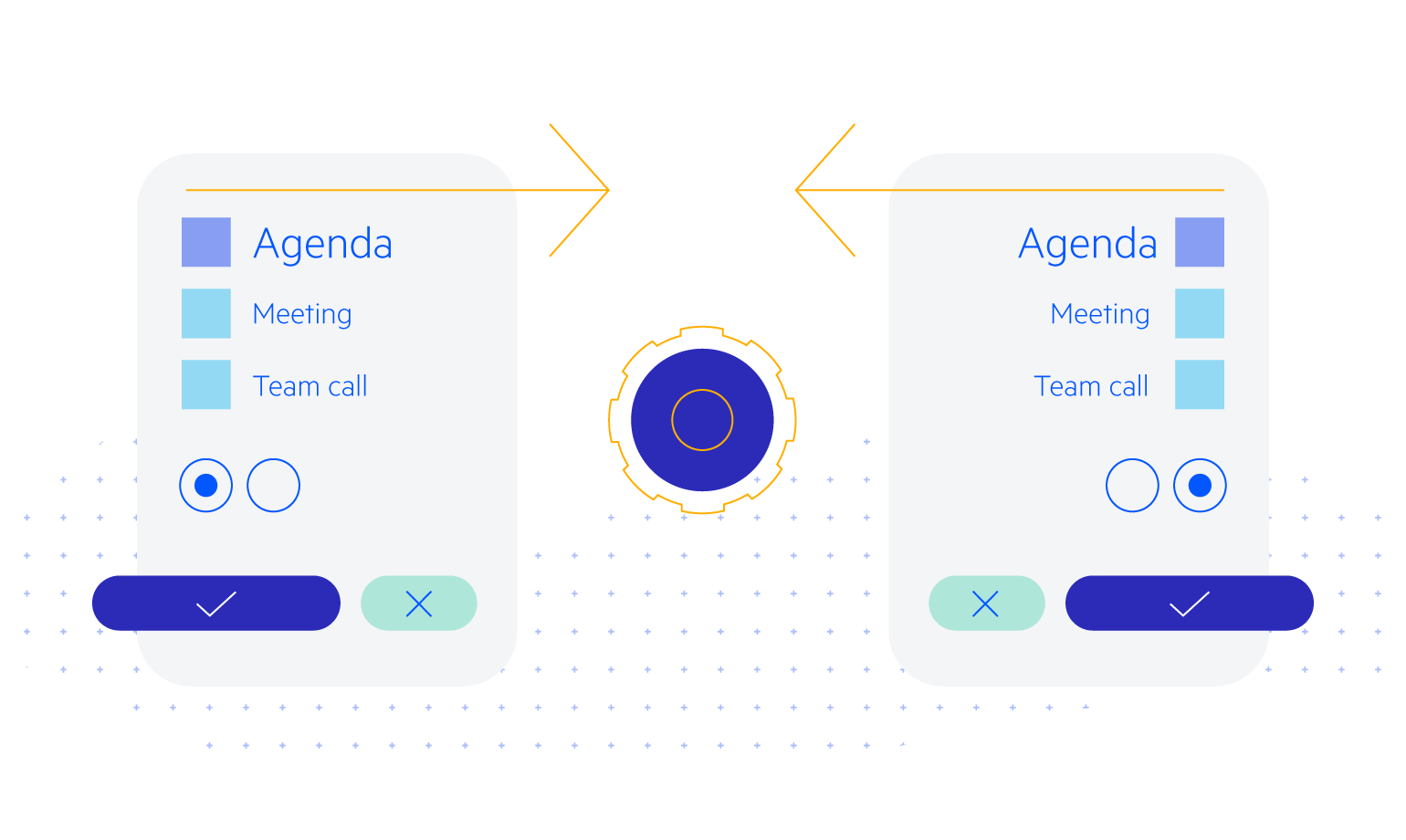
Action Buttons
Each jQuery Card has an area reserve for buttons related to the content. These can execute any action you need. For example, you can add like, comment, and share buttons. Or save and edit buttons. Furthermore, the style and content of these buttons can be virtually anything.
-
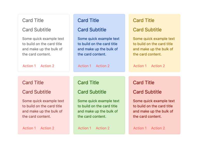
Card Types
To make development even faster and help you create familiar-looking web pages, the jQuery Card component includes various built-in card types. These include “warning”, “error”, and sever more. You can also use templates to create your own.
-
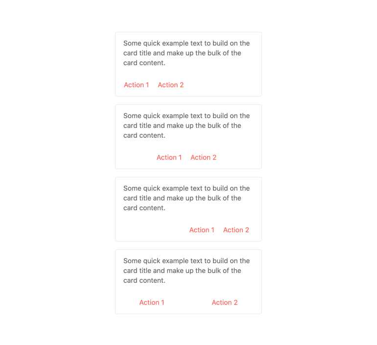
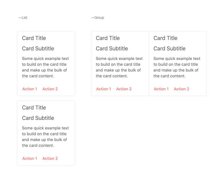
Layouts
When displaying multiple jQuery Card components, there are several built-in layouts to help display cards in various ways, including building a list from top to bottom as well as rendering the cards side-by-side.
-
Media
The jQuery Card component can display virtually anything. Augment your text witch media such as text and video.
-
Drag and Drop
The jQuery Card component isn’t just a static list of items, you can allow your users to arrange cards in a container or move between containers using drag and drop.
-
Globalization
The jQuery Card supports any globalization or localization scenarios. You can also enable RTL mode to display the control’s text and UI elements from left to right.