Kendo UI for jQuery
jQuery TimeDurationPicker
- Allow a user to type or select a specific time duration, leveraging the built-in list of values for days, hours, minutes, seconds and milliseconds with the Kendo UI for jQuery TimeDurationPicker component.
- Part of the Kendo UI for jQuery library along with 120+ professionally-designed components.
- Includes support, documentation, demos, virtual classrooms, learning resources and more!
-
Overview
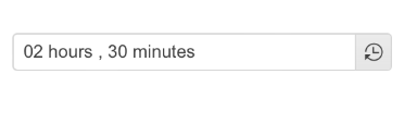
The Kendo UI for jQuery TimeDurationPicker component enables users to select a particular time duration, without the necessity to provide a specific date, range of dates or time slot. Instead, they are empowered to determine how many days, hours, minutes, or seconds an activity (e.g., online session, event, work project, etc.) is expected to take. Users can either type the desired time duration or pick a value from the component popup with built-in shortcut values.

-
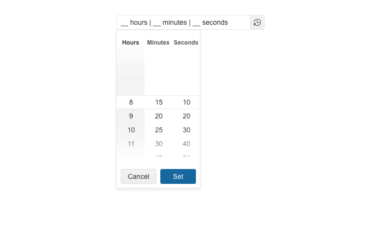
Columns
Configure the columns in the Kendo UI for jQuery TimeDurationPicker component popup with ease. You can determine the columns number, specify format for each one of them and constrain the allowed selectable values.
-
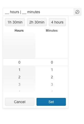
Shortcuts
Effortlessly add shortcuts for your users in the form of button elements to the TimeDurationPicker component popup. These button elements can have predefined values and upon clicking on one of them, the value of the TimeDurationPicker gets updated. This is useful for activities or events with repetitive duration time.
-
Appearance
Simply turning an input element into a time duration picker is not enough—you must also be equipped with the right options to customize its appearance. That’s why the Kendo UI for jQuery TimeDurationPicker component comes with various options, allowing you to control its size, fill mode and border radius. Additionally, you can easily switch between the available themes and swatches to test what colors match your needs.

-
Adaptive Mode
The jQuery TimeDurationPicker UI component supports an adaptive mode that provides a mobile-friendly rendering of its popup. When enabled, the component will automatically adapt to the current screen size and will change its rendering accordingly.
-
Events
Ensure smooth interaction with the component thanks to the jQuery TimeDurationPicker’s set of events:
- Change event – triggered when the selected time duration is changed
- Open event – fires when the TimeDurationPicker component is opened
- Close event – triggered when the TimeDurationPicker component is closed
-
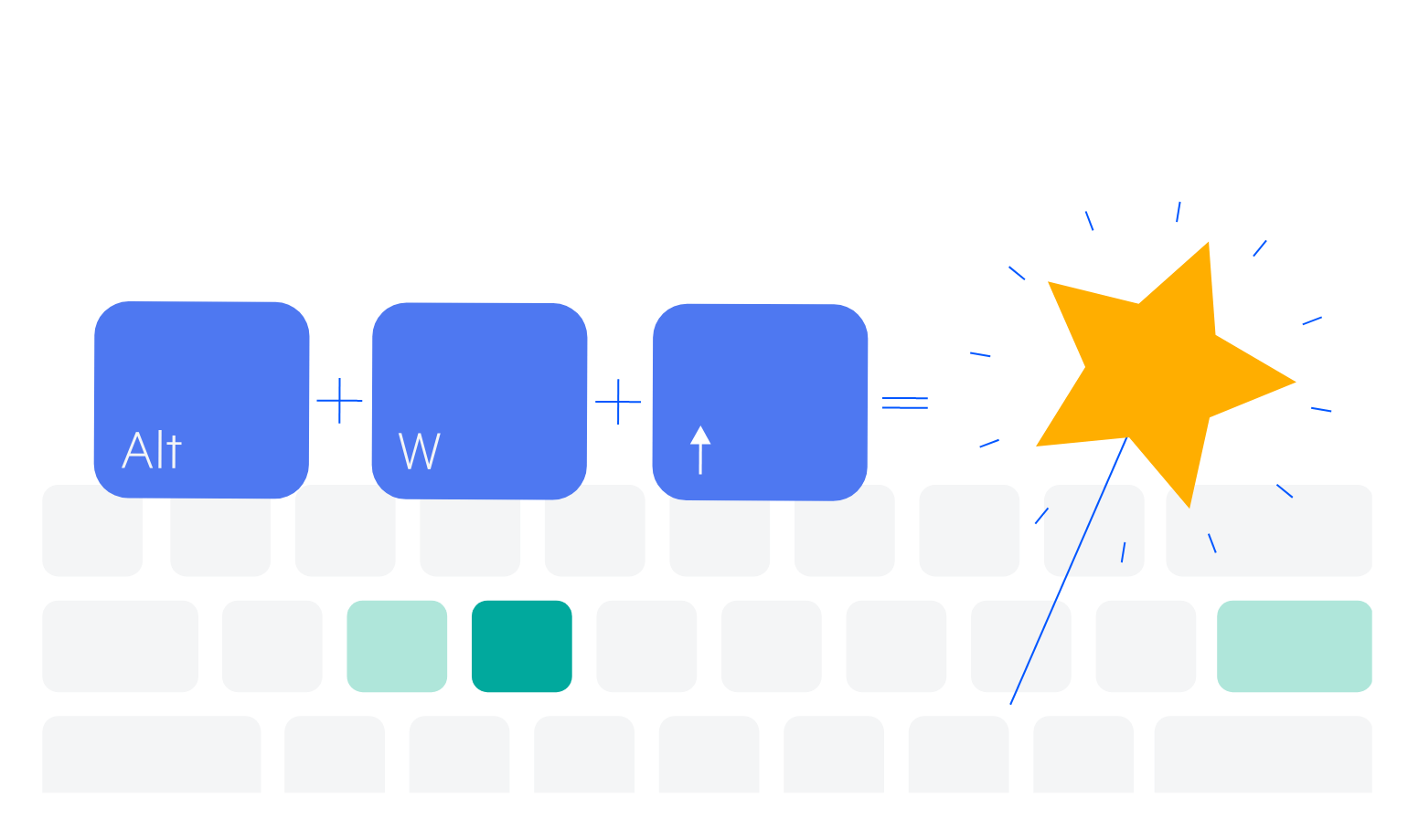
Keyboard Navigation
Improve accessibility and productivity with keyboard-only navigation. This component supports keyboard navigation to help navigate the jQuery TimeDurationPicker and assist with selecting a value using the keyboard alone.
-
Theming
The jQuery TimeDurationPicker component supports four built-in themes, including Default (our own Telerik-infused styling), Material (based on the Material Design guidelines), Bootstrap and Fluent. Additionally, you can customize any of the ready-to-use themes with a few lines of CSS or create a new one to match your branding needs by using the Progress ThemeBuilder application.