Kendo UI for jQuery
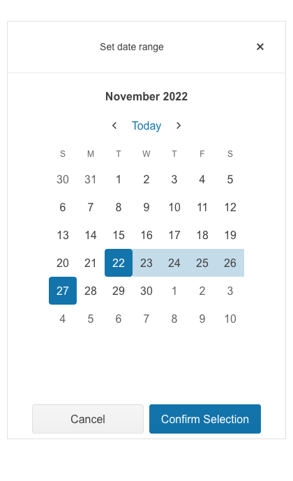
jQuery DateRangePicker
- Allow users to select a range of dates using multiple side-by-side jQuery DatePickers.
- Part of the Kendo UI for jQuery library along with 120+ professionally-designed components.
- Includes support, documentation, demos, virtual classrooms, learning resources and more!
-
Overview
The Kendo UI for jQuery DateRangePicker component provides users with a sleek and intuitive interface to select a range of dates over multiple side-by-side calendars. The jQuery DateRange component is comprised of two jQuery DateInputs—for the start date and end date, respectively. Combining these jQuery UI components into a single composite component gives developers the full power of each individual component when it comes to customization and configuration options.
-
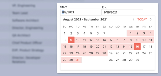
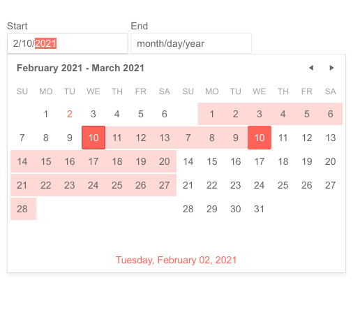
Date Range
The Kendo UI for jQuery DateRange component can handle any future or past date the user provides. For scenarios that require you to limit the range of dates available to users, use the built-in MultiViewCalendar min and max properties to define the earliest and latest dates that can be selected by the user.
-
Disabled Dates
By default, the jQuery DateRanePicker is enabled and fully interactive. You can prevent date selection by setting a simple disableDates property. Common uses are disabling weekends and holidays. In a more advanced case, you can disable dates already booked in a reservations system.
Read the jQuery DateRangePicker Disabled Dates documentation
-
Adaptive Mode
The jQuery DateRangePicker UI component supports an adaptive mode that provides a mobile-friendly rendering of its popup. When enabled, the component will automatically adapt to the current screen size and will change its rendering accordingly.
-
Start View and Navigation Depth
The Start View Selection Depth feature of the Kendo UI for jQuery DatePicker enables you to set the initial view and limit or expand the depth of the calendar to which the user can navigate. You can define how far users can zoom in on a date selection or zoom out of a date by for example narrowing down the selection options to only selecting a year and a month or only a month of a particular year.
Read the jQuery DateRangePicker Start View and Navigation Depth documentation
-
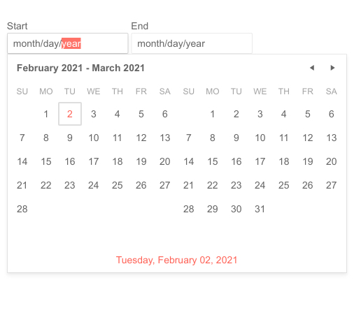
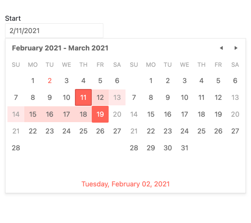
Selected Dates
Help give your users a great experience by preselecting a date range when the scenario calls or it.
Read the jQuery DateRangePicker Selected Dates documentation
-
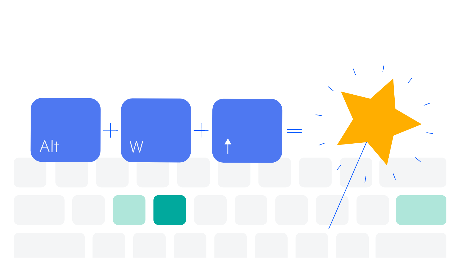
Keyboard Navigation
Improve accessibility and productivity with keyboard-only navigation. This component supports keyboard navigation to help navigate and interact with dates.