Kendo UI for jQuery
jQuery Rating
- The jQuery Rating component gives your users an enjoyable way to rate content as they can enter a score with a simple click.
- Part of the Kendo UI for jQuery library along with 120+ professionally-designed components.
- Includes support, documentation, demos, virtual classrooms, learning resources and more!

-
Overview
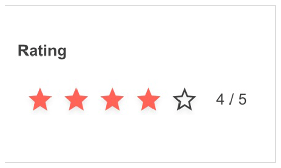
The jQuery Rating component allows users to rate items with a certain number of stars or any other preferred shape, such as hearts, circles and more. The component features Selection, Precision, Labels, Tooltip and Templates settings for full customization.

-
Selection Modes
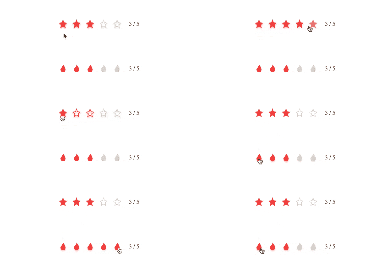
The jQuery Rating component offers two selection modes. The most typical is one in which all indicators are selected up to the one selected. Optionally, only the clicked indicator will be selected.

-
Precision
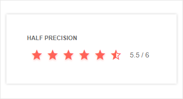
It is common that you need to give users the ability to rate something other than a whole number. By modifying the precision property, you can enable users to give a 4.5/5 rating or constrain the rating to an integer value.

-
Labels
Depending on your preference, you can add a label to the component to show the current rating’s numeric value. It can be displayed either as “3/6” or “3 out of 6”. If you prefer, you can also disable labels altogether. See the jQuery Rating demo
-
Tooltips
By default, the jQuery rating component will show a tooltip containing the ratings numeric value on hover. This can easily be disabled.
-
Templates
Much like the rest of Kendo UI for jQuery, the Rating component gives you the ability to completely customize the appearance to fit your design requirements.
-
Keyboard Navigation
Improve accessibility and productivity with keyboard-only navigation. This component supports keyboard navigation to help navigate and interact with items.

-
RTL Support
Right-to-left support is available for languages like Arabic and Hebrew, in which users read from right to left. You can satisfy any script preference and ease user interaction by toggling between left-to-right and right-to-let alignment with only a few settings.

All Kendo UI for jQuery Components
Data Management
- Data Grid (Table)
- FileManager
- Filter
- ListView
- Pager
- PivotGrid
- PivotGrid v2
- PropertyGrid
- Spreadsheet
- TreeList
Charts
Scheduler
Media
Conversational UI
Gauges
Layout
Editors
- AutoComplete
- Captcha
- Checkbox
- CheckBoxGroup
- ColorGradient
- ColorPicker
- ComboBox
- DateInput
- DatePicker
- DateTimePicker
- DropDownList
- DropDownTree
- Image Editor
- ListBox
- MaskedTextBox
- MultiColumnComboBox
- MultiSelect
- NumericTextBox
- OTP Input
- RadioButton
- RadioGroup
- RangeSlider
- Rating
- Rich Text Editor
- Signature
- Slider
- Switch
- TextArea
- TextBox
- TimeDurationPicker
- TimePicker
- Validator
Interactivity & UX
Bar & QR Codes
Document Processing
Scheduling
Navigation
File Management
Diagrams and Maps
Barcodes
Framework
