UI for ASP.NET Core
ASP.NET Core PanelBar
- Use the ASP.NET Core PanelBar to logically separate app content for a more intuitive user flow.
- Part of the Telerik UI for ASP.NET Core library along with 120+ professionally designed UI components.
- Includes support, documentation, demos, virtual classrooms, Visual Studio Code Extensions and more!

-
Overview
The ASP.NET Core PanelBar is a flexible navigational component suitable for any mobile and desktop environment. It offers an Outlook-style navigation system with a set of expandable panels giving you the option to show and hide content. Perfectly suited for information-rich apps, the component logically separates the information for a less crowded UI and intuitive user flow.
See the ASP.NET Core PanelBar in action
-
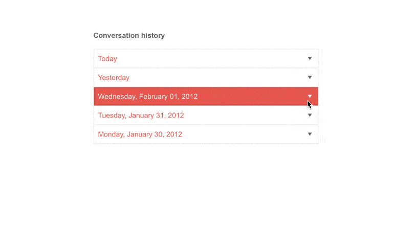
Expand Modes
The ASP.NET Core PanelBar supports both a single and a multiple expand modes. Depending on the amount of content and screen space, you can choose the way panel items expand via the ExpandMode property. Check out the documentation page to learn more.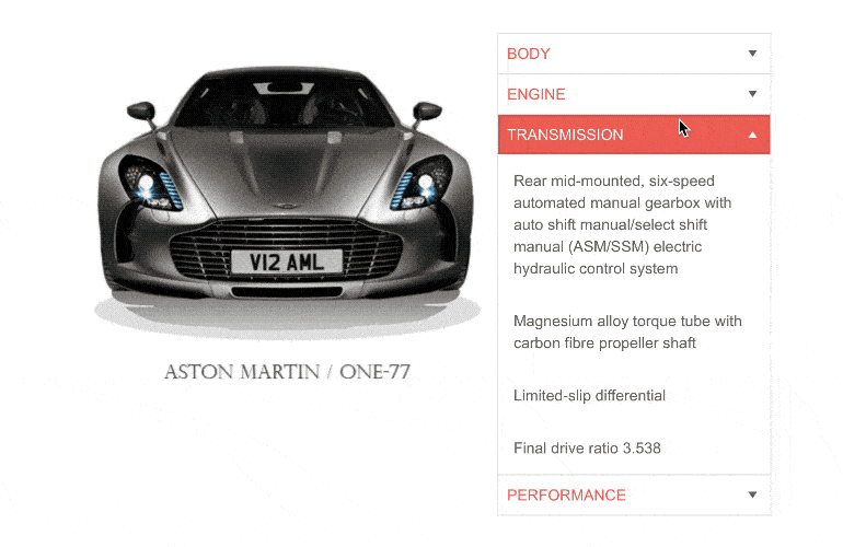
-
Images
You can decorate the PanelBar items with icons and images to enhance the navigation experience and help your users find the panel item they are looking for. Choose from a wide variety of images or sprites such as national flags and sport category icons to match the unique requirements of your app.
See how the images work in ASP.NET Core PanelBar Demo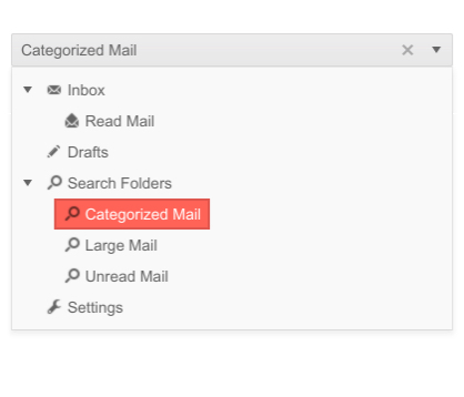
-
Animations
Utilize the built-in animations of the Core component for expanding and collapsing your items, enabling slick interactions and visually appealing indications of when an item is interacted with.
-
Templates
The PanelBar component offers flexible customization options to match the look and feel of your application—you can choose from unique templates for certain items or for all of them.
See more about ASP.NET Core PanelBar Templates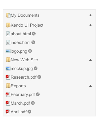
-
Data Binding
You can insert data into the Telerik ASP.NET Core PanelBar by declaring all items within the HTML helper. However, you can also use the data-binding approach to local data – on the server, or remote data – through the DataSource configuration object. Find out more on our documentation page.
-
Flexible Client and Server-side API
Use the rich server- and client-side API found within the PanelBar component to implement advanced and specific scenarios. The available public methods, properties and events provide robust functionalities such as enable/disable, expand/collapse or add/remove the panel items.
-
HTML & TAG Helpers
Telerik UI for ASP.NET Core offers two options for declaring UI components – through HTML or Tag Helpers. You can choose the approach based on your preference, technology background or team development practice. Both methods allow you to lay out the PanelBar component and its configuration with a simple and easy-to-read HTML-like or Razor syntax.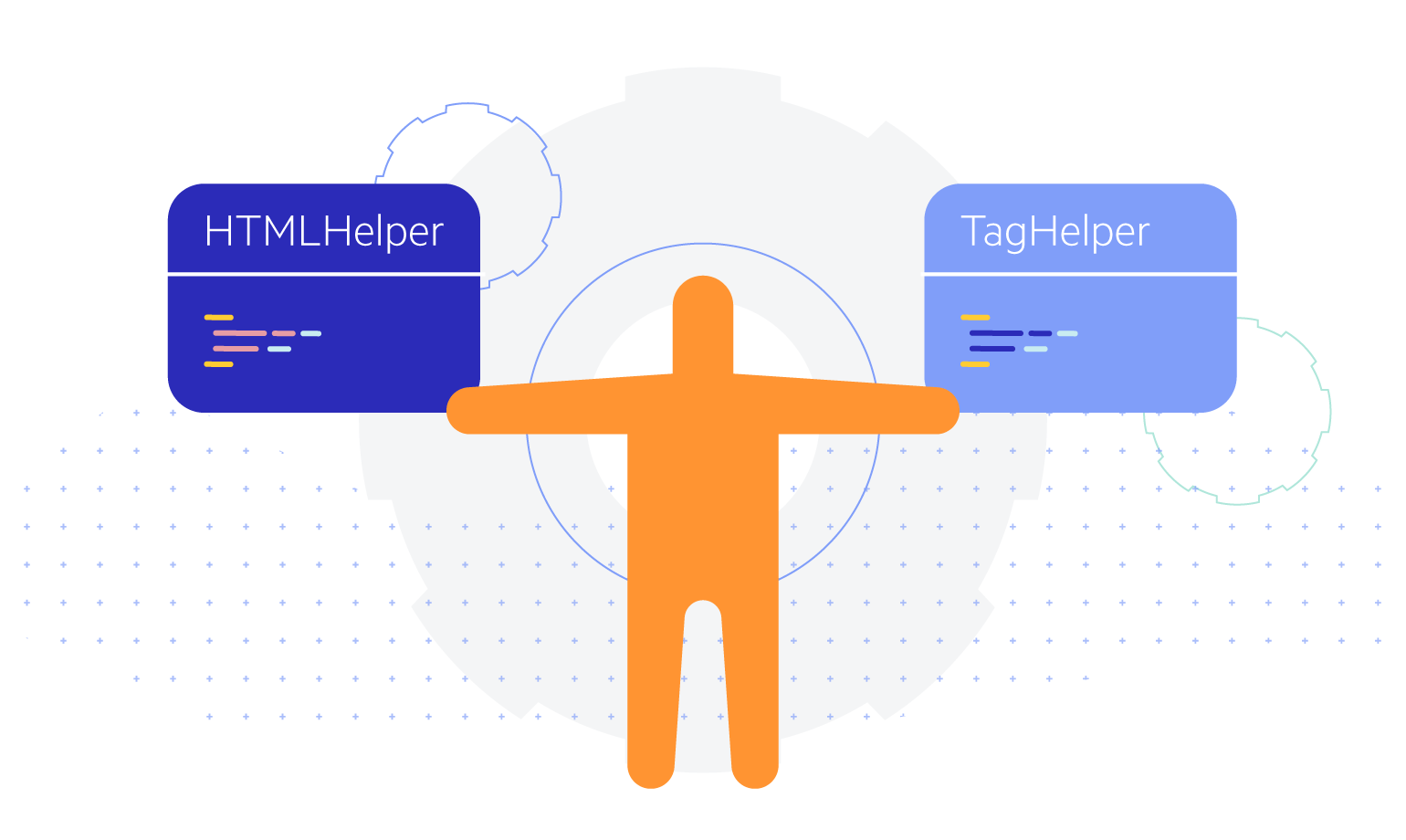
-
RTL Support
Right-to-left support is available for languages like Arabic and Hebrew, in which users read from right to left. By toggling between left-to-right and right-to-let alignment, you can satisfy any local preference and ease user interaction with the component.
See how RTL Support works in ASP.NET Core PanelBar Demo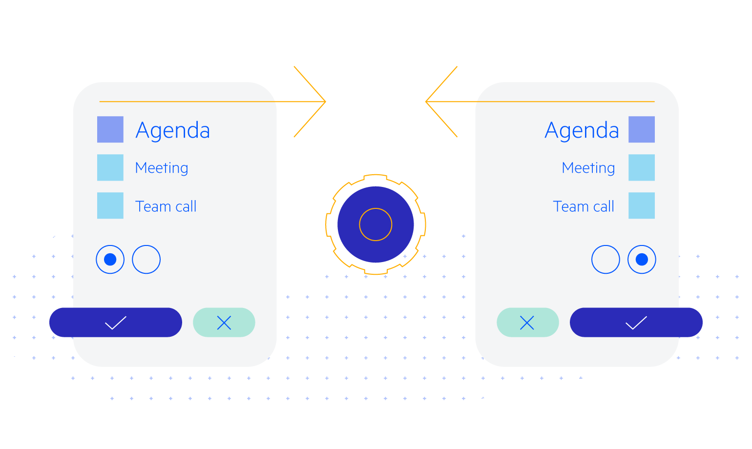
-
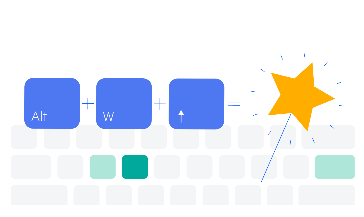
Keyboard Navigation
The PanelBar is accessible to all users thanks to the built-in keyboard navigation that allows easy navigation and interaction with the component. Once the control is focused, users can easily navigate through the panel-bar items with quick keystroke combinations.