
UI for ASP.NET Core
ASP.NET Core LinearGauge
- Utilize the ASP.NET Core LinearGauge component to visualize data on a linear scale.
- Part of the Telerik UI for ASP.NET Core library along with 120+ professionally designed UI components.
- Includes support, documentation, demos, virtual classrooms, Visual Studio Code Extensions and more!
-
Overview
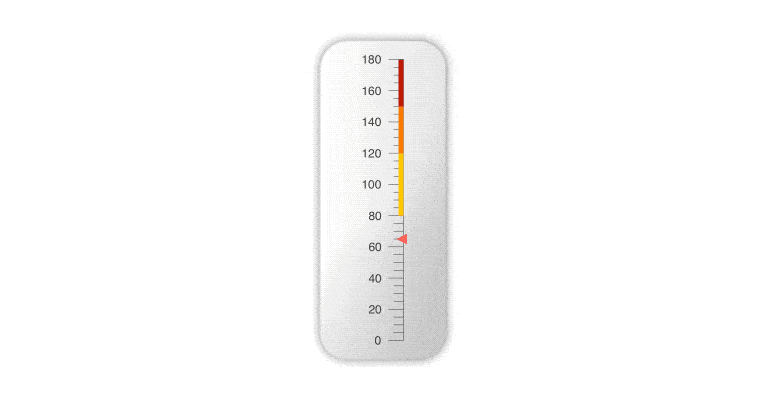
The ASP.NET Core Linear Gauge is here to help you visualize data on a linear scale. Doesn’t matter if it’s a temperature value or a Ph level, you can illustrate any value on the scale and provide ranges so the user can easily interpret the results. In case you want to illustrate multiple results, you can use the multiple pointers functionality and display more than one value.
-
Scale Options
The Linear Gauge component offers three different scale options allowing you to customize its orientation, labels and ranges.
-
Multiple Pointers
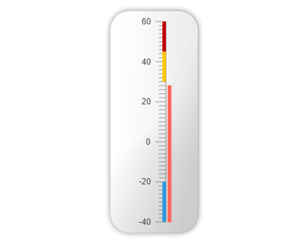
The Telerik UI for ASP.NET Core Linear Gauge supports multiple pointers: thus, you can easily visualize multiple values on the same scale. This can be utilized in many scenarios including thermometers displaying various temperature values, Ph meters showing the different Ph levels of water and other drinks etc.
Check out the ASP.NET Core LinearGauge Multiple Pointers demo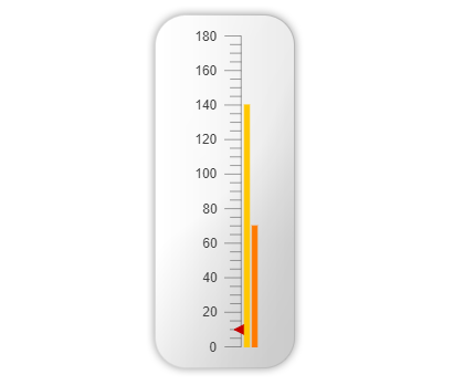
-
Export to PDF, Image or SVG
Adjusting all values on the scale is important, but not as important as having a way to export and present the information. That is why the ASP.NET Core Linear Gauge can be exported to three different formats for your convenience – PDF, Image and SVG. -
Server- and Client-Side API for Maximum Flexibility
Telerik UI for ASP.NET Core comes with a complete server-side API. With simple API calls, you can configure all features of the Gauges. You also have full access to the client-side API, as the sever wrappers output the JavaScript. -
HTML and Tag Helpers
Telerik UI for ASP.NET Core offers two options for declaring UI components – through HTML or Tag Helpers. You can choose which approach to use for the LinearGauge component based on preference, technology background or team development practice. Both HTML and Tag helpers allow you to lay out the components and their configuration with a simple and easy-to-read HTML-like syntax.
-
LinearGauge Theming
The LinearGauge component has several built-in themes and swatches. Explore the Default (our own styling), Material (based on the Material Design guidelines), Bootstrap (which looks like the Bootstrap styling to integrate better) and Fluent (based on Microsoft Fluent UI) themes and choose the swatch that meets your design requirements.
You can easily customize any theme with a few lines of CSS or create a new one with the Progress SASS ThemeBuilder application to exactly match your colors and branding.
