
UI for ASP.NET Core
ASP.NET Core Dialog
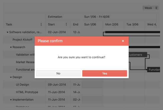
- The ASP.NET Core Dialog component allows you to ask users for input in the form of a popup dialog window.
- Part of the Telerik UI for ASP.NET Core library along with 120+ professionally designed UI components.
- Includes support, documentation, demos, virtual classrooms, Visual Studio Code Extensions and more!
-
Overview
The Telerik UI for ASP.NET Core Dialog component is a modal popup used to bring information to the user. It asks for input or a decision, which can be made through the action buttons. It comes with built-in keyboard navigation and RTL support.
See the ASP.NET Core Dialog in action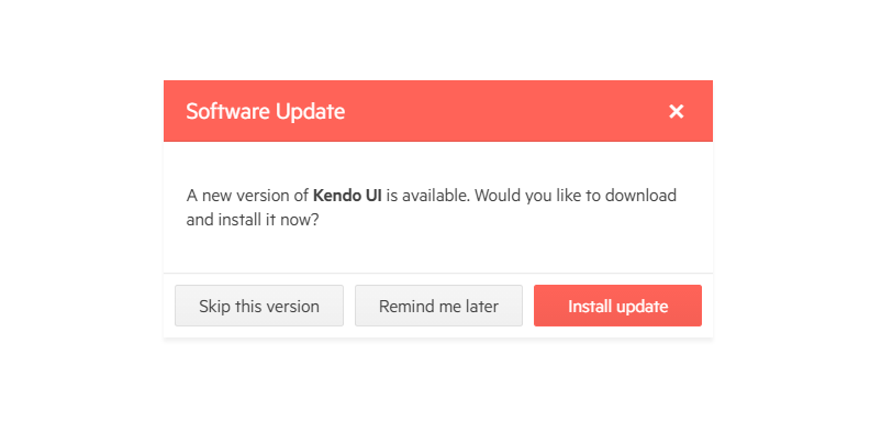
-
Action Buttons
The component's action buttons allow you to provide specific interaction to users. Each of the buttons has a text and an action handler. By default, each button closes the Dialog as its last action, however you can easily cancel this.
Read more about the ASP.NET Core Dialog Action Buttons in our documentation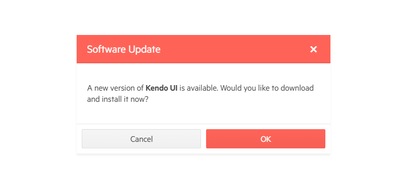
-
Predefined Dialogs
Similarly to the browser dialogs, the predefined dialogs of the ASP.NET Core Dialog popup are Alert, Confirm and Prompt. You can easily change and customize them to match the style of your application by removing the buttons you do not need, changing the Alert icon etc. -
Dimensions
The ASP.NET Core Dialog does not have a default preset height or width. Its size depends solely on its content. If the Dialog contains horizontally expandable block-level elements it will expand until it touches the right edge of the browser. However, it lacks restrictions over the dimensions for vertical expanding. -
Events
The Telerik UI for ASP.NET Core Dialog component fires a variety of events defining the text, animation, height, width and more.
See more in the ASP.NET Core Dialog Events demo
-
RTL Support
Right-to-left support is available for cultures where people read from right to left. You can satisfy any cultural preference with the ASP.NET Core Dialog component by changing the alignment between left-to-right and right-to-left with only a few settings.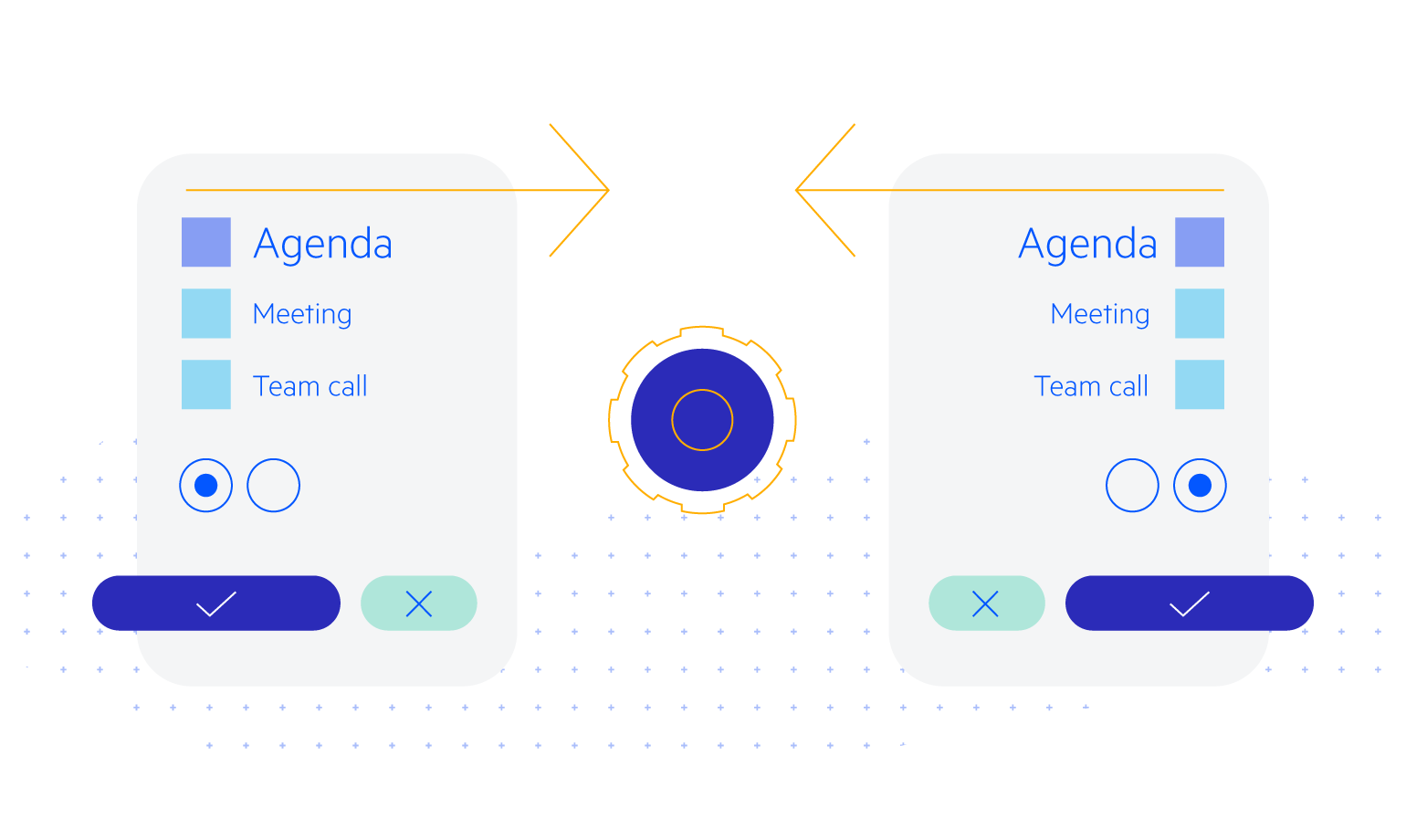
-
Keyboard Navigation
The ASP.NET Core Dialog component comes with out-of-the-box support for keyboard navigation. Users can easily make their decision and select the action they want using only their keyboards.
-
Theming
The Dialog has several built-in themes and swatches. Explore the Default (our own styling), Material (based on the Material Design guidelines), Bootstrap (which looks like the Bootstrap styling to integrate better) and Fluent (based on Microsoft Fluent UI) themes and choose the swatch that meets your design requirements.
You can easily customize any theme with a few lines of CSS or create a new one with the Progress SASS ThemeBuilder application to exactly match your colors and branding.
