
UI for ASP.NET Core
ASP.NET Core Splitter
- Use the ASP.NET Core Splitter component to separate your pages into sections for a more intuitive flow.
- Part of the Telerik UI for ASP.NET Core library along with 120+ professionally designed UI components.
- Includes support, documentation, demos, virtual classrooms, Visual Studio Code Extensions and more!

-
Overview
The Telerik UI for ASP.NET Core Splitter is a layout component used to split pages into panes that can be expanded or collapsed, both vertically and horizontally. The vertical and horizontal orientation of the Splitter can be combined to build complex layouts. Their main goal is to let users resize panes to their preference for a better user experience.
See the ASP.NET Core Splitter demo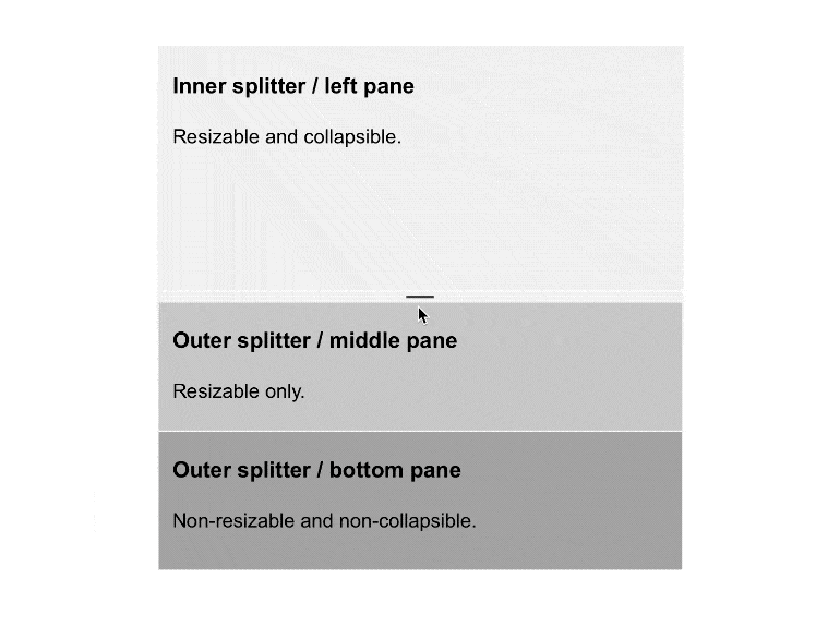
-
Auto Resizing
The Splitter component can be programmed to automatically resize in the following scenarios:
- Along with a Window component
- Expand its height depending on the content of the pane
- Adjust its height if you expand it vertically and resize it together with the browser window
-
Customization
The ASP.NET Core Splitter component and its panes can be customized in several ways. The control can be positioned horizontally or vertically. You can add a CSS class to both the Splitter and its panes to configure their default, minimum and maximum sizes and define if they can be resized and collapsed.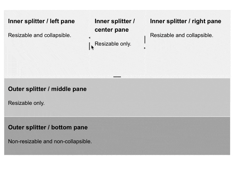
-
Content Operations
The Splitter also provides several options for setting the content of the panes—the static content and the asynchronously loading content. -
Razor Pages
The Splitter component is one of the many Telerik UI for ASP.NET Core controls that are supported in both MVC and Razor Pages applications. To view the complete list of Telerik components that you can plug in ASP.NET Core Razor Pages projects, check out the documentation article or visit the Razor Pages examples in our GitHub project repository. -
RTL Support
Right-to-left support is available for users who read from right to left. You can satisfy any cultural preference with the Splitter component by changing the alignment between left-to-right and right-to-left with only a few settings.
See the ASP.NET Splitter RTL Support demo
-
HTML and Tag Helpers
Create expandable and collapsible panels with an HTML-like syntax through the Splitter Tag Helper or use the convenient HTML Helper.

-
Accessibility
Accessibility can be a large concern in any application. Thanks to the Telerik Splitter component being Section 508 and WCAG guidelines compliant, you can rest assured when adding the component to your application.
-
Keyboard Navigation
The Telerik UI for ASP.NET Core Splitter component supports keyboard navigation, which allows users to navigate panes by only using a keyboard. Whether your application’s audience consists of avid keyboard users or prefers the old-school mouse approach, they would all enjoy using the control. To see more details about Keyboard Navigation for the Splitter, visit this demo.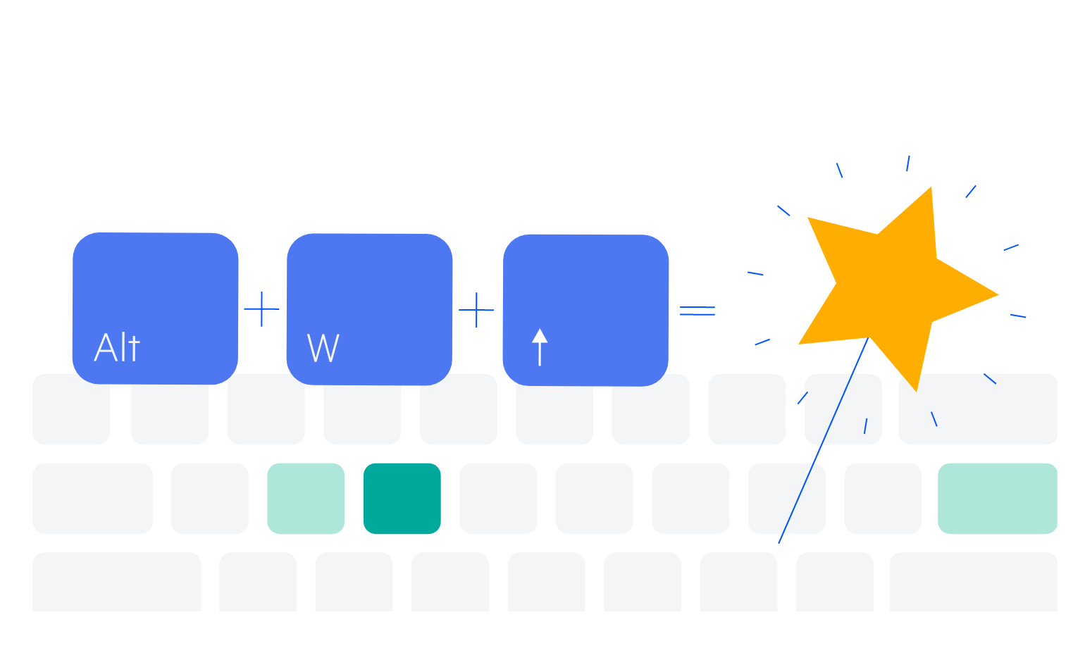
-
Theming
The Splitter component has several built-in themes, such as Default (our own styling), Material (based on the Material Design guidelines), Bootstrap (resembling the Bootstrap styling) and Fluent (based on Microsoft Fluent UI). You can easily customize any out-of-the-box theme with a few lines of CSS or create new themes to match your colors and branding by using the Telerik SASS ThemeBuilder application.
