
UI for ASP.NET Core
ASP.NET Core Breadcrumb
- The ASP.NET Core Breadcrumb component lets users navigate hierarchically arranged structures.
- Part of the Telerik UI for ASP.NET Core library along with 120+ professionally designed UI components.
- Includes support, documentation, demos, virtual classrooms, Visual Studio Code Extensions and more!
-
Overview
The Telerik UI for ASP.NET Core Breadcrumb indicates the current position in your application. If your app or website are complex in structure (which they probably are), you will help your users greatly if you add breadcrumbs to make navigation easier.
Visit the ASP.NET Core Breadcrumb Demo page
-
Adaptive Rendering
In case there isn’t enough space to display the entire navigation path, the initial few items will be hidden so the others fit the available space. Users can click on one of the available items to change the value of the path and reveal the hidden parent nodes.
-
Icons
The ASP.NET Core Breadcrumb component allows the configuration of the icons of the items and delimiters. You can choose to make only the root item icon unique, or make all of them different, depending on your project's needs.
Check out the Breadcrumb Icons demo -
Navigation
By default, the Breadcrumb's automatic navigation is turned off, however you can easily enable it through the Navigational configuration. When this is done, the URL will be added to thehrefattribute of the Breadcrumb items. -
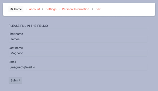
Editing
The Telerik UI for ASP.NET Core Breadcrumb component also supports manually editing the path. Enter into editing mode and modify the value to any path you want to navigate to. Adapt it to best fit your project needs.
Learn more about ASP.NET Core Breadcrumb editing in our documentation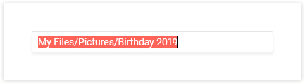
-
HTML and Tag Helpers
Telerik UI for ASP.NET Core provides two ways for you to declare UI components – by using HTML or Tag helpers. You can choose between the two approaches based on technology background, developer preference and practice, and implement the Breadcrumb component in your applications as well as configure its placeholder, value and other options.
-
RTL Support
Right-to-left support is available for users who read from right to left. You can satisfy any cultural preference with the Breadcrumb component by changing the alignment between left-to-right and right-to-left with only a few settings.
-
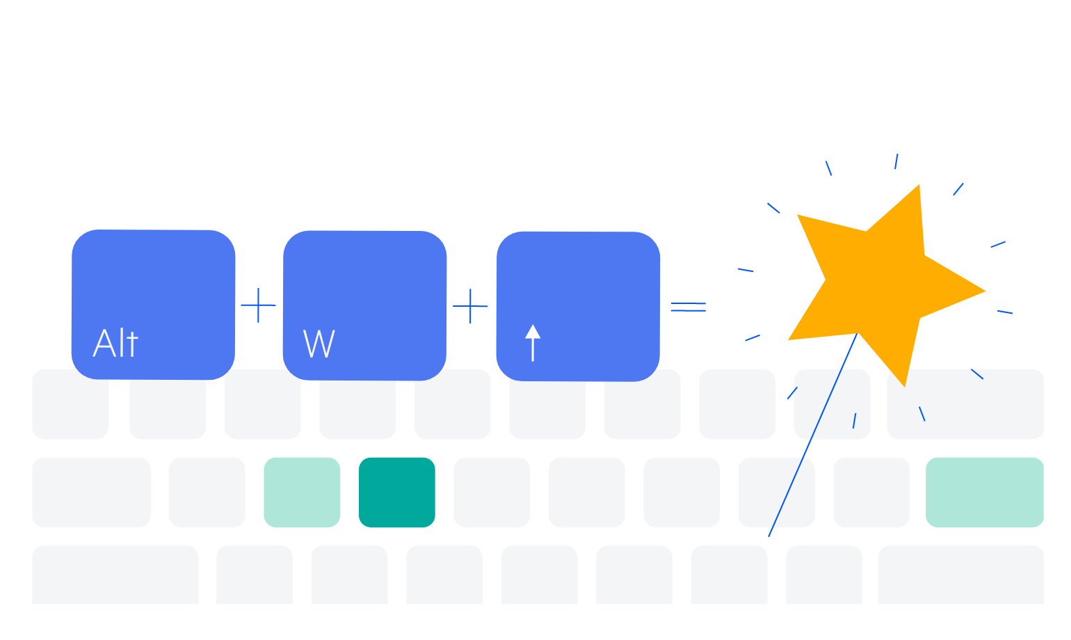
Keyboard Navigation
The ASP.NET Core Breadcrumb is one of the many components in the suite with out-of-the-box support for keyboard navigation. Users can use the arrows to open or close a node on focus or to navigate to other items in the chart.
-
Theming
The ASP.NET Core Breadcrumb has several built-in themes and swatches. Explore the Default (our own styling), Material (based on the Material Design guidelines), Bootstrap (which looks like the Bootstrap styling to integrate better) and Fluent (based on Microsoft Fluent UI) themes and choose the swatch that meets your design requirements. You can easily customize any theme with a few lines of CSS or create a new one with the Progress SASS ThemeBuilder application to exactly match your colors and branding.
